Imagine this: a 30-year-old guy decides he’s going to tries his own kitchen design for his wife. Sounds cool, right? WRONG. Trust me, I’ve seen this kind of thing go down, and it’s a total rollercoaster. I mean, the dude’s got big ideas, but the reality? Chaos. We’re talking towering cabinets that feel like they’re gonna eat you alive and lighting that’s so flat, it could put you to sleep. But here’s the thing, I get it. I’ve made the same rookie mistakes. You’re all excited, you want to make it personal, but then, boom, you end up with a design that’s almost there, but not quite.
So yeah, take it from me, hiring a pro might’ve saved him a whole lot of headaches. A 30-year-old homeowner who, with the help of his father, who owns a cabinet shop, took on the challenge of designing his kitchen took on this bold kitchen design. The process wasn’t just about choosing countertops and cabinets; it was about designing a space that reflected his personal style and preferences. After 18 months of construction, the kitchen featured cherry wood, black oak cabinets, and striking quartz countertops.
The result itself is impressive on paper (though it also has some pretty cool features), but there are a couple of design elements that say “I am a 30-year-old guy’s first kitchen design”. And there are both marvelous successes and tragic errors from which we, as designers, can take lessons. This project helps us analyse the balance between functionality and aesthetics, especially for someone stepping into a role that requires design knowledge.
As an interior designer, discussing this case study isn’t just about dwelling on the good or bad points. What it covers is how personal preferences, practical challenges and lack of professional experience can also combine in a real-world home design project. Most importantly, this case study will remind us why elements like lighting, scale, and colour consistency are crucial when designing spaces meant for long-term use. Let’s dive in and look at it, breaking it by choosing to see how it wasn’t even as easy as it appeared to be to get it right the first time.
Kitchen Design, layout and idea
Cabinet Design and Layout:
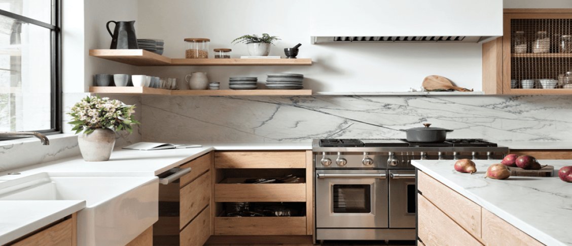
First off, the cabinetry. A 30-year-old designing his kitchen for his wife? See, I understand, he’s excited, but this is the real thing here, a professional commitment to craftsmanship. Between this set of cabinetry, which is filled with a mix of Sundance-stained cherry and black stained oak, you can also find an Evident cabinet. That is a little bit of a wild combination; dark, warm woods with a modern edge.
The cherry cabinets are rich and classic, while the black oak provides a modern and edgy contrast. But imagine, combining these two could go wrong very quickly if not executed well. Here, it works. However, the black accents are consistent with the quartz countertop, and the sheer bulkiness of the cabinets (from 90” to 144” in height) will need to be lived with.
Those heights could be rightfully intimidating for someone without professional design experience after a while. The inclusion of glass panels next to the range hood was a gamble. It could have turned into a “why did he include that?” but it helps punch up the act with some breathing space and brings some levity to the overall heaviness of the woodwork.
Those glass sections would’ve broken up the solid, heavy cabinets into a block of wood, which would’ve looked like an inconspicuous and imposing one. I do wonder how many items they’ll actually display in those glass panels. Some glass-front displays may end up looking more like a storage closet than a feature if not curated properly.
Countertops:
Next up, the countertop which is Quantum Quartz Bianco Tifone. A classic choice of this white quartz with dramatic black veins, it conveys ‘fancy’, but plenty of ‘practical’. Meagre maintenance and it gives the kitchen an air of luxury.
But the thing is, this is one of those features that, on a design level, either saves or breaks the kitchen. It’s bold, it’s eye-catching and feels overwhelming if its mates are from outdated cabinetry or outdated lighting. It’s bold here, being set against the dark cabinets, but the strong cabinetry combination could overshadow it.
Honestly, it could get a little too dark with the dark cabinets, but overall, the design works. Don’t be concerned; wrong choices with lighting or too many contrasting elements will lead you to an overpowering space.
Range and Hood:
I think let’s focus on the 30-inch GE Profile induction range and the 36-inch range hood. That 600 CFM hood is a sound decision to start with. The wider hood than the stove? That’s not a bad move either. But in a good functional design sense, it captures better the airflow and it’s a great design for cooking fumes that they tend to get trapped in smaller hoods.
Aesthetics and function for me. However, the regret may come in if the larger hood looks bulky if not well balanced. With the height of those cabinets, the range hood in particular will only add to the feeling of width that’s already there. It can feel a bit clunky unless you do it right.
Faucets:
Okay, the dual Moen touchless faucets? Well played, 30-year-old! I can’t help but applaud this one of those details. Now they have that matte black finish, which goes with the rest of the kitchen’s colours scheme. Trust me, two faucets at the sink is genius. It allows the homeowner to use the sink with his wife simultaneously without inconveniencing anyone.
One of these features kind of makes me think, “Well, they must know what they’re doing…” That definitely is a practical choice if you’re a busy household. How many 30-year-olds are actually thinking about this, though? That’s a thoughtful touch that he didn’t slap things together.
Lighting:
Well, here comes where I am going to put myself on the brakes. The lighting is practical, but could be a lot more. They didn’t have any problems with the recessed lighting through the space, that was just standard. The overall vibe isn’t helped much by its being functional. In designing a kitchen like this, lighting should highlight the beauty of the materials.
Yes, the title does allude to a certain point in a way so yes, I mean, there is a point here. It is obvious that there is no layered lighting. And where are the pendant lights that hang above the island. The under-cabinet lighting? The little details could take the space from ‘functional’ to ‘wow.’
Overall Design: It’s clear this kitchen was a major passion project. The 30-year-old homeowner has spent a lot of time and effort creating something to match his perspective and practical requirements. It works in general, with solid elements like the large cabinets and clear colour choices, but I think they could use better balance, so to speak. Where it goes a little over the top is certain (hell, 144” cabinets), but that’s the nature of self-designed projects. They are personal and have a place for those wild, imperfect choices.
Is it good? What goes right or wrong?
This kitchen design has a mixed bag. The 30 year old homeowner clearly put in a lot of time and effort to the results? There are, however, some places where it works and some places where it just squanders the mark. So as an interior designer, let’s discuss what I would have done right or wrong or done differently.
What Goes Right:
Cabinet Design and Materials: The wood is solid enough, with Sundance-stained cherry and black stained oak as the chosen materials. Using contrasting woods makes the kitchen interesting and adds character and depth; it’s also timeless: the dark, rich tones. The Quantum Quartz Bianco Tafone countertops complement with it are so luxurious and polished. The wood tones all stand out really quite well against the black and white veins in the quartz, which don’t read as too busy. Combined, this is a high-end aesthetic that can be a selling point in the kitchen.
Functional Features: The dual Moen touchless faucets at the sink? Genius. A small but beneficial feature, especially in a kitchen where two people will likely be cooking or cleaning. It helps in improving the work of the space; you enjoy doing the work in this space. Another functional win is the larger-than-usual range hood (36 inches) with its 600 CFM capability. The goal is to capture cooking fumes more efficiently, and the wider range hood is a practical choice.
Personal Touch: The personal touch in the design is something to be praised. This homeowner gave the project his heart. The space also feels custom, from the cabinet design to the glass panels of the cabinetry. High ceilings (cabinets extending to a height of 144 inches) alongside a bar effort that finds ways to make the kitchen both functional and visually stunning, is what gives the kitchen grandeur.
What Goes Wrong:
Scale Issues: The biggest problem is the scale of other elements. From 90 to 144 inches, the cabinets reach the cathedral. This is big, and while impressive in action, you can feel the home feel topsy-turvy. The main issue with the cabinets is their size, as the range hood’s width and available space are pushed to their limit. I think this would have worked better with a smaller scale or more balanced proportions in the cabinetry compared to the other elements in the room. There’s a lot of bulk, and it might look cramped or disproportionate.
Lighting: This is a major miss. The recessed lighting is functional, but it doesn’t highlight the materials or create the desired mood for the space. There should be three types of lighting: task, accent, ambient.
When the lights have turned on in this case the kitchen seems rather flat and uninviting. Where are the pendant lights for the island? They should definitely add under-cabinet lighting to highlight the quartz countertops. These small lighting details would have eventually put the design over the edge from good to great.
Glass Cabinet Panels: An interesting choice is the use of the glass panels next to the range hood. The intent is to reduce the bulk of the cabinet, to lighten it up, but what exactly are you going to show inside of those glass panels?
Without carefully leaving them empty or filling them up with random items, it will look unfinished or just cluttered. Glass-front cabinets require careful curation. Without it, they are simply another distracting feature rather than in itself a design highlight.
Over-Designing Certain Areas: In some areas, the kitchen looks overly designed and also resembles snowiness. The large range hood and the extravagant cabinet heights all fit into the category of overdesigning, where almost every inch is used to make some sort of statement. However, over time, this design can become exhausting to live with.
I get easily lost in making everything impressive, but a truly good design should also have a place for simplicity, breathing space, and consistency. If the cabinets are too high, they may lead to cluttering or may make it hard to reach items stored up there.
What would an interior designer do better?
This kitchen design feels a bit vague. Looking at the layout, the upper cabinets should be aligned with the ceiling and have the same shape. Even if that’s not possible, the ceiling could be lowered, and the upper cabinets could be redone. If the cabinet colors can be changed to match the top (which is a white and black patterned stone), it will look much more aesthetically pleasing, as I can still see some black paint finishes in the kitchen.
Scale and Proportions:
I would definitely reduce the cabinet heights, and would certainly change the proportions. High cabinets may have an imposing appearance, but it should never take up too much space. Rather than stretching the cabinets to 144 inches, I’d prefer a balance, maybe less tall cabinets and more mid height. I would also try to balance the size of the range hood with the rest of the room to stop it from becoming too visually prominent.
Lighting:
This is the area where I would make these drastic changes. To give the kitchen warmth and depth, I would merge different lighting types. Pendant lights over the island would not only be a magnificent addition to the space, but would also provide much-needed task lighting. Instead of putting lights up high, the quartz could be highlighted with under-cabinet lighting and glow at night. In addition to that, I think the glass-front panels and the backsplash would be good candidates to get some directional lighting to highlight the unique parts.
Glass Panels:
There is also room for more consideration regarding the glass panels that line the hood. I would either remove them altogether, or if kept, fill them with something stylish and curated (perhaps high-end glassware or pottery) if I were redesigning it. If glass panels have to stay, they should not be a stylistic flourish, they should have a role to play.
Simplicity and Cohesion:
Lastly, I would work on simplifying some of the design pieces. Bold moves such as a massive cabinet, a cumbersome range hood, and pricey faucets can give a space the appearance of trying too hard. The job of an interior designer is to keep these aspects balanced so that they work together harmoniously. With the character-giving kitchen touches like touchless faucets and custom cabinetry, I’d push for simplicity in the design.
Final thoughts: What do I think?
Certainly, this kitchen has good potential, but there’s quite some refining that needs to be done. A little more experience with space planning and a little more professional language may have made all the difference for the homeowner, but there are a lot of great ideas. What I can say is it is an excellent start.
But still lacked the part of a more coordinated plan for scale, light, and proportion that the interior designer would do. This is, of course, a case study of why it’s wise to seek advice from professionals when designing a space where you’ll live every day. This is, of course, a case study of why it’s wise to seek advice from an interior design company in Dubai when designing a space where you’ll live every day.

