Ever walk into your home and just feel tired, down, or uninspired instantly without knowing why?
Most people put effort into selecting furniture, decorations, and arrangements, yet there is something not right. The space looks great, but it doesn’t match your mood. This is because we frequently forget about one of the most powerful design elements during an interior renovation: colour psychology.
The right colours help brighten your mood, reduce stress, increase creativity, and make your home feel warmer and more alive; the wrong ones can drain you or create tension.
In this blog, we’re going to look at how different colours affect our mood and behaviour, and show you how you can use that knowledge to design spaces that are not only attractive but will have positive emotional and psychological effects on those residing there.
What Is Colour Psychology? A Science-Backed Explanation
As proposed by Cherry (2025), colour psychology is related to examining how these colours influence our emotions, behaviour, and ideas. It describes how certain colours can make us feel calm or happy, excited or focused. People use this idea in shops, houses, and designs to make moods. For instance, some colours are better-suited to help us relax, while others promote increased activity or creativity.
The Origins of Colour Psychology
Colour psychology has ancient roots, but it began to develop into a formal field during the 19th century. According to Flaviani et al. (2023), Swiss psychologist Max Lüscher has contributed to contemporary theories by way of his colour personality test in 1949. Johann Wolfgang von Goethe investigated colour psychology long before Verveer in his 1810 work Theory of Colours (Goethe, 1810).
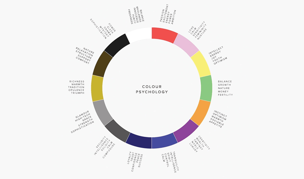
Colours That Boost Your Mood (A Complete Psychological Breakdown)
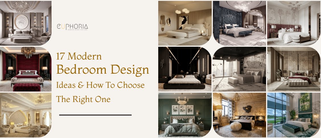
#1: Blue: Calm, Focused, Restorative
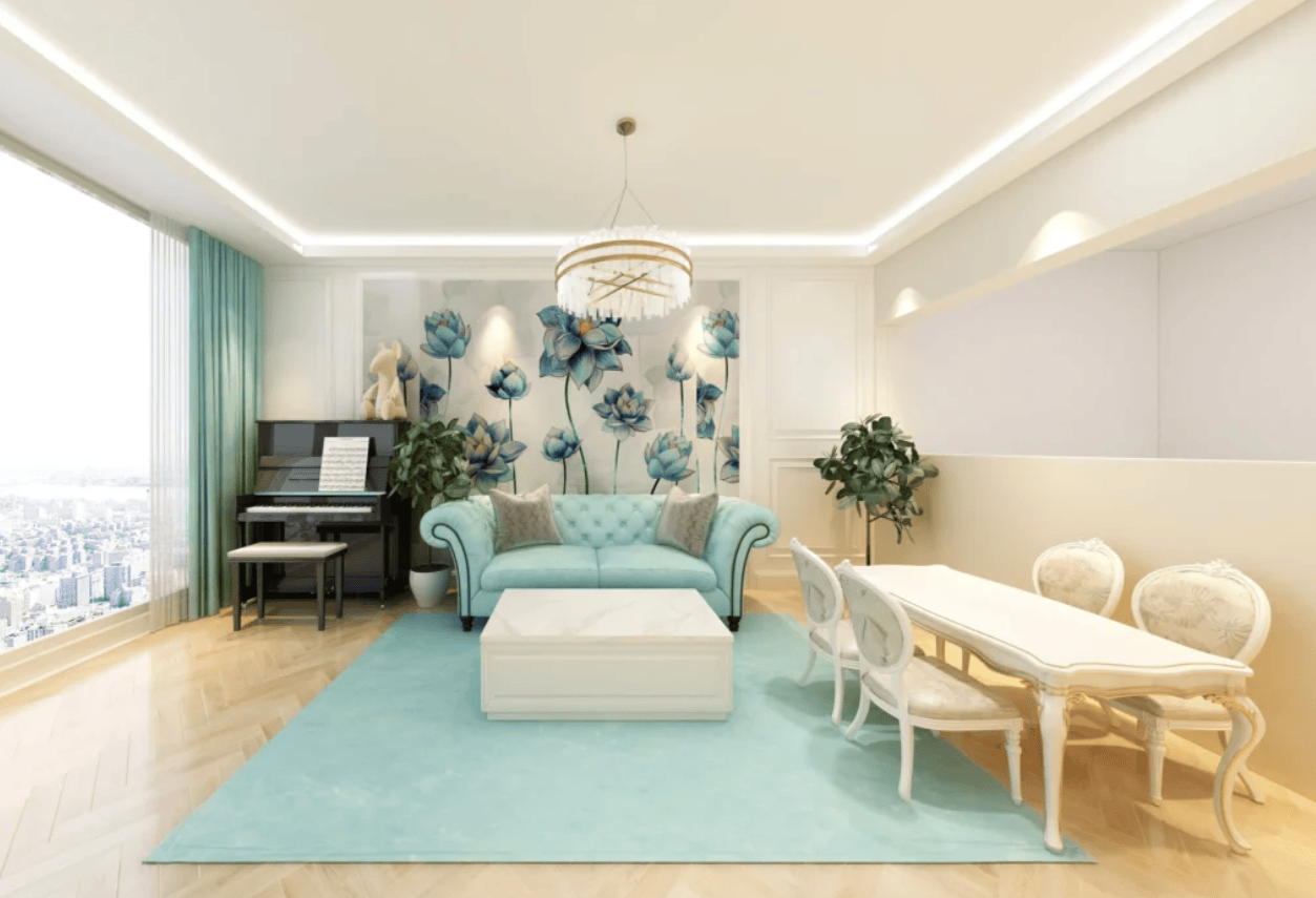
Blue is the commonly associated colour with peace, calmness, and stability. It encourages relaxation and is frequently employed where clear thinking is necessary. According to Xu et al. (2024), blue is among the colours that yield the highest levels of pleasure. This would be an ideal choice for bedrooms, bathrooms, reading or study rooms, and meditation or relaxation spaces where a relaxing atmosphere is desired.
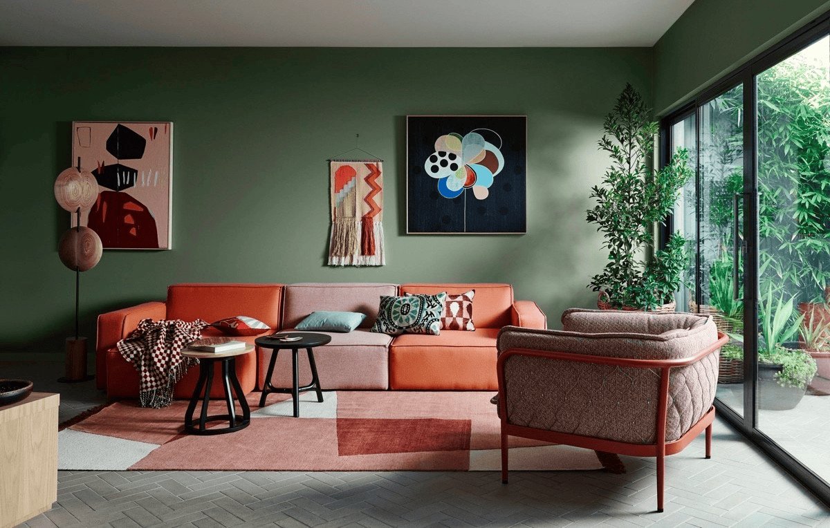
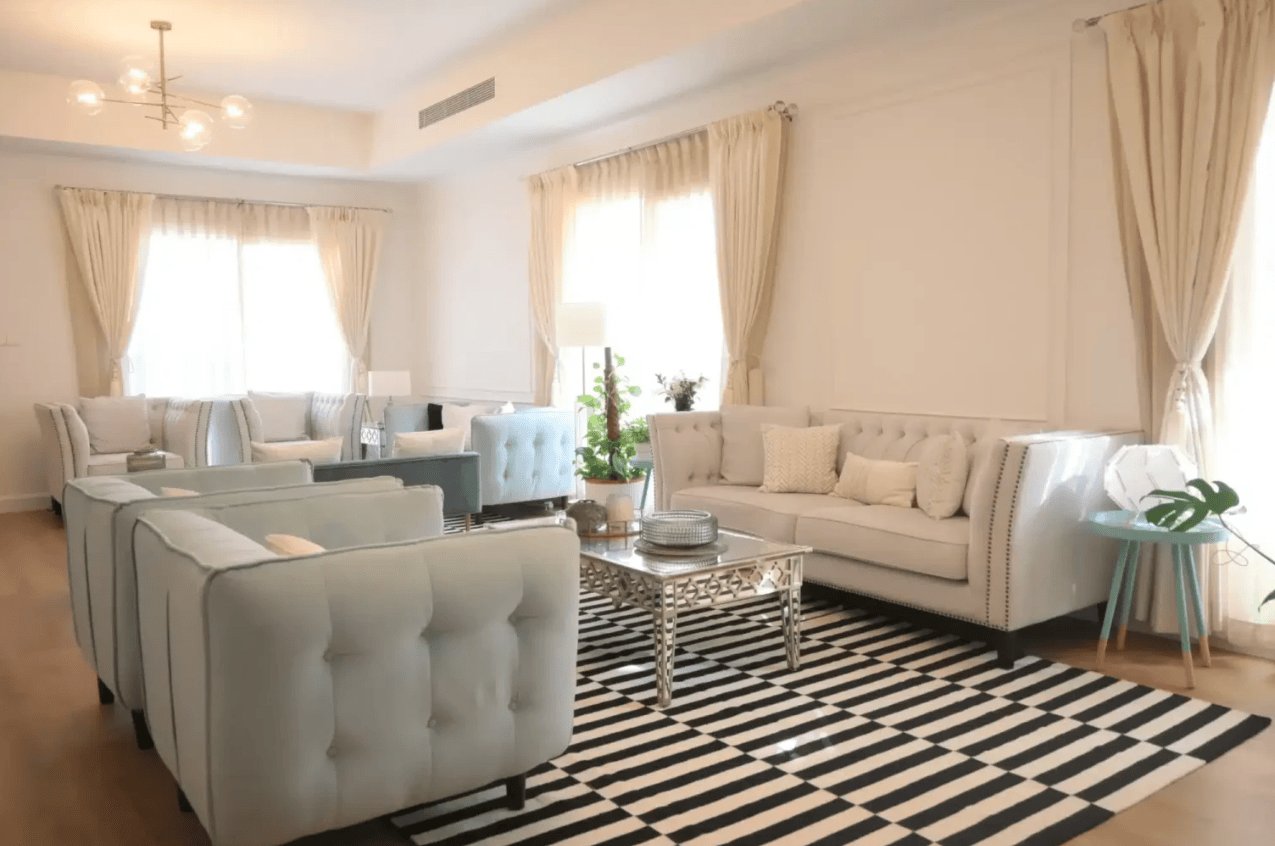
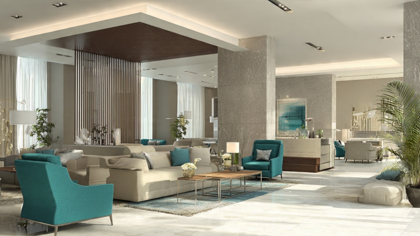
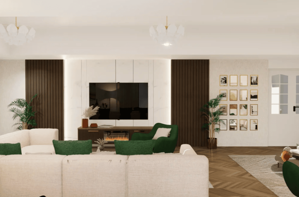
#2: Green: Restful and Restoring
Green is another colour that brings peace and calm. It is believed to encourage balance, harmony, and growth. As per Chen and Illia (2024), green is perfect in places where you wish to create a relaxing yet energising atmosphere.
Like blue, it translates well in the bedroom, living room, and study, or anywhere that needs to have a calming influence while helping people feel recharged and balanced.
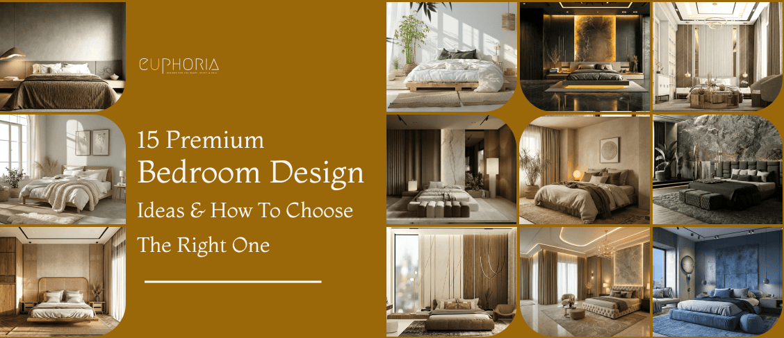
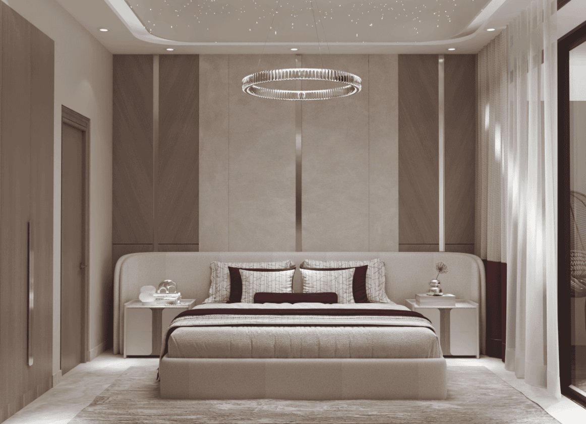
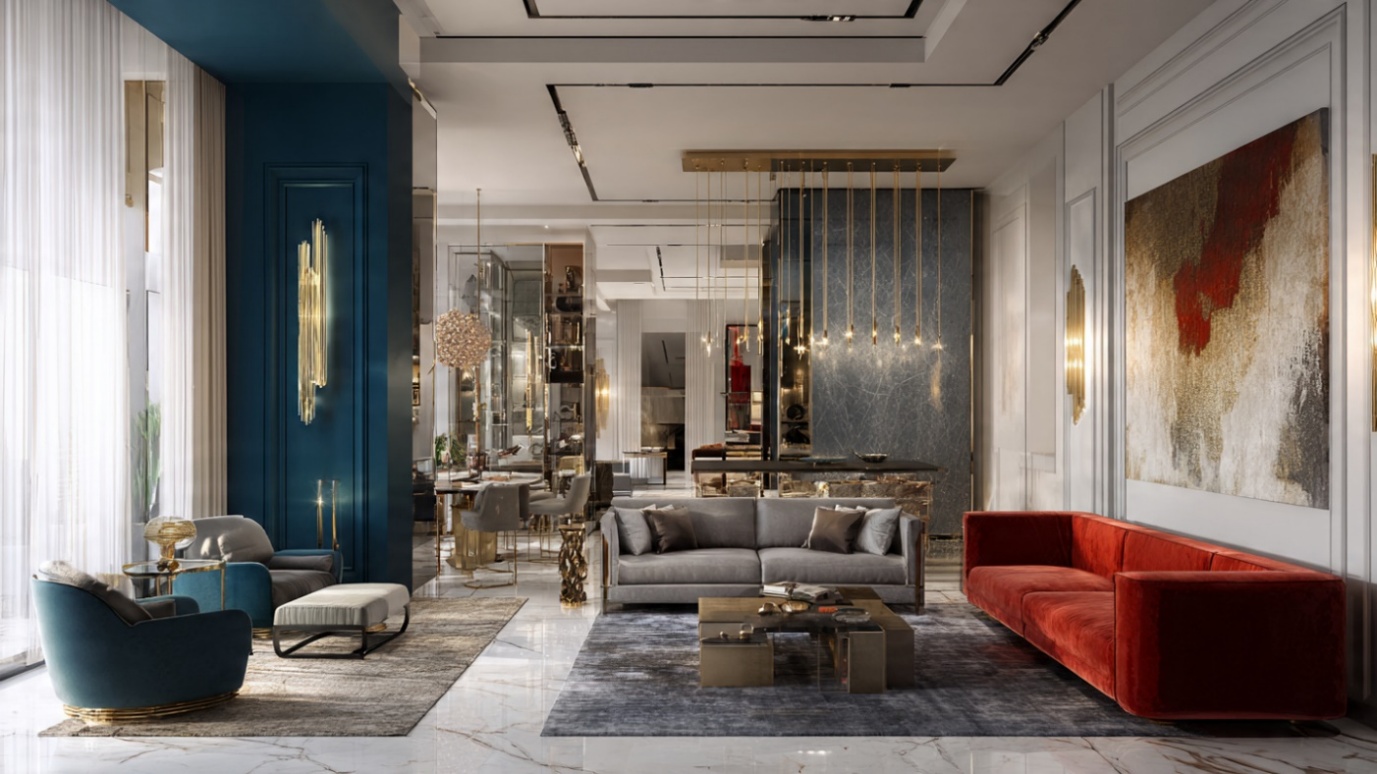
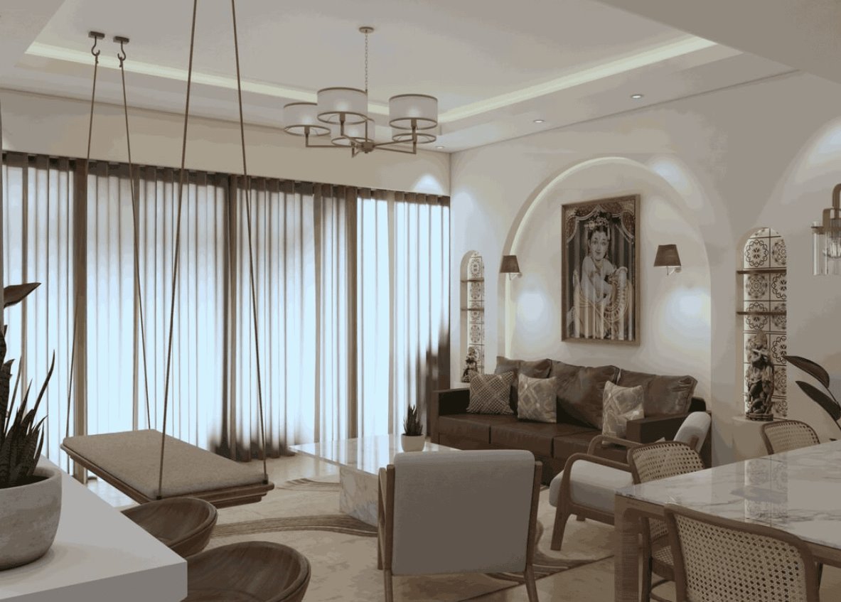
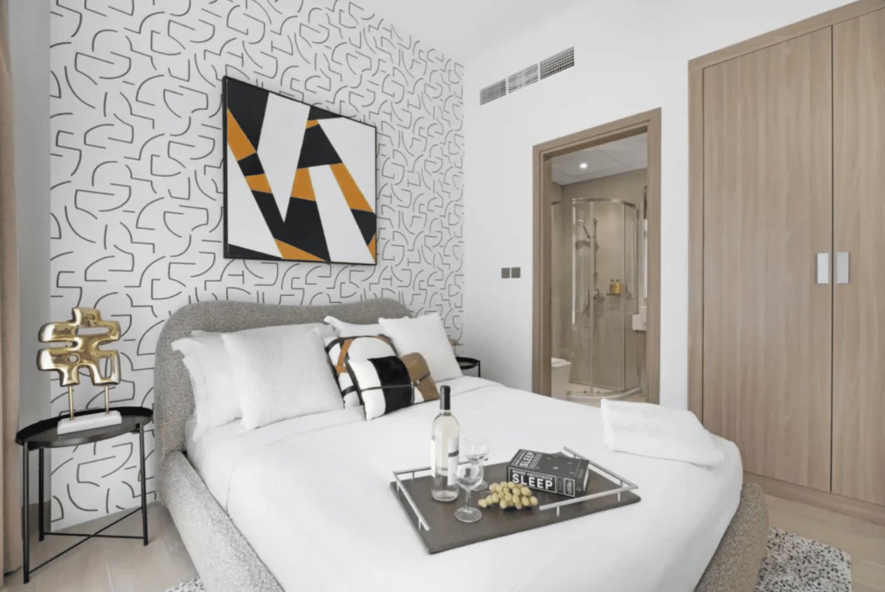
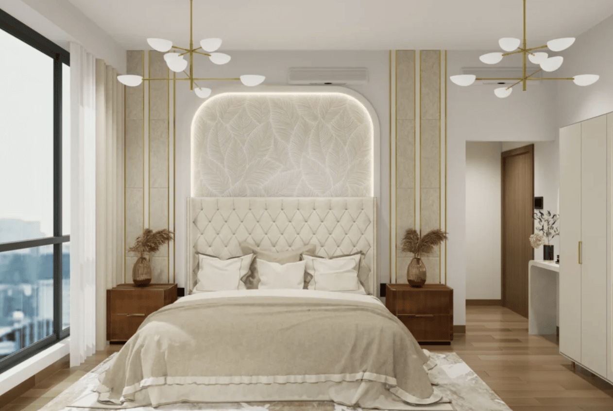
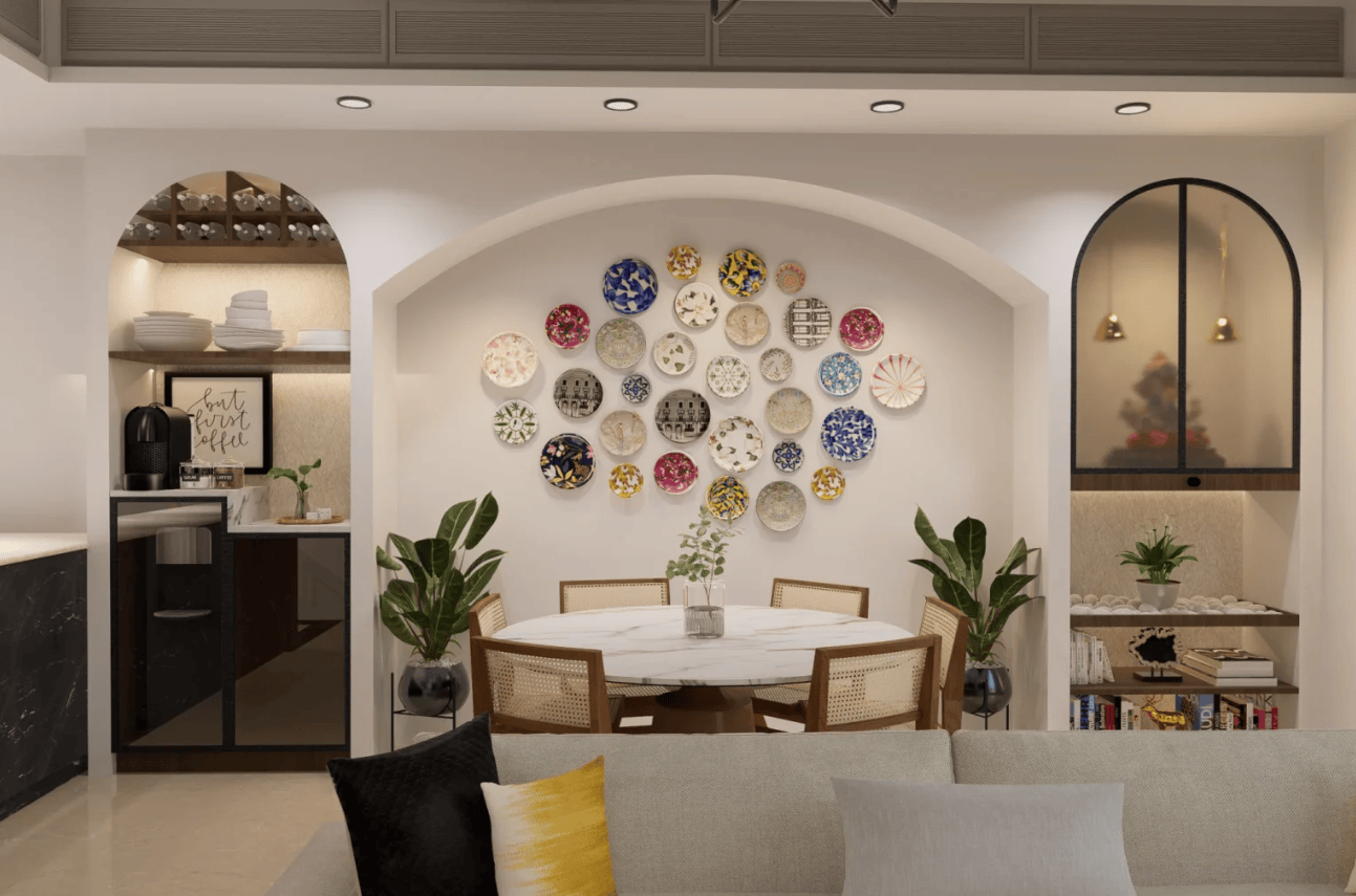
#3: Soft Earth-Tones / Neutrals: Grounded, Warm, Comforting
Neutral earthy colours, such as beige, taupe, brown, muted green, and off-white, can make you feel cozy and stable. As per Datta et al. (2023), these colours establish an environment-based approach and are a good way to make people feel more comfortable psychologically.
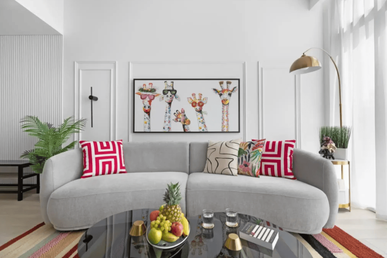
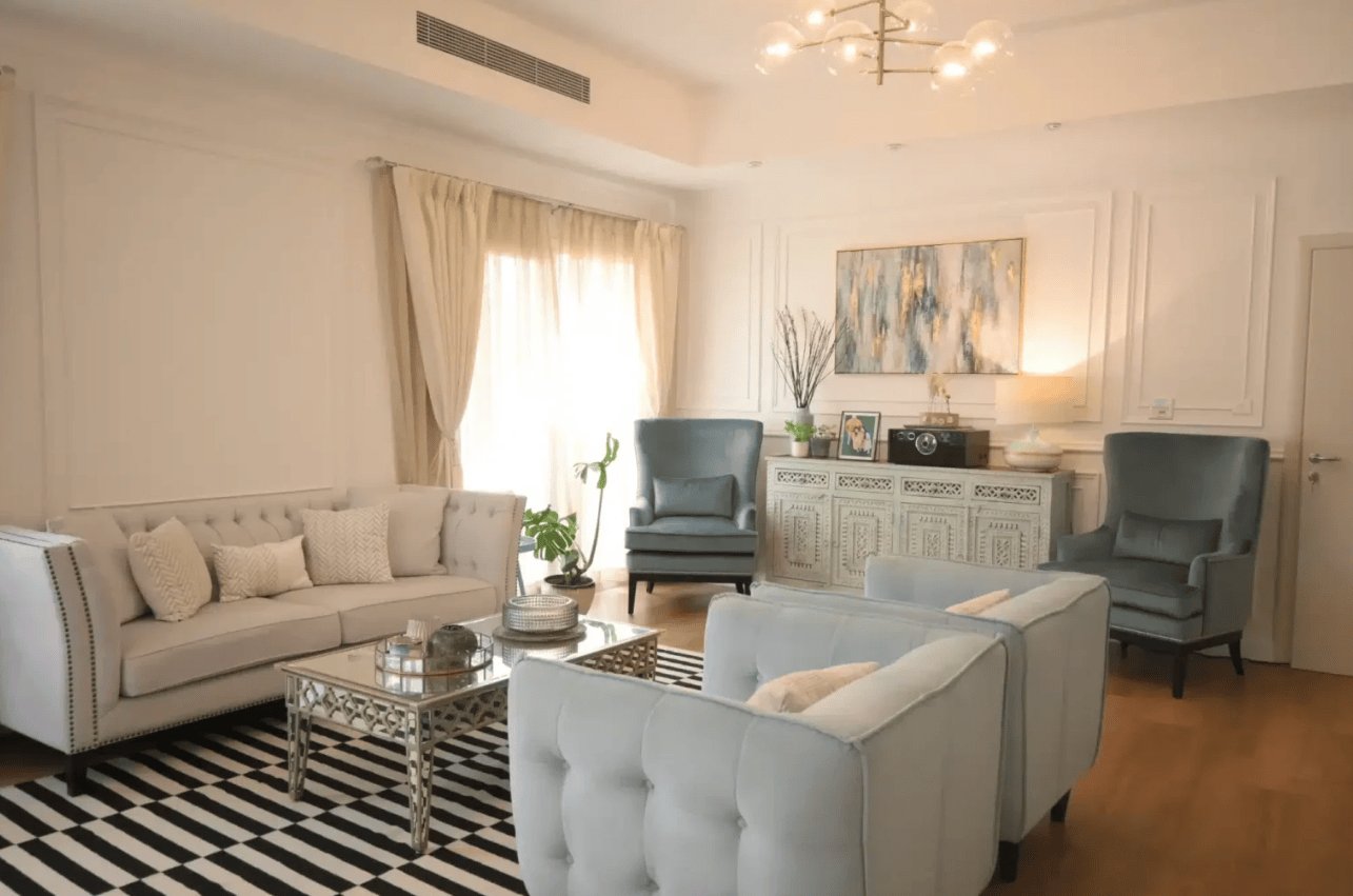
Light neutrals work very well in rooms intended for relaxing and gathering, like living rooms, lounges, and family rooms, or any other space where comfort and balance are key.
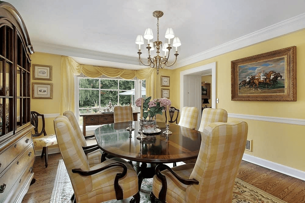
#4: Yellow: optimism and energy
Yellow is a happy and warm colour; it makes you feel joyous and gives you energy. It can perk up a space and encourage socializing. As reported by Roberts (2018), yellow is especially effective for dining rooms, living rooms, and kitchens, or anywhere people gather to talk and enjoy themselves in good company. Furthermore, yellow is ideal for creative areas where mental activity is required.
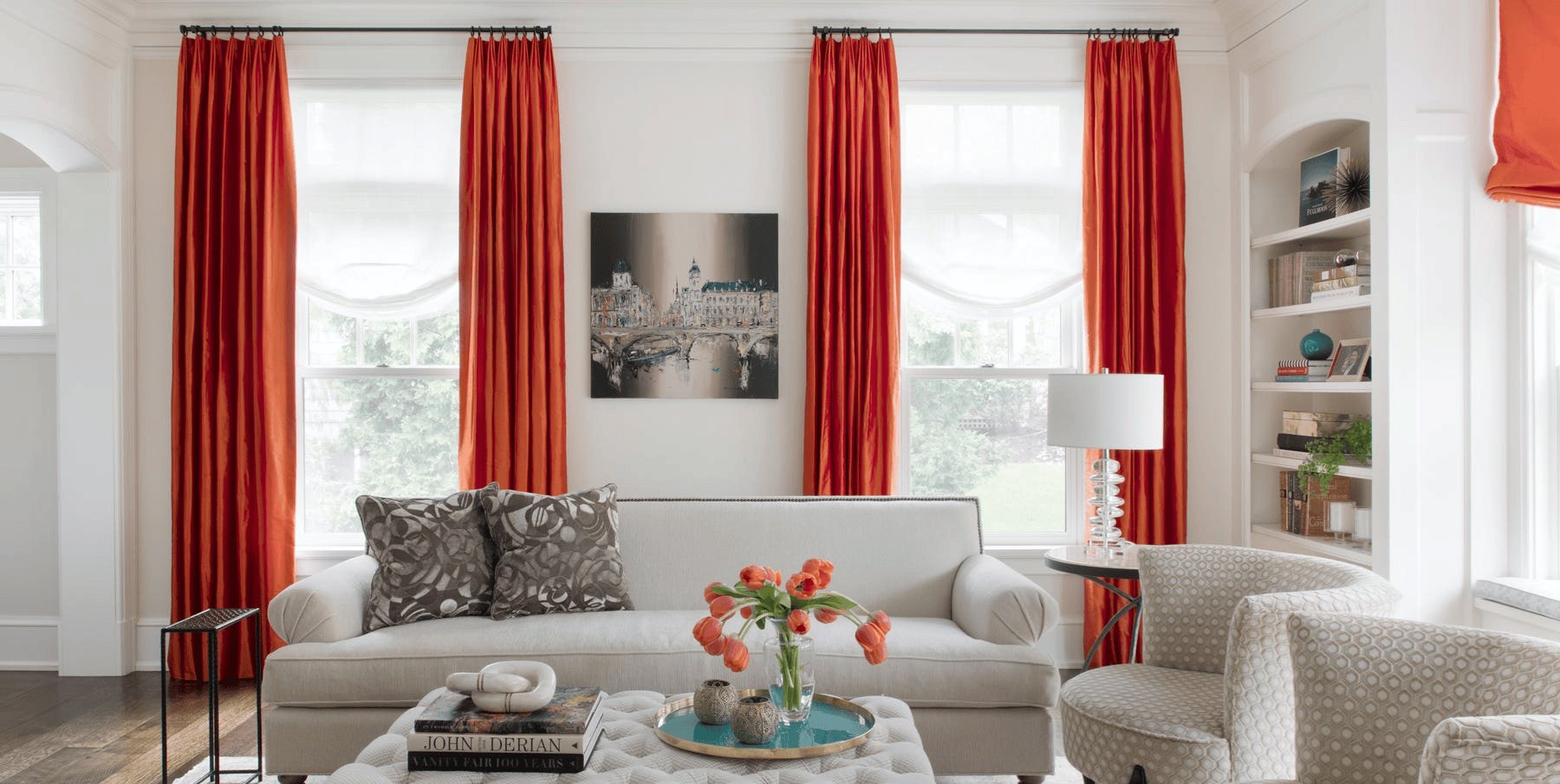
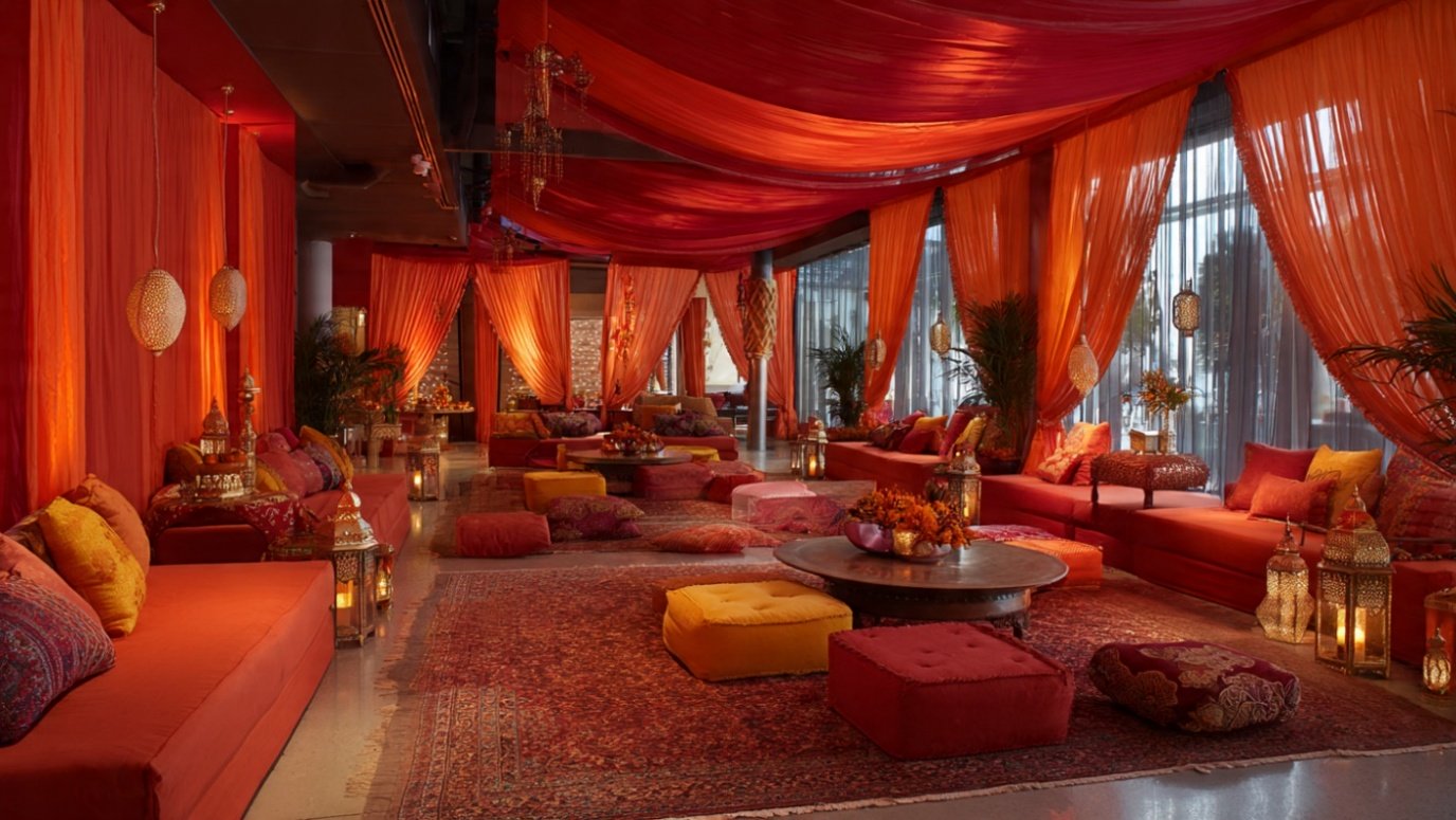
#5: Orange: Enthusiasm, Creativity, Excitement
Orange is an energizing colour that symbolizes enthusiasm, creativity, and excitement. According to William (2024), it is a blend of red and yellow, being the warmest colour yet effective in spaces where social interaction and creativity are encouraged.
But because it’s so aggressive, use orange with caution. It’s great for accent walls, art, curtains, or decor, not so much for large surfaces that it might overpower.
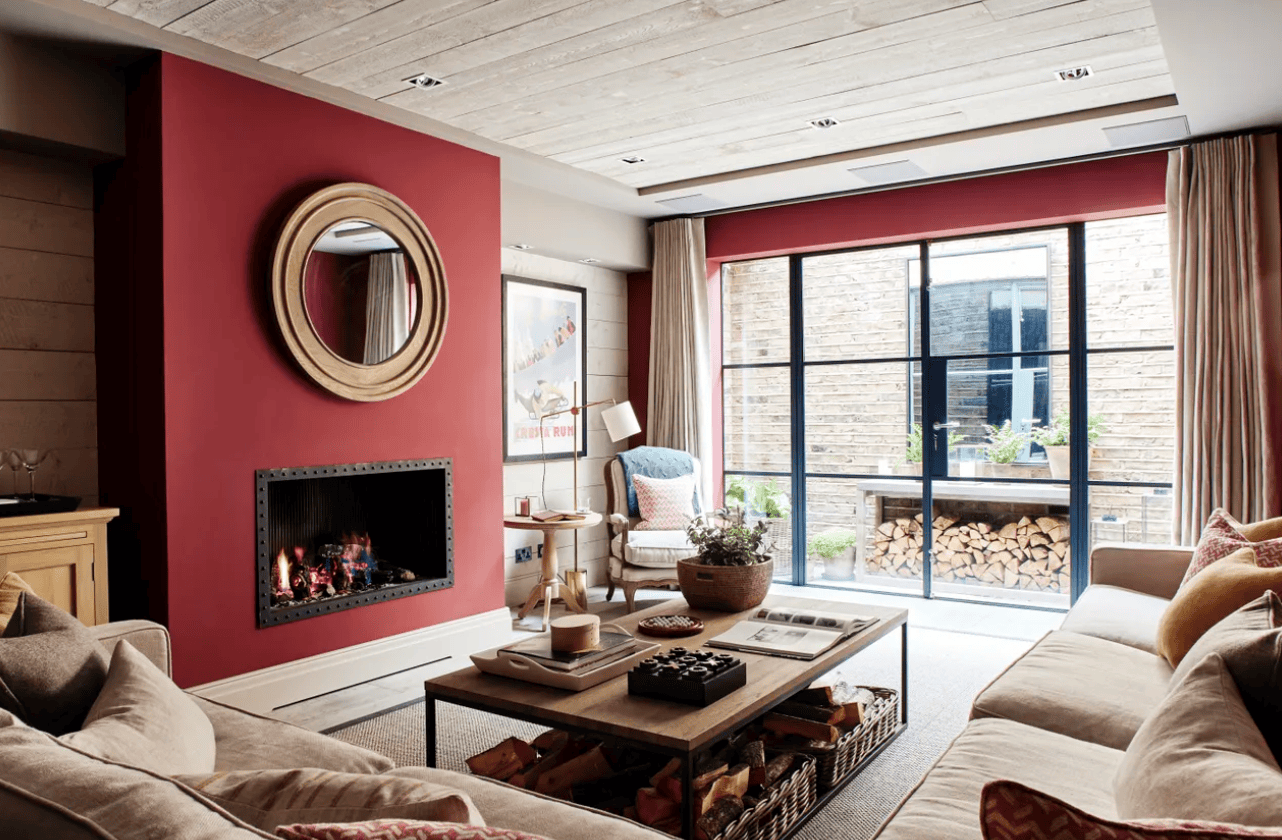
#6: Warm Red: Passion, Excitement, Vitality
Warm red, which is commonly synonymous with passion, excitement, and energy, can bring a strong charge of energy to any area. Van Braam (2025) notes that red colours are good to boost concentration and motivation and, therefore, suit the environment where these attributes are central, including offices, home gyms, and educational spaces.
Nevertheless, red may also be oppressive, and hence moderation is essential when using it to design rooms.
#7: Soft Coral: Warmth and Inviting Cheer
Deep tones of coral have a touch of coziness and welcoming cheer. According to Thompson (2025), this colour creates a positive outlook and is not as bright as the red and orange hues. It suits perfectly to establish a warm, good mood in the living rooms, bedrooms, and dining rooms.
The soft coral helps create a sense of warmth and the feeling of vibrancy without being overwhelming.
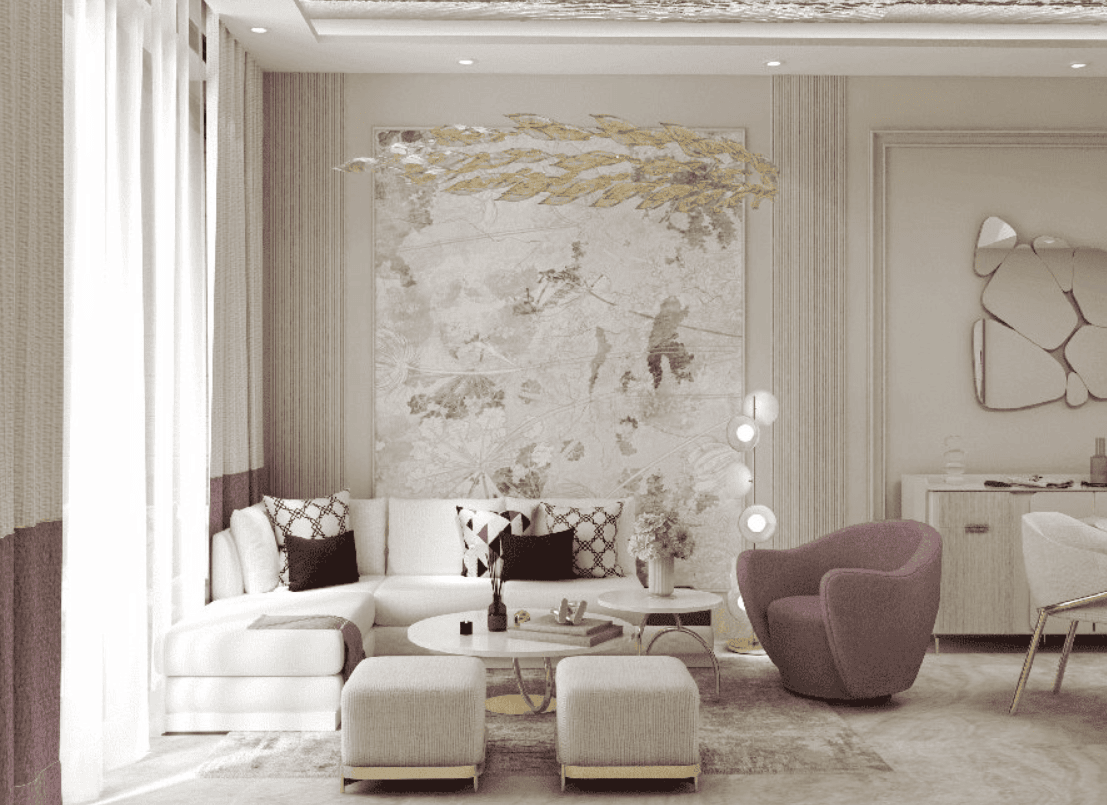
#8: Warm Pastels: Gentle, Uplifting, Cozy
ThisMoodboard (2025) states that warm pastels, such as peach or soft apricot, light hues are mood or spirit-enhancing colours, which help to boost optimism and comfort. They are very effective in areas such as bedrooms, living rooms, and corners where you would wish to have a light, airy, and inviting atmosphere. Such colours are pleasant but do not overexcite and are therefore ideal in intimate or relaxing environments.
#9 Soft Pastels: Calm, Serene, Soothing
ThisMoodboard (2025) points out that soft pastels are light colours that are associated with comfort, softness, and mild optimism. The colour, such as light pink, lavender, or pale peach, is soothing and gentle.
The colours fit well in bedrooms, reading spaces, and lounges where one would want to relax. The use of light pastels facilitates peacefulness without disturbing the eyes too much.
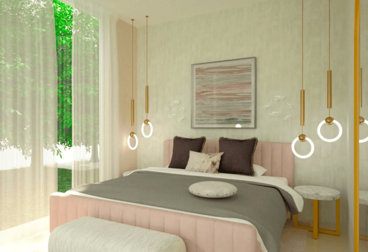
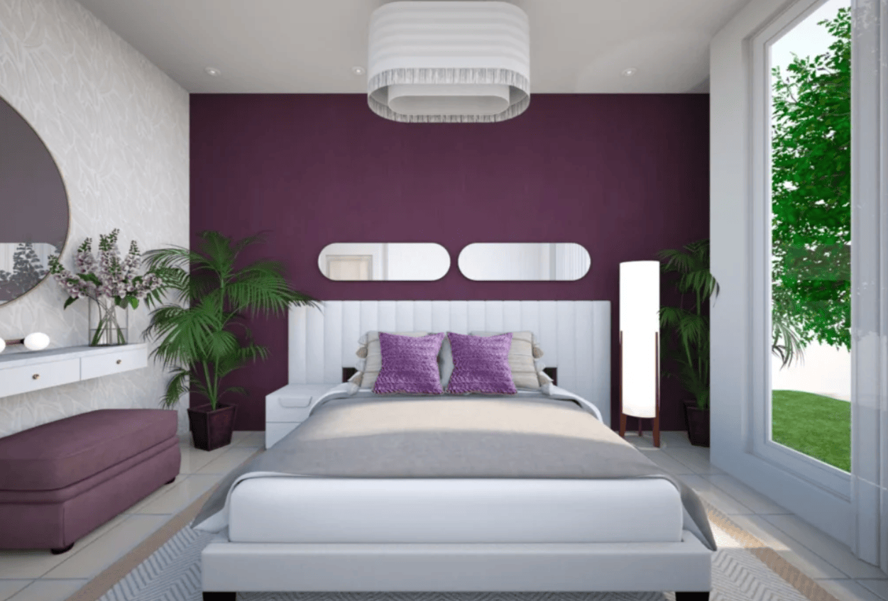
#10: Gentle Pinks / Lavenders: Nurturing, Calming, Comforting
Becker (2024) claims that soft pinks and lavenders mix in harmony and gentle warmth and present a space that is welcoming and comfortable. These shades are ideal in areas where a calming background is needed. They are perfect in bedrooms and living rooms, as they create the atmosphere of relaxation and happiness and help to relieve the mind and inspire positive emotions.
Each of these colours has a particular psychological impact, which is why colour psychology is such a necessity in interior design. With a careful use of these colour hues in your spaces, you can be able to design spaces that not just appear beautiful, but can also improve emotional feelings, improve mood, and even improve the intended purpose of the room you are dealing with.
Real-World Examples: The Dubai Context
As stated by The ArabianUAE.com (2025), the application of colour as an element of interior design is associated with a unique blend of Arabian tradition in Dubai and international design practices. This is because the city is a place of luxury, modernity, and cultural diversity. This popular blend implies that interior spaces should be oriented to both a rich heritage theme and high-end and modern design.This is a hallmark of a premier fit out company in Dubai, where efficiency and aesthetics must coexist.
Colours in Dubai are usually applied not to generate emotions recklessly, but to represent royalty, luxury, and hospitality, which are the main elements of what Dubai is and represents.

Luxurious living rooms, hotels, and high-class restaurants usually have one or more of the following deluxe materials: Gold, Bronze, and Rich Metallics with symbolic significance of prosperity, royalty, and a sign of luxury in Dubai.
The use of these colours is close to the cultural traditions of the area, where the golden colour has always been the sign of wealth and prosperity.
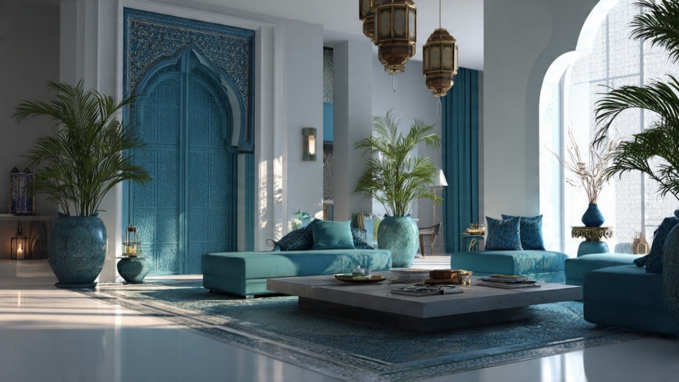
Deep Blues and Greens:
In the Middle East, the colour blue is referred to as a symbol of protection and peace, which is associated with the customary practice of using blue tiles in decorating mosques. Rich teal or deep green colours in kitchens and bathrooms are relaxing and are applied to bring attention and calmness.
Bright Reds and Oranges:
Red and orange are commonly used in the celebration areas of Dubai, like during Ramadan or the Dubai Shopping Festival, to show happiness, warmth, and welcome.
These bright colours are energetic and offer a welcoming and celebratory mood that is essential in social and communal areas.
Light Shades with a Splash of Colour:
Although Dubai is reputed for having sleek and modern-day architecture, cleaning up of the houses and hotels with light grey and beige colours is the theme in many places, as these colours lend the house a clean and open appearance. They are usually matched with such daring colourful additions as emerald green or sapphire blue, which, besides showing luxury, help to instil a sense of sophistication and calmness.
Such colour arrangements are culturally significant, yet at the same time, accommodate contemporary and high-end living that Dubai portrays. The atmosphere in both business and home construction is also enhanced due to a balance between the classic richness and modern, high-end touch of the city.
Dos: What to Do in Colour Psychology
The application of colour psychology should be well-planned and strategic. The following best practices will assist you in distinguishing the power of colour purposefully so that your design preferences produce the desired emotional and psychological effects.
Defining emotional intent before picking colours
You should know what feeling or impression you want to create before deciding on colours – e.g., feeling trust, creating energy, relaxing, or creating sophistication.
After identifying emotional intent, be selective with colours by selecting those colours that indicate and support the same mood rather than random colour choices. This will make sure that your design or brand is intentional (Singh and Chowdhury, 2023).
Respect cultural and contextual meaning.
Colours are cultural and might have various implications for communities or regions. What is interpreted as prosperity or celebration in a particular culture might imply the opposite in another.
Always modify colour decisions to cultural and contextual standards, in particular, this is critical when your audience is of mixed backgrounds. (Singh and Chowdhury, 2023).
Use a limited, coherent palette for clarity.
Instead of a palette of colours, a restrained, harmonious palette should be used. A minimal colour palette avoids confusion in the visual image, strengthens brand recognition, and enhances readability or visual appeal. When filled with plenty of colours or conflicting colours, this dilutes emotional appeal and is likely to confuse the audience. (Graphic Design Resource, 2025).
Test colours across media and environments
Colours cannot be guaranteed to be the same on a screen, on a print material, or in the real world (under different lighting). Whatever colours you are using, always test them in all the potential media (digital, print, interior, etc.) so that the tone of feeling and the picture can be saved using the same type of colour everywhere (KIU, 2025).
Leverage colour psychology as a strategic tool — not a guarantee
The colour psychology is not deterministic, but can have effects on both emotions and behaviour. It should not be used loosely. It must be used while taking layout, architecture, content, and cultural knowledge as helping factors. However, they are not the main elements. The reactions to people differ; colour is one of the instruments of design. (Toptal, 2025).
Don’ts: What to Avoid In colours psychology
Effective design is based on visual accessibility, which is disregarded in favour of visual preferences. Bad colour choices may put a large part of your audience out of reach and counteract even the most well thought-through psychological colour strategy, and contrast and readability are considerations non-negotiable.
Avoid overuse or “colour overload.”
Excessive colour or inappropriate colours may create havoc rather than effect by using excessive colour or competing colours and overly bright colours. This makes the brand presence less prominent, disturbs visions, and ruins the emotional attachments you want. The reserved conscious use of colour aids in keeping your design deliberate and to the point (Graphic Design Resource, 2025).
Do not rely on colour alone for important cues.
Colour may be used to accompany emotional or informational signals, but do not use it alone when you really have some important information to communicate or give. Use contrast, colour, form, text, or symbols to make it easy on the eyes. This inhibits misunderstanding, particularly among spectators of colour vision discrepancies (Singh and Chowdhury, 2023).
Be aware that colour effects vary with individuals and context.
The pairing of colours is not some universal law; personal experience, cultural conditions, a situation, and even the illumination may change the way of perceiving colour in a person. You never want to design where you can never change, always you should have a flexibility in designing so that based on the feedback or testing you have to be able to alter your design. (Handbook of Color Psychology, 2020).
Don’t ignore contrast and readability.
Lack of contrast, e.g., light text on a light surface, incompatible colour combinations, badly affects readability, particularly amongst people with poor eyesight or colour-vision problems. Monochrome designs not only make them uninteresting, but they also make a significant number of people bored (Teye and Esseku, 2023).
Quick toolbox: How to Choose a Palette That Actually Works
Although colour psychology can help us gain a better idea of the influence of colour on mood and behaviour, it is worth knowing the limitations of colour psychology and how to use it.
Colour does not exist in isolation but must be considered as a single tool in the overall design technique and it must be in agreement with other elements.
Start with purpose.
Ask yourself, “What impression do I need this room to give?” This will inform your choice of colour, whether it is rest, concentration, or social power. As an illustration, when you are trying to relax, choose blues or greens, which are calming.
Intentional colours are in reference to the use of the room, and they make it appear purposeful and helpful to your intents.
Layer neutrals + nature.
The colour scheme is established with neutrals such as beige and soft greys, but it is complemented by such additions as wood, plants, which improve wellbeing. This mixture is a compromise between aesthetics and mood.
The beige colours produce an ambiance of calmness and reconnect your surroundings with nature. They combine bold colours and create natural and natural textures on floors.
Use accents, not overwhelm.
Rather than leaving the whole walls painted with bright colours as an accent, go with accents in the form of artwork, cushions, or carpets. The additions improve the mood in tiny nail polish additions do not overcrowd the space.
The flexibility presented by accents embraces can be easily substituted and altered, so there is always an option to give the room a new energy boost and not to make it sound boring.
Consider finishing and lighting.
Light and colour treatment would change how your space is perceived dramatically, as well as the finish (matte vs. eggshell). Test high-test large swatches on different walls and see them when there are all kinds of varying lighting conditions.
This can assist in ensuring that your selected colour will be able to play off natural daylight, and it will bring out the proper atmosphere during the day and evening.
Balance saturation.
Saturated colours have good energy; however, they may be overwhelming when used in huge amounts. To make it a peaceful environment, combine bright and deep colours with lighter ones that tone the effect and subdue the effect.
Such a practice makes the room cheerful and light but does not cause stress, something which is important according to psychological research on the effect of colour on emotional reaction.
Why Colour Psychology Matters More Than Ever
Since there is a rise in the number of work-from-home settings and individuals are spending more hours in their respective physical surroundings, an environment that improves mental health is most critical. Depending on the purpose of the room, the right colours can assist in supporting focus, relaxation, or creativity.

Final Thoughts
When you use colour as decoration, you are throwing away a key part of interior design to make people feel and act. Colour can either cultivate or interfere with the experience of the people in them, including their levels of productivity as well as their levels of relaxation.
The colour psychology should be used as an engineer would use structural load calculations as a tool. This is the foundation of all design decisions. Knowing this and putting it into practice would not only help you to make spaces that are beautiful but also make them healthier and easier to use by those who are going to inhabit them.