

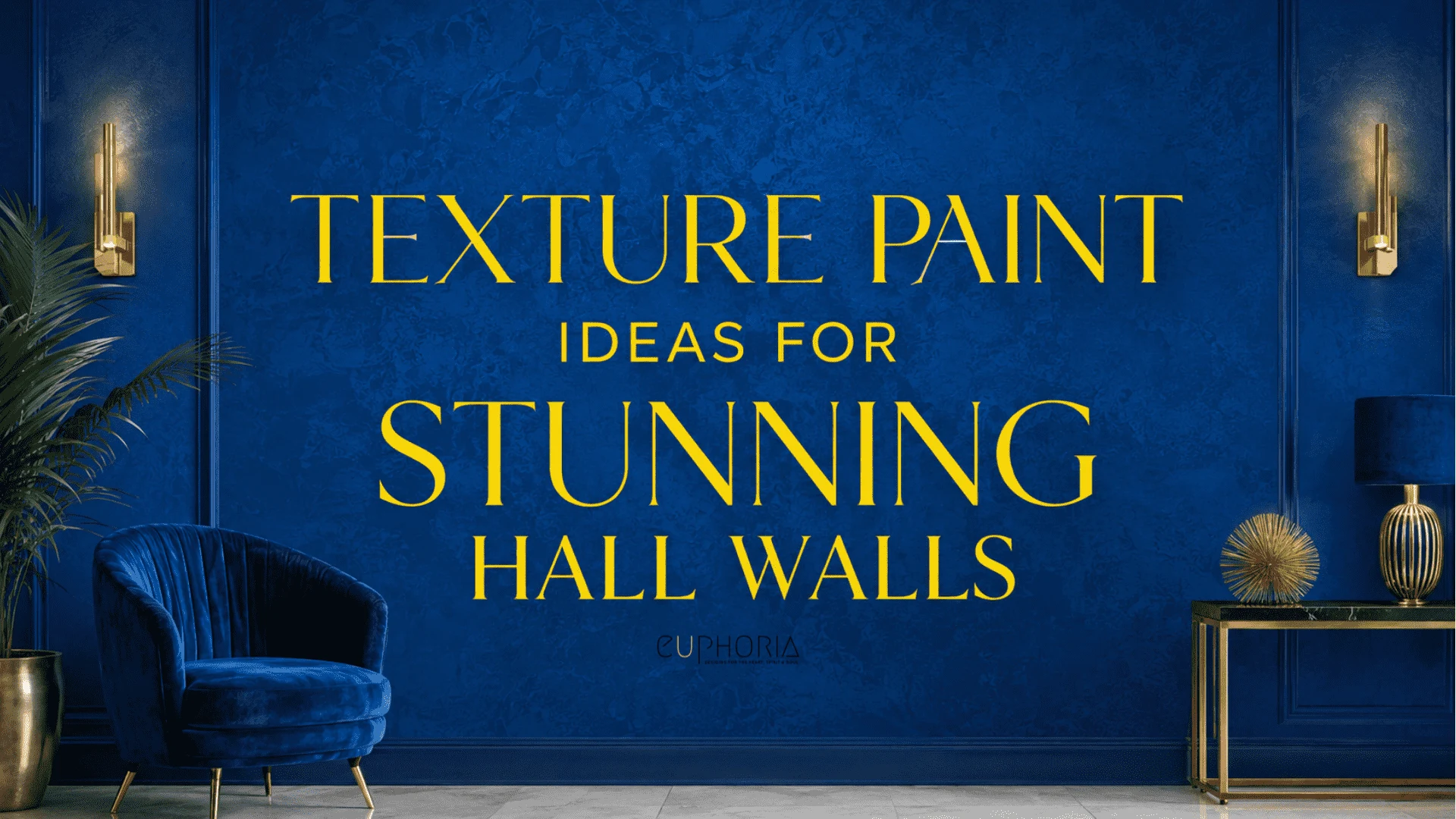
I keep coming across the same complaint from homeowners that their hall walls just sit there, flat and forgettable, while every other room gets the attention.
Yet the hall is often the first space guests see when they walk in. A texture paint design can give those walls depth and make the entrance feel more considered.
The finish should look just as inviting in your hall as it does in the reference photo. Reviewing a sample panel with an interior designer in Dubai lets you see how the texture catches your hall’s light before committing to the whole wall. A subtle finish might be enough, or you may prefer something more noticeable.
This month, I spent time going through project portfolios and following up with designers. I wanted to know which texture paint designs hold up in a real home. While researching, I also found a 2025 Nagoya University study. Lead researcher Shusaku Iseki tested 1,193 people and found that texture affects how luxurious a surface looks.
These 16 royal texture paint ideas draw on those conversations and real projects, with options ranging from velvet-soft finishes to liquid gold. Keep reading to find a finish that suits your hall and learn what its application involves, so you know what to expect before work begins.
Royal Texture Paint Designs For Hall Walls
These 16 go from the easiest to commit to, to the boldest on the list. Pick based on how loud you want your hall to feel.
1. Try The Velvet Touch Texture Paint Design For An Instant Five-Star Feel

Image Source: cdn.shopify
Nothing makes a hall feel like a boutique hotel lobby faster than a velvet-effect finish. It is soft and slightly plush, and it catches light unevenly, which is exactly what gives it that expensive look.
More than one designer has told me the same thing. Clients cannot stop touching the wall once it is done, because the surface genuinely feels different under your hand. Pair it with a deep jewel tone like emerald or sapphire and the hallway shifts into something more formal.
Start with one feature wall near the entrance, since that is what greets guests first. Keep the walls around it plain, and the texture stays the focus.
2. Go Bold With An Imperial Drama Marble Wall Paint Design
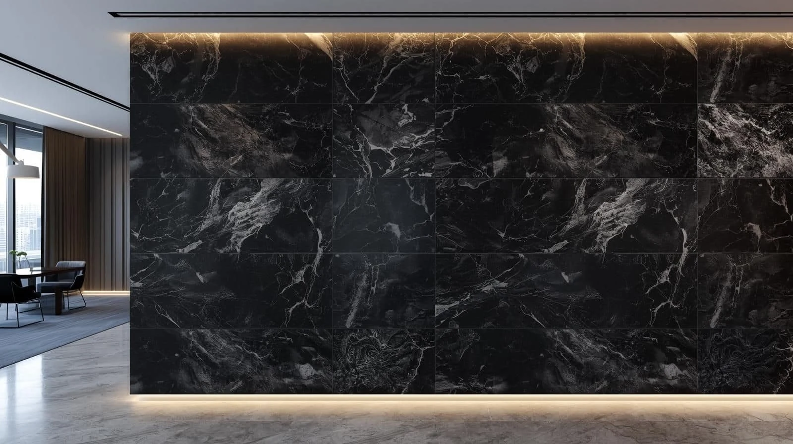
Image Source: Simpolo
A dark marble finish is not subtle. Honestly, that is the point. Walk into a hall with plain white walls and it feels like nobody ever decided on anything. Designers at Euphoria Interiors run into this exact problem on a lot of first consultations.
One project I reviewed used a navy marble finish with faint gold veining through it. It read like something out of a private members club. That instinct tracks with the numbers too. Zillow’s home trends expert Amanda Pendleton has linked navy tones to real added value. Buyers offer close to 1,800 dollars more for homes with navy accents. The Beige & Breeze Home project leaned on the same logic, anchoring a lighter palette with darker, moodier tones.
If you want a hall that reads powerful and high end, put this one at the top of your list.
3. Add Gilded Opulence With A Gold Leaf Texture Paint Design

Image Source: delongcarpet
Gold leaf on a wall sounds excessive. But see it under soft lighting and that thought disappears fast. It is one of those royal texture paint choices that signals old money, even in a brand new home.
A designer walked me through an entryway with a deep royal blue base and gold leaf accents on top. Guests assumed the homeowners had inherited the house. They had not. It came down to picking the right finish.
Keep the gold to accents or a single wall. Spread it across the whole hall, and the effect stops feeling deliberate.
4. Choose Regal Rust For An Industrial-Chic Texture Paint Design

Image Source: edwardgeorgelondon
You would not expect rust to look expensive, but an oxidised metal finish pulls it off. It works especially well if your hall already leans toward contemporary art and clean furniture lines.
I have seen deep brownish copper tones with a faint metallic sheen used in a penthouse hallway. The effect was moody, without trying too hard. It fits naturally with the kind of luxury apartment wall textures that bring an industrial edge into a polished space.
Ask your applicator for a sample patch first. Oxidised finishes vary a lot once the metallic particles hit your actual lighting.
5. Bring In Classic Elegance With A Damask Plaster Finish

Image Source: dhresource
Chandeliers, grand staircases gives that slow, old-European kind of hall. A damask-patterned plaster finish gets you close, even if your hall is nowhere near that scale.
I looked into one boutique hotel project that used a soft grey damask texture. It felt closer to a period drama set than an actual hallway. Done in cream, grey, or soft gold, this finish tends to age well instead of looking dated.
If your hall connects to a formal living or dining area, carry the same damask texture through both. The transition will feel intentional, not abrupt.
6. Soften Things Up With The Luxe Cloud Texture Paint Design

Image Source: static.asianpaints
Not many homeowners try this one, which is exactly why it stands out. A smoky, ombre-style texture shifts from neutral beige into charcoal and gives a hall an almost dreamlike quality.
Designers describe it as soft, expensive, and quietly sophisticated. This is a popular pick for main hall texture paint designs. It works well in living room spaces that connect straight to the entry.
Test the gradient direction on a small board first. A cloud effect running top to bottom looks completely different from one running wall to wall.
7. Add A Glow With The Pearl Illusion Wall Finish

Image Source: cms.interiorcompany
Soft light does more for a hallway than a hard shine ever could. A satin pearl finish delivers exactly that, a gentle glow that keeps it from looking cheap. I reviewed one powder room project where the light bounced off the wall in an almost silk-like way.
It works particularly well in off-white or champagne tones, where the shimmer reads as refined. Guests notice it almost immediately, even if they cannot explain why the wall looks different.
Use this finish wherever natural or warm artificial light hits the wall directly. The pearl effect needs light to actually show up.
8. Go Timeless With A Stone Cold Royalty Limestone Finish

Image Source: sylviatdesigns
Limestone and Venetian plaster borrow straight from Italian villas, and they earn that comparison. The matte, layered texture looks expensive because it follows the same build method used on old Roman walls.
I followed up on this one out of pure curiosity. Research from the Polytechnic University of Milano traces the most durable lime plaster mixes back to the Roman architect Vitruvius. Conservators still rate a well applied lime finish at several years of life before it needs redoing. In a climate-controlled home, it often lasts much longer. That durability is exactly why designers reach for this finish in hallways specifically.
Ask your plasterer for a matte version if you want the wine cellar feel, not a polished showroom look.
9. Layer In Stormy Drama Concrete Texture

Image Source: cdn.prod.website-files
A textured concrete finish in stormy grey brings a high-end loft feeling into a hallway. It needs no exposed brick or industrial windows. The mood stays intact without going cold.
I have seen this used in a New York loft-style renovation. It paired well with almost any furniture nearby, from mid-century pieces to modern minimal seating.
Your hall gets a lot of natural light? This finish will look softer than you expect. View a sample panel at a few different times of day first.
10. Wrap Your Hall In The Grand Silk Texture Paint Design

Image Source: i.pinimg.com
Silk-effect textured walls are about as close as paint gets to feeling like actual fabric. The finish is sleek, and it holds up well in hallways, bedrooms, and even bathrooms.
A designer once described a penthouse where the silk-effect walls seemed to glow under recessed lighting. That client redid three more rooms with the same finish within a year. Repeat requests like that say a lot about how a finish performs once the novelty wears off.
Pair it with simple, unfussy trim and door hardware. The wall texture should stay the star of the hallway.
11. Make A Statement With Baroque Majesty 3D Panels

Image Source: adecorativeaffair.wordpress
Raised 3D panel texture paint designs read as architecture, not decoration. That is exactly why they carry so much weight in a hall. The patterns catch shadow in a way flat paint never could.
I came across one Paris hotel corridor with this raised pattern. It genuinely felt like walking through a private residence. This texture pairs naturally with mid-century modern furniture in vintage or period-styled homes. It softens the formality just enough.
Keep the pattern to one accent wall in smaller halls. Raised texture on every wall quickly turns busy instead of grand.
12. Warm Things Up With The Desert Luxe Sand Finish

Image Source: i.pinimg
A textured sand finish gives you a minimal, warm kind of luxury with no shine and no metallics. It carries the same calm feeling as a high-end spa. The room does not need much else to support it.
Designers describe it as smooth with just enough grain to feel intentional, evoking the quiet warmth of a Moroccan retreat. It is also low maintenance, which matters if your hall sees a lot of foot traffic. If you are planning a nursery nearby, these nursery design ideas pair naturally with the same earthy tones.
Go warmer with the sand tone if your hall relies on artificial light. Cooler shades can look washed out under standard bulbs.
13. Layer Two Tones With A Mystical Hues Texture Paint Design

Image Source: nobroker
Layer one shade over another and a wall gains real depth, not the flat look of a single colour. Done well, a two-tone textured finish can change how a whole hallway feels.
I looked at one project that paired deep charcoal grey with a muted olive green underneath. The layering gave the wall genuine dimension depending on where the light hit it. An experienced interior design consultant can help balance the two tones so the effect looks intentional, not patchy.
Test both shades together on a sample board first, under your actual hallway lighting. Undertones shift more than people expect once applied at full scale.
14. Catch The Light With A Royal Geometric Wall Paint Design

Image Source: i.pinimg
Hexagons, diamonds, abstract waves, it does not matter which pattern you pick. Metallic geometric embossed patterns give a hall a genuinely designer feel. Flat paint simply cannot compete with how they catch light.
Rose gold against a dark navy base is a combination designers keep returning to. It also lines up with the same buyer preference data on navy tones mentioned earlier.
Choose a matte metallic instead of a high-shine one if your hallway already has a lot of overhead lighting. Otherwise the pattern turns distracting fast.
15. Go Dramatic With Midnight Opulence Walls

Image Source: shutterstock
Deep blue, black, or gold walls with subtle metallic accents turn a hallway into something closer to an exclusive lounge. It is a dramatic look, and it depends heavily on getting the lighting right.
I looked at one cocktail bar project with this exact combination, deep inky walls with faint silver highlights. The space felt far more expensive than its actual footprint. A single overhead fixture will not do it justice. You need warm, layered lighting instead.
Add at least two light sources at different heights, so the metallic flecks catch light from more than one angle.
16. Bonus, Try The Liquid Gold Texture Paint Effect

Image Source: images.hellomagazine
This one is the most maximalist entry on the list, and I think it earns its spot. A liquid gold texture paint finish gives you a metallic, glossy surface. It reads as pure luxury, closer to a palace wall than a standard hallway.
Pair it with deep emerald green or black, and the finish photographs beautifully and reads as expensive in person too. Getting this right takes more than a paintbrush and confidence. An experienced interior designer in Dubai can turn the idea into a finished wall instead of a patchy DIY attempt.
Reserve this finish for one statement wall, ideally one you can see from the entrance. Keep the drama contained, and it will not overwhelm the whole hall.
Which Royal Texture Paint Design Is Right For Your Hall
That is the full list of royal texture paint ideas I would recommend for a hall that feels flat. The goal is not to copy every idea at once. Pick the one that matches how the rest of your home already feels, and commit to it properly.
If your hall connects to your dining or prep areas, keep the wall finish consistent through those spaces. It helps the whole layout feel connected, not pieced together. Our kitchen layout guide covers how that flow works in more detail. Want a spiritual and cultural layer on top of any of these finishes? Our Islamic wall decor ideas guide pairs well with several of the designs above.
You might be planning a compact hall paint design. Or maybe a full main hall texture paint design for a living room. Either way, hire someone who applies these finishes regularly. Do not attempt a complex texture as your first DIY project. The gap between a showroom sample and a properly finished wall usually comes down to application, not the paint itself. If you want a second opinion before committing, our residential interior design service is a good place to start.