Living room
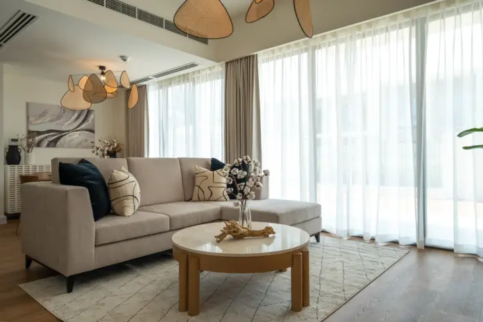
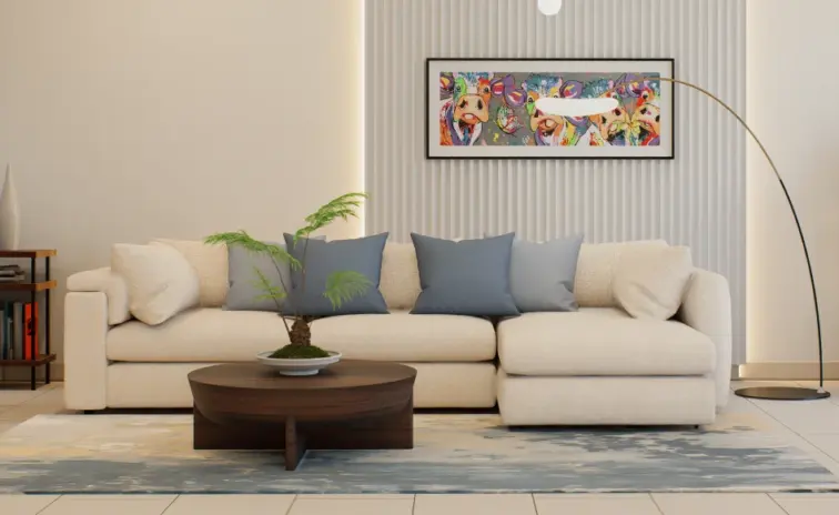
Where the day finally slows downA cream L shaped sofa on a soft palette rug, a wooden circle coffee table, and a globe cluster pendant. A slatted wood accent wall softens the seating.
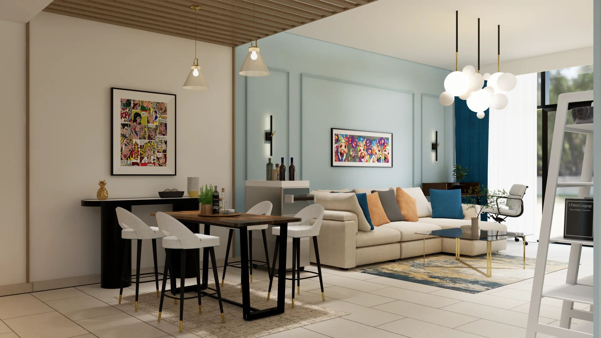
Beige & Breeze Home is a 775 sqft 1BHK Modern Minimalist apartment design at Sobha Hartland Greens, Dubai. The plan is a redesign rather than a fresh start, and the brief carried a set of pieces that had to remain and a set of problems that had to be solved around them.
The whole reason people take the redesign route instead of moving out, and try to make an old apartment feel like home again, is the promise that the same footprint can hold a completely different atmosphere.
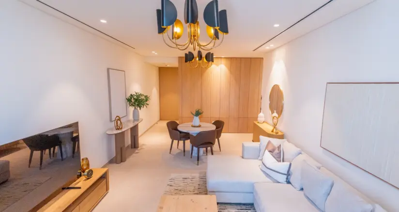
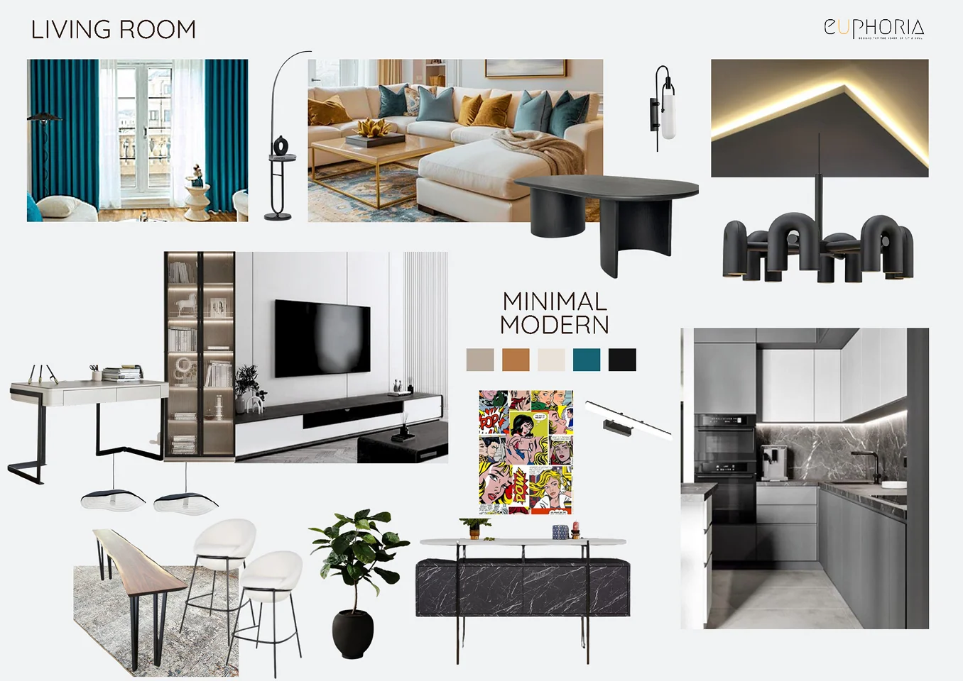
The palette runs cream, greige, light wood and warm neutrals, layered against a fluted feature wall behind the sofa, cove lighting on the ceiling and integrated joinery that runs floor to ceiling on one side of the plan.
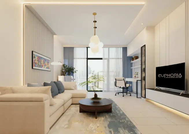
The living zone sits around a cream L shaped sofa on a soft palette rug with a wooden circle coffee table and a globe cluster pendant overhead. A single custom unit now combines the television, open shelving and a compact desk into one continuous plane, which is how the apartment gained a workspace without surrendering any floor area.
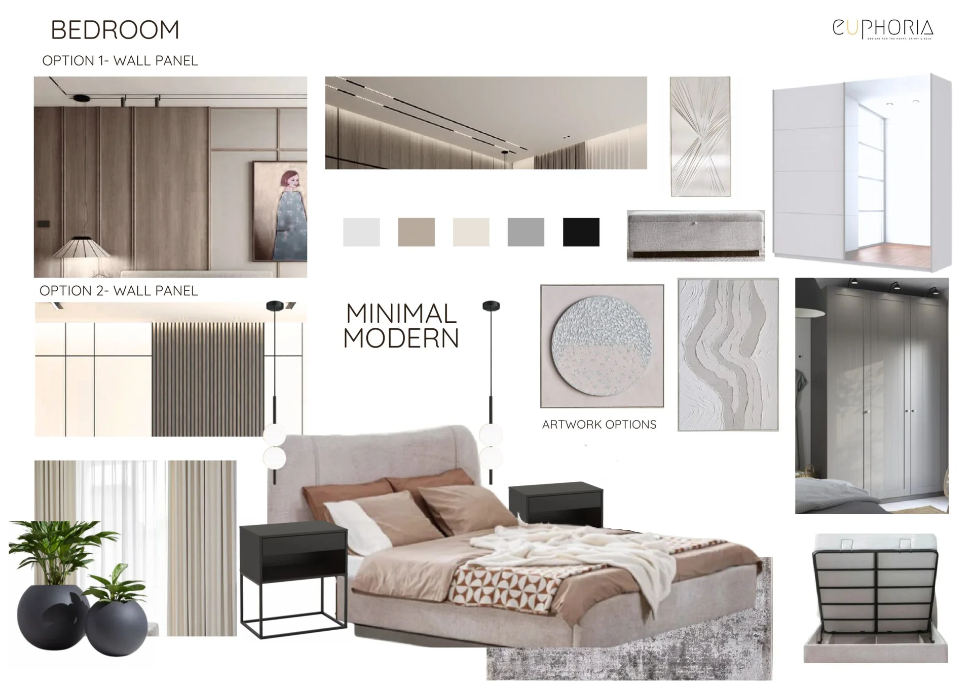
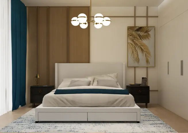
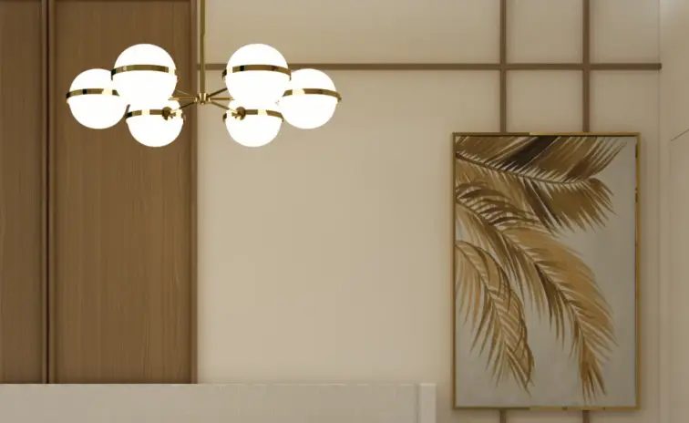
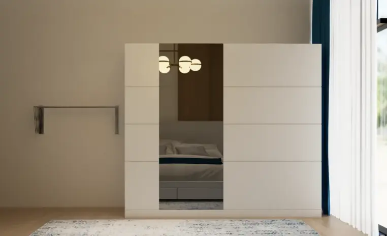
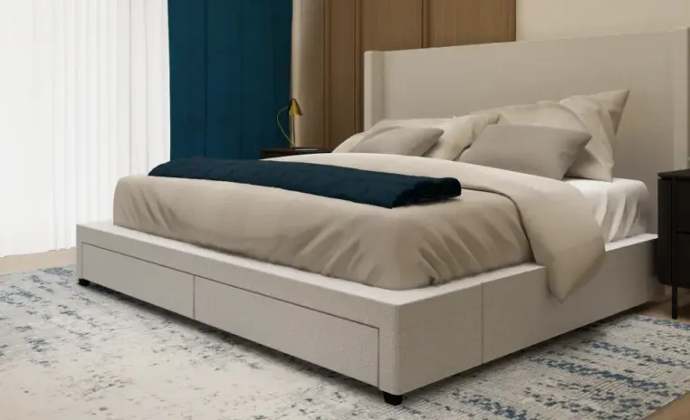
The bedroom lifts into a wood slat feature wall behind an upholstered bed, with a globe cluster chandelier overhead and a monochromatic palette that reads calm rather than busy.

Why they choose Euphoria Interiors for 1BHK design?
A cream L shaped sofa on a soft palette rug, a wooden circle coffee table, and a globe cluster pendant. A slatted wood accent wall softens the seating.
A cream upholstered bed against a wood slat feature wall, teal curtain accent, gold palm leaf wall art, and a warm globe cluster chandelier overhead.
3D Walkthrough
Studio profile
The brief was for a refresh rather than a rebuild, and the difference between the two shaped every decision that followed.
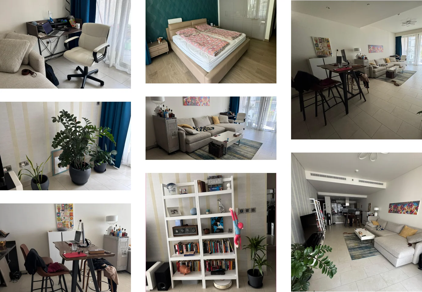
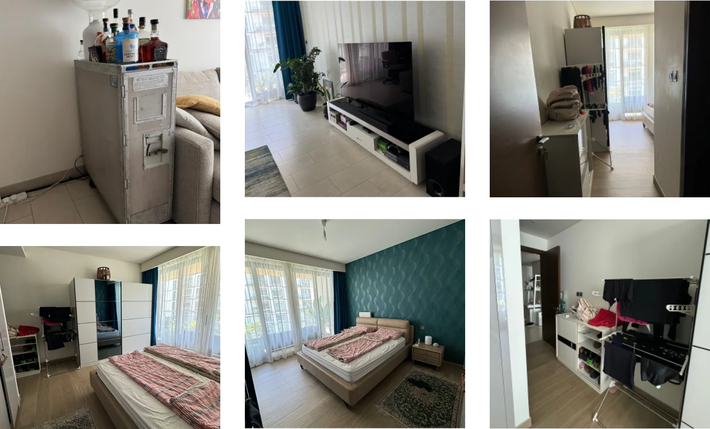
A set of existing pieces had to remain inside the new scheme. The sofa, the rug, the bookshelf, the built in wardrobe, the mattress and a repurposed bar unit were all nominated as fixtures that the design had to work around rather than replace.
The palette had to hold together with those pieces already in the room. Cream, greige and light wood were chosen deliberately because they agree with the retained furniture, so the finished scheme reads unified rather than as old items surrounded by new ones.
Beyond the retained pieces, three requirements shaped the layout. The living area needed clear zoning between relaxing, dining and working, storage had to increase without surrendering floor area, and the bedroom needed a calmer palette than the high contrast walls it started with.
Lighting had to layer indirectly rather than rely on a single ceiling fitting, and the whole plan had to read cohesive and modern rather than assembled.
Read as considered one bedroom apartment interior design, the real request was cohesion inside a fixed set of retained fixtures and finishes.
Three constraints defined the design.
The first was that the scheme had to work around a fixed set of retained pieces. The sofa, the rug, the bookshelf, the wardrobe, the mattress and a repurposed bar unit were all staying. Each of them arrived with a different colour, scale and period, and none of them were chosen originally to work together, since they were acquired at different times for different purposes.
That is a harder starting point than an empty shell, because every new element has to negotiate with something that is already there.
The second was that 775 sqft is generous for a one bedroom and small for a home that also has to accommodate a workspace. The living area had no clear boundary between relaxing, eating and working, so the room where the day was supposed to slow down was also the room where work sat in view.
That is exhausting in a way that is rarely attributed to the floor plan itself.
The third was that storage was insufficient at the start of the project, which is the usual reason a tidy home stops looking tidy, and the bedroom was working against itself with a high contrast palette in a room that is meant to invite rest.
Euphoria Interiors resolved zoning before touching anything decorative, because no amount of finish quality fixes a room that does not know what it is for.
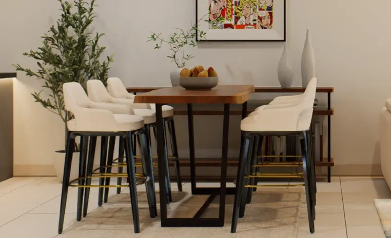
Layered lighting and separate area rugs now define the dining and living zones as distinct places, so moving between them registers as a change of activity rather than as a change of chair.
A slatted fluted feature wall behind the sofa gives the seating a back and a boundary, and a low wooden circle coffee table softens the traffic route through the room rather than blocking it.
Vertical space did the heavy lifting on storage. A custom floor to ceiling unit combines the desk, open shelving and the television console into one continuous plane, which is how the apartment gained display and storage capacity without surrendering any floor area, and it is also what finally gave work a defined place to live.
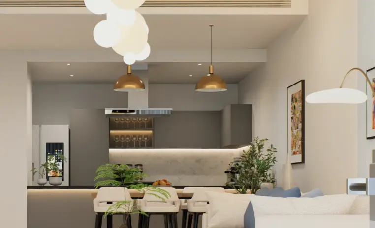
Lighting was rethought in layers. Integrated strips in the cove, sculptural globe pendants overhead and side lamps replaced the single ceiling fitting, so the same room can be bright at midday and low and warm at night.
In the bedroom a monochromatic scheme of light wood, cream and greige replaced the high contrast walls, and the palette was matched deliberately to the existing wardrobe so the joinery sits inside the room rather than standing apart from it.
An asymmetric wood slat headboard wall behind the bed and a backlit art piece above give the room its texture and its focal point, without ever raising the visual temperature of the palette.










Creative Head

3D Lead

Project Coordinator

Quantity Estimator

Client Happiness Associate
Get your space designed,
without the stress.

Because true luxury isn’t just what you see —, it’s what you feel every day.
You make the retained pieces the reference point instead of the obstacle.In this apartment the sofa, rug, bookshelf and bar unit all stayed, so the palette was derived from them rather than imposed on them. The cream and greige base was selected because it agrees with the existing sofa, and new joinery was finished to sit alongside the built in wardrobe rather than compete with it.The pieces that left were the ones that were no longer working, the old chairs, the storage units and the previous television console, and the design attention went into what replaced them.Retained furniture is often treated as a compromise on a design. Handled properly it becomes the reason a finished home reads distinct rather than assembled from a catalogue, and it is the layer that carries a personality no fresh scheme can replicate on its own.
By giving work a wall rather than a corner.A desk pushed into a leftover space stays visible from every seat in the room, which is why the laptop never really stops being present, and why the living room never fully switches from work back into a living room in the evening.Here the desk was built into a single floor to ceiling unit alongside the television and open shelving, so the workspace reads as part of the architecture instead of as furniture that wandered in. It occupies vertical space, which the apartment had spare, rather than floor area, which it did not.The unit also gave the apartment the storage it was short of, so the workspace and the storage upgrade were solved in the same piece of joinery.When work has a defined place and a way to be closed off visually, the living room goes back to being a living room in the evening, which is the outcome a compact home has to plan for rather than assume.
Three things, and none of them are walls.Rugs come first, because a rug draws a boundary on the floor that the eye accepts immediately, and separate rugs for the dining and living zones tell you these are two places rather than one continuous room.Lighting comes second. A pendant hung over the dining table and cove lighting washing the living feature wall create two pools of light, and people read pools of light as separate rooms even in an open plan.Vertical treatment comes third, which is the job the fluted feature wall does behind the sofa. It gives the seating group a back so it stops floating in the middle of the plan, and it defines the living zone architecturally rather than just by furniture placement.Applied together in 775 sqft, the three moves produce genuine separation without losing the openness or the daylight that made the apartment attractive in the first place.
Because contrast is stimulating, and stimulation is the wrong ambition for a bedroom.Strongly opposed wall tones keep the eye moving around a room, which is useful in a living space and counterproductive somewhere you are trying to wind down. A high contrast palette in the bedroom quietly works against the function of the room.The replacement scheme here works within one narrow band of light wood, cream and greige, so the room reads as a single calm surface rather than as competing panels.Interest was then reintroduced through texture rather than tone, with warm wood slats behind the bed in an asymmetric arrangement and a backlit geometric piece above.Keeping to a narrow band had a practical benefit as well. The existing built in wardrobe now sits comfortably inside the palette instead of reading like the piece that was left behind, which is often the visible cost of a partial redesign in a bedroom.
It suits any home where the plan is fundamentally sound and the problem is organisation rather than architecture, which describes a great many apartments in Dubai.The sequence matters more than the finishes.Establish zones first using rugs, layered lighting and one vertical feature. Then take storage upward into a single integrated unit rather than adding separate pieces around the room, since separate pieces consume floor and rarely match.Then set the palette from whatever furniture is staying, not from a reference image. Then treat the bedroom as a deliberately quieter version of the same palette so the two rooms speak the same language.The specific joinery in Beige & Breeze Home was made for this floor plan, and the equivalent for another compact apartment would look different in dimension while following the same sequence, which is what makes the approach portable rather than locked to this one home.
 Villa interior design service
 Penthouse interior design service
 Townhouse interior design service
 Duplex interior design service
 Studio interior design service
 One bedroom villa interior design service
 Two bedroom villa interior design service
 Three bedroom villa interior design service
 Four bedroom villa interior design service
Areas we serve across Dubai