

Kitchen wallpaper has a reputation for going wrong, and honestly, that reputation is earned. Most people who regret it either chose the wrong material for the wrong wall, picked a pattern that fought everything else in the room, or trusted a showroom sample under perfect lighting instead of testing it in their actual kitchen. The ones who love it? They treated wallpaper the way they treated their countertop choice: with just as much thought about function as about appearance.
As designer Kelly Wearstler, one of the most followed names in interior design today, put it on her podcast with AD, “Pattern is a point of view. It tells you immediately who lives there.” Kitchen wallpaper, done right, is one of the few choices that can do exactly that without a full renovation.
This article covers every practical and visual decision involved: which materials actually hold up, which styles work by cabinet colour, where to place wallpaper safely, and what separates a kitchen that looks considered from one that looks cluttered. Keep reading before you commit to anything.
Can You Use Wallpaper in a Kitchen?
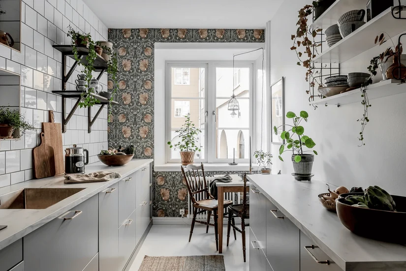
Yes, kitchen wallpaper works, but not every wall in the kitchen is equal. A wall behind a breakfast nook and a wall directly beside the hob are completely different environments, and the material choice for each should reflect that.
The best options for kitchen walls are washable kitchen wallpaper, vinyl wallpaper for kitchen walls, PVC wallpaper for kitchen surfaces, and waterproof or moisture-resistant finishes. These are designed with wipe-clean surfaces that handle splashes, cooking fumes, and the steady humidity that builds up in most kitchens over time.
The stove zone and sink zone are the two areas where most wallpaper fails. These walls need either glass panelling over the wallpaper, a different material entirely, or, at a minimum, a fully waterproof surface behind any protection layer. The safest placements are walls with good ventilation and low splash exposure: behind open shelves, a breakfast nook, a pantry wall, or a coffee station.
If you want kitchen wallpaper waterproof enough for splash-prone walls, look for washable vinyl, PVC, or water-resistant finishes, and check the product’s wipe-clean rating before buying. Wall preparation also matters: a smooth, sealed, primed surface holds any kitchen wallpaper better than bare plaster or flaking paint.
For the wider picture, start with our kitchen design ideas.
What Is the Best Kitchen Wallpaper for Your Space?
The best kitchen wallpaper is the one that fits the wall location, matches the cleaning routine, works with the available light, and holds up to daily heat and humidity without peeling two years later. The right material comes first. The pattern comes second.
| Wallpaper Type | Best For | Avoid When | Design Effect |
|---|---|---|---|
| Washable kitchen wallpaper | Family kitchens, breakfast corners, open shelf walls | Direct sink splashes without protection | Practical and easy to clean |
| Vinyl wallpaper for the kitchen | High-use kitchen walls, pantry walls, cabinet backs | Damp or badly prepared walls | Durable and wipeable |
| Waterproof wallpaper for the kitchen wall | Splash-prone zones with glass protection | Direct flame or strong heat | Safer for busy kitchens |
| PVC wallpaper for the kitchen | Rental updates and budget refreshes | Uneven-textured walls | Quick and clean-looking |
| Heat-resistant wallpaper for the kitchen | Warm zones near cooking areas with protection | Direct stove contact or gas flame exposure | Useful but needs caution |
| Self-adhesive waterproof wallpaper for the kitchen | Renters, island panels, cabinet interiors, temporary updates | Flaking paint or rough walls | Flexible and easy to replace |
One thing worth being clear about: even waterproof wallpaper is not the same as ceramic tile in extreme splash or heat zones. It is more resistant than standard paper, but not impervious. If the wall sits directly behind the hob with no glass panel or extractor hood close to the surface, use a proper splashback material there and move the wallpaper to a nearby low-risk wall instead.
For renters, rental-friendly peel-and-stick options offer reasonable adhesive strength on a smooth wall surface without causing damage when removed. Any high-use cooking area that generates constant steam deserves a material rated for it, not just one that looks good in a sample.
Kitchen Wallpaper Ideas by Style
The material keeps the wallpaper alive, but the style is what makes the kitchen feel like it belongs to someone. Each idea below is meant to work in a real kitchen, not just a styled photoshoot.
1. Use modern kitchen wallpaper to sharpen plain cabinets
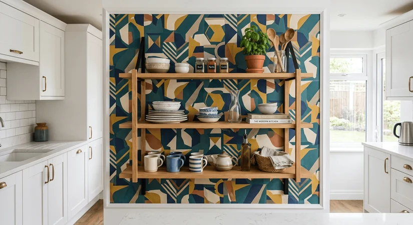
Plain white, beige, grey, or handleless cabinets are everywhere right now, and the problem is that the kitchen can feel like a rental even when it is not. Modern kitchen wallpaper with geometric lines, abstract forms, matte patterns, or soft contrast gives a flat kitchen identity without touching the cabinetry. A matte charcoal geometric on a warm white wall reads as considered; a very busy black-and-white grid in the same space can feel aggressive.
Look for kitchen wallpaper designs with clean lines, moderate scale, and a matte finish. When the wallpaper becomes the focal wall, everything else in the room should support the visual balance rather than compete with it.
Pattern scale tip: If the kitchen is under 10 square metres, keep the repeat small. Oversized geometric prints in compact modern kitchens tend to feel like the walls are closing in.
2. Add luxury kitchen wallpaper where the kitchen already feels refined
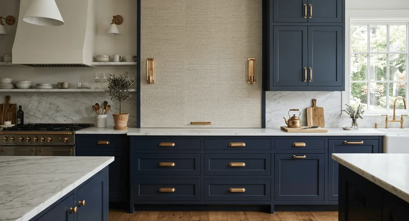
Luxury kitchen wallpaper works by supporting what is already there. If the kitchen has marble counters, brass hardware, walnut cabinetry, or smoked glass doors, the wallpaper should feel like the final layer of a considered scheme. Muted sheen, premium texture, tone-on-tone patterns, and restrained botanical prints all sit well here.
Layered texture in a single warm undertone reads far more refined than a bold print with cool undertones fighting against the brass and stone. Where the brass hardware and stone counter already have warm undertones running through them, a tone-on-tone wallpaper in the same direction keeps the room cohesive rather than competitive.
A printed velvet-effect wallpaper or a subtly raised texture in deep sage reads as expensive. An oversized tropical print beside marble worktops and brass handles reads as two moods fighting for the room.
The restraint rule: The more refined the existing finishes, the quieter the wallpaper should be. Texture over pattern, tone over colour.
3. Soften white cabinets with floral wallpaper for kitchen walls
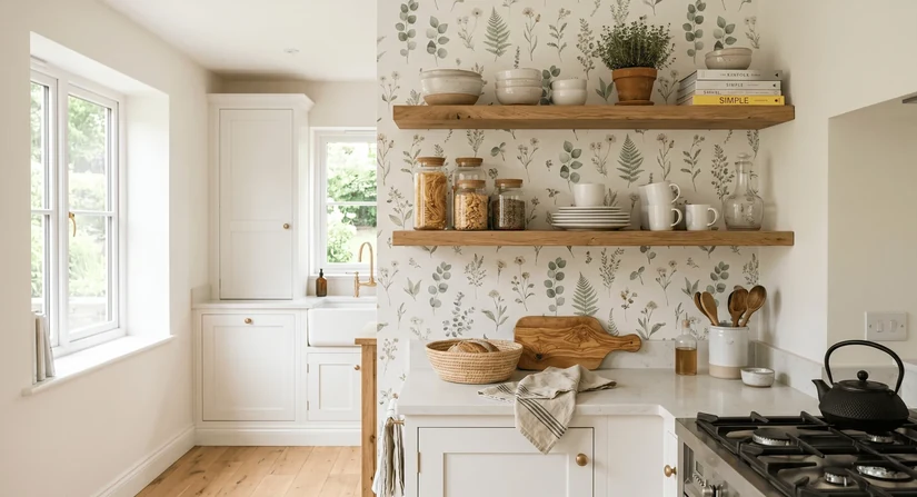
White cabinets are the most forgiving base for floral wallpaper for kitchen walls because they let the print carry the colour with no clash risk. A white kitchen with no wallpaper can feel clinical.
Add a small-scale botanical print behind open shelving or in the breakfast nook, and the room shifts from functional to genuinely warm. Small florals suit a cottage-style kitchen on a full wall. Large botanical prints work better as a single feature wall because the pattern scale matters as much as the pattern itself.
This style also plays well with wooden cabinets and black hardware, where the contrast between the organic print and darker fixtures adds depth without clashing with a plain tile backsplash.
Lighting note: Very saturated florals can shift colour noticeably between morning and evening light, so test a physical sample across different times of day before committing.
4. Use country kitchen wallpaper for a warm family kitchen
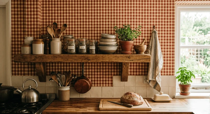
Country kitchen wallpaper is about warmth, not theme-park farmhouse. Gingham, herb prints, toile, muted stripes, and soft vintage colours all fall here. The point is to make the kitchen feel like someone actually lives and cooks in it. A muted sage gingham or a cream-and-terracotta herb print beside a wooden shelf looks warm and practical rather than costume-dressed.
Interior stylist Abigail Ahern, known for her maximalist approach featured regularly in House & Garden, has noted that pattern in a kitchen “grounds the room and makes it feel genuinely inhabited.” Country wallpaper is exactly that.
5. Try vintage kitchen wallpaper when the room needs character
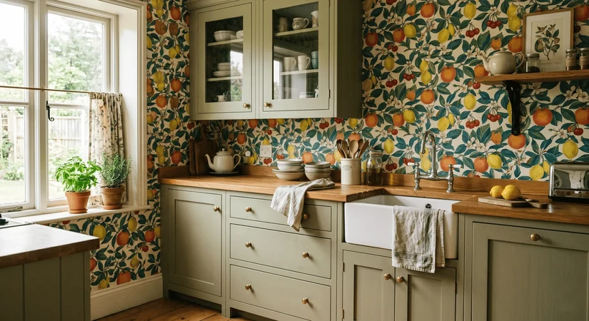
Retro fruit prints, heritage florals, checkerboard pairings, and 70s-inspired botanicals all work in kitchens that feel too plain or too safe. Vintage kitchen wallpaper adds genuine character rather than just decoration. The balance is that it should be paired with cleaner, simpler cabinetry. If the cabinets are already ornate or the room has a lot of period detail, adding a heritage print can tip the space into busy territory.
Muted retro tones age better than saturated ones, and aged brass hardware ties the look together without pushing it into costume territory.
6. Choose textured wallpaper for kitchen walls if you dislike busy prints
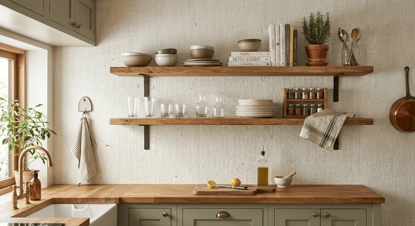
Not everyone wants a pattern on the kitchen wall. Some want depth without visual noise, and textured wallpaper is precisely that. Linen-look wallpaper, plaster-effect wallpaper, grasscloth-look vinyl, and subtle raised textures all add tactile richness without demanding attention. This is a long-horizon choice.
The wall looks better when the light changes, adds warmth without any colour commitment, and works behind open shelves without competing with displayed objects.
Why it works long-term: Texture reads differently at 8 am and 8 pm, under task lighting and natural light. The wall stays interesting without any single moment feeling loud.
7. Use metallic kitchen wallpaper in small controlled areas
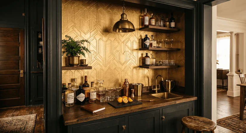
Metallic kitchen wallpaper is effective in the right spot and overwhelming everywhere else. A bar wall, pantry wall, dining corner, or small nook beside the kitchen are the right spots. A whole kitchen in metallic wallpaper, particularly in a bright space with natural light from multiple sides, creates glare rather than glow. The reflective finish pairs well with brass hardware and warm pendant lighting.
In an open-plan space, using metallic wallpaper on one small surface, such as the back wall of a drinks cabinet or inside glass-front doors, creates a warm accent that reads as intentional.
8. Make an open-plan kitchen feel artistic with abstract wallpaper
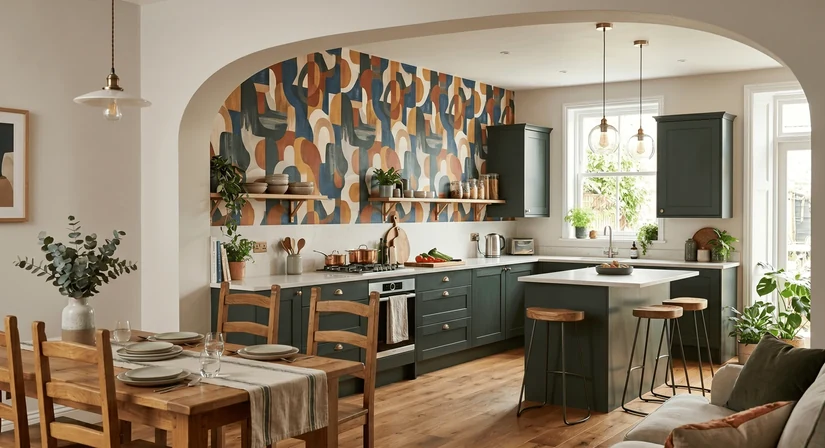
Abstract kitchen wallpaper works particularly well in open-plan spaces where the kitchen wall is visible from the living or dining area. A bold abstract print on one wall functions like a piece of art there: it creates a focal point appreciated from a distance.
Soft abstract shapes, organic movement, and painterly patterns tend to age better than very graphic or geometric abstract designs. The wallpaper should connect visually with both zones, so the sofa colours, floor tones, and dining furniture should inform the print scale and palette before buying.
Cohesion test: Stand at the furthest point in the connected living area and look at the kitchen wall. The abstract print should feel like it belongs in the wider room, not just the kitchen.
Kitchen Wallpaper Ideas by Colour
Colour is often where people get stuck, and the most common mistake is choosing wallpaper colour in isolation from the cabinets, counters, hardware, and flooring. These things work as a system, not as separate choices.
| Colour | Best Match | Mood | Avoid When |
|---|---|---|---|
| Beige kitchen wallpaper | Oak, cream, travertine, warm white cabinets | Soft, warm, timeless | The kitchen already feels too yellow or honey-toned |
| Green kitchen wallpaper | White, walnut, brass, stone, cream cabinets | Calm, organic, fresh | Cabinets are already very saturated in colour |
| Blue kitchen wallpaper | White, grey, navy, chrome, marble counters | Crisp, coastal, refined | Flooring has strong orange undertones |
| Grey kitchen wallpaper | White, black, steel, pale wood | Modern and quiet | The kitchen already feels cold or flat |
| Black kitchen wallpaper | Large kitchens, bar corners, and dramatic feature walls | Bold and polished | The kitchen is small with weak lighting |
| White kitchen wallpaper | Small kitchens, rental kitchens, busy cabinets | Light and flexible | The wall gets daily food splashes without protection |
| Gold kitchen wallpaper | Dining corners, bar walls, luxury kitchens | Warm and decorative | Used across every wall in the same space |
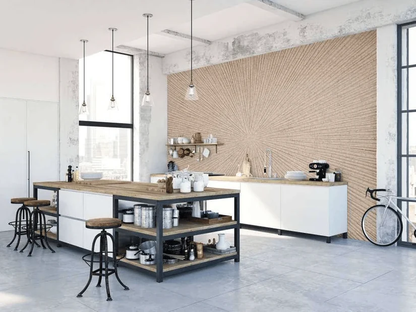
Beige kitchen wallpaper is one of the most versatile choices because it works with both warm and neutral tones without adding any competing colour. It disappears in the best way, letting the hardware, shelving, and cabinet details carry the room. The softness of beige also means it reads well in both artificial light and full daylight, which makes it a consistent choice across different kitchen orientations.
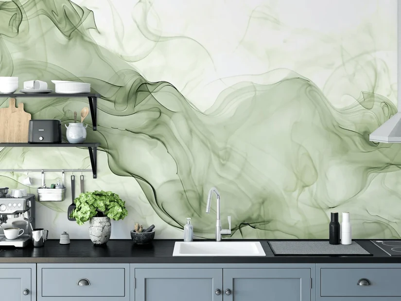
Green kitchen wallpaper has become one of the most popular directions in residential kitchen design in recent years. Against white cabinetry with brass handles or black handles, a sage or olive green wallpaper feels grounded and organic. The range within green is wide, from very cool eucalyptus tones to warmer sage and forest greens, so matching a shade to either the hardware finish or the stone counter undertone keeps everything cohesive.
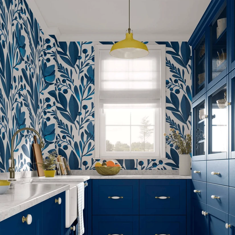
Blue kitchen wallpaper reads differently in different light. In a kitchen with north-facing exposure, a strong blue can feel cold. In a kitchen with warm artificial lighting or south-facing natural light, the same blue becomes crisp and refined. If there are strong orange tones in the flooring or wood grain, blue wallpaper tends to clash rather than complement.
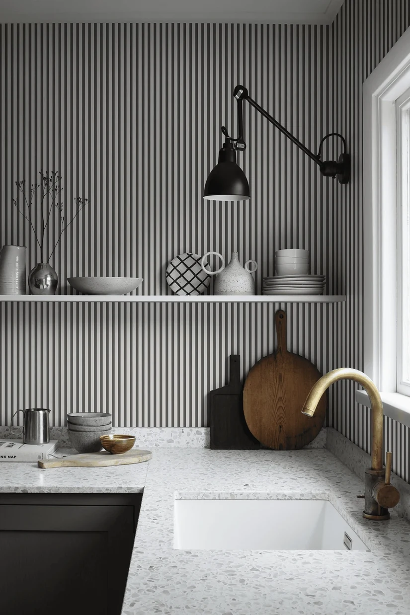
Grey kitchen wallpaper is a useful neutral, but it can flatten a space. If the kitchen already has grey cabinets, grey flooring, or chrome finishes, read our guide on how grey interiors can feel flat without warmth and texture before choosing grey kitchen wallpaper, because the right textural choice makes all the difference.
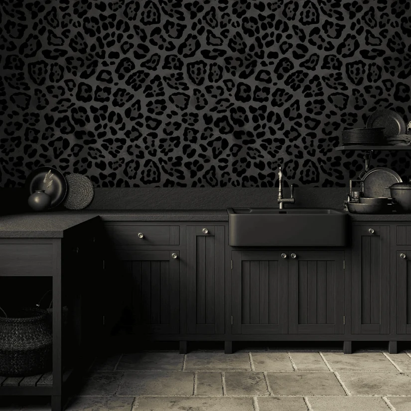
Black kitchen wallpaper works best in large, well-lit kitchens with strong contrast already built into the room. It should be limited to one wall or zone. In a compact kitchen with modest lighting, black wallpaper makes the room feel considerably smaller.
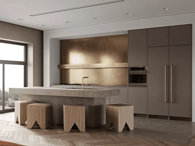
Gold kitchen wallpaper used in a dining corner or bar area as kitchen wallpaper decor creates warmth that reads as decorative. The same gold spread across every kitchen wall becomes a very different situation, one that dates quickly.
These modern kitchen design ideas show which palettes wallpaper has to sit alongside.
Wallpaper for Small Kitchen Spaces
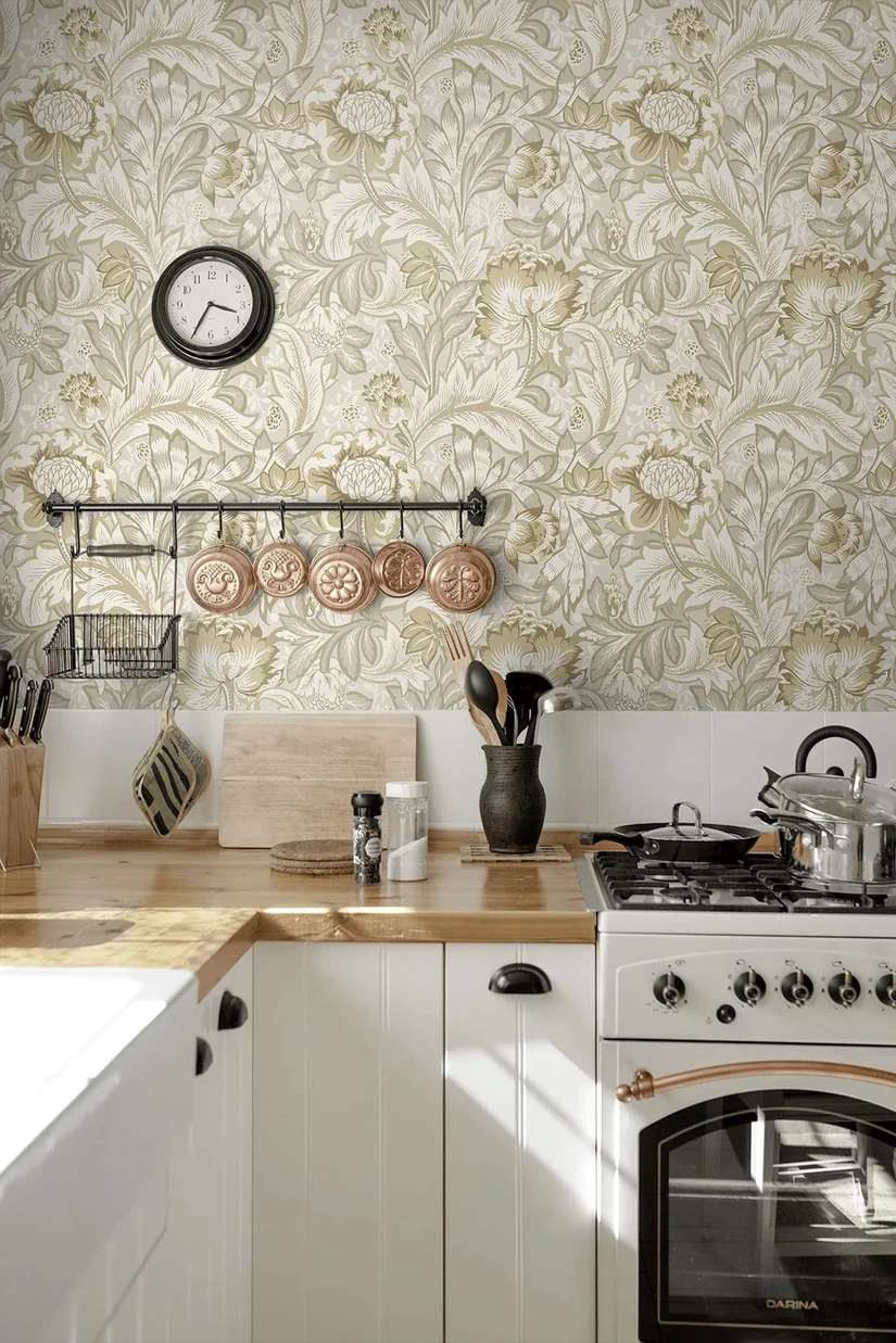
Small kitchens need wallpaper to do the opposite of what bold prints do in large rooms. The goal is to keep the wall visually open, draw the eye upward, and add warmth without making the room feel tighter.
| Good Choices for Small Kitchens | Why They Work |
|---|---|
| Light beige, white, soft blue, or muted green wallpaper | Keeps the wall visually open |
| Fine patterns | Adds detail without crowding the kitchen |
| Vertical stripes | Makes the wall feel taller |
| Wallpaper above open shelves | Adds style without covering every surface |
| One feature wall | Creates personality without visual overload |
| Subtle modern patterns | Keeps the kitchen current and clean |
What to avoid in small kitchens and why it can go wrong
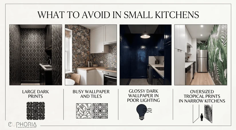
For small kitchen modern kitchen wallpaper designs, the consistent advice is the same: fine patterns, pale colours, or vertical movement work better than oversized dark prints. A galley kitchen or compact apartment kitchen benefits most from wallpaper on one wall only, ideally the end wall that acts as a visual anchor when you look down the space.
Fine print keeps the visual space open rather than crowding it, and light reflection from pale wallpaper in soft tones helps a room that lacks natural light feel less enclosed. Vertical stripes draw the eye up toward the ceiling height, making the room feel taller even when the actual dimensions have not changed.
| Avoid in Small Kitchens | Why It Can Feel Wrong |
|---|---|
| Large dark prints on every wall | Can make the room feel tighter |
| Busy wallpaper beside busy tiles | Creates too many focal points |
| Glossy dark wallpaper in poor lighting | Adds glare and visual heaviness |
| Oversized tropical prints in narrow kitchens | Can overpower the wall |
Wallpaper behind open shelving is particularly effective in small kitchens because the shelves frame the print and stop it from becoming the whole room, and the shelves themselves help with clutter control by giving everyday objects a defined place. The same print on a completely bare wall in the same kitchen would feel more overwhelming.
If the kitchen is compact, our small-space decor guide covers the same light-colour and visual-space principles that apply equally well to wallpaper for small kitchen walls as they do to furniture and layout decisions.
Where Should You Use Kitchen Wallpaper?
Placement is the single most important decision in a kitchen wallpaper project. The wrong material in the wrong spot peels, stains, and looks worn quickly. The right material in the right spot can last years with minimal maintenance.
Our kitchen storage ideas cover the cabinet runs that decide how much wall you actually have.
1. Begin with an Accent Wall and Keep the Risk Low
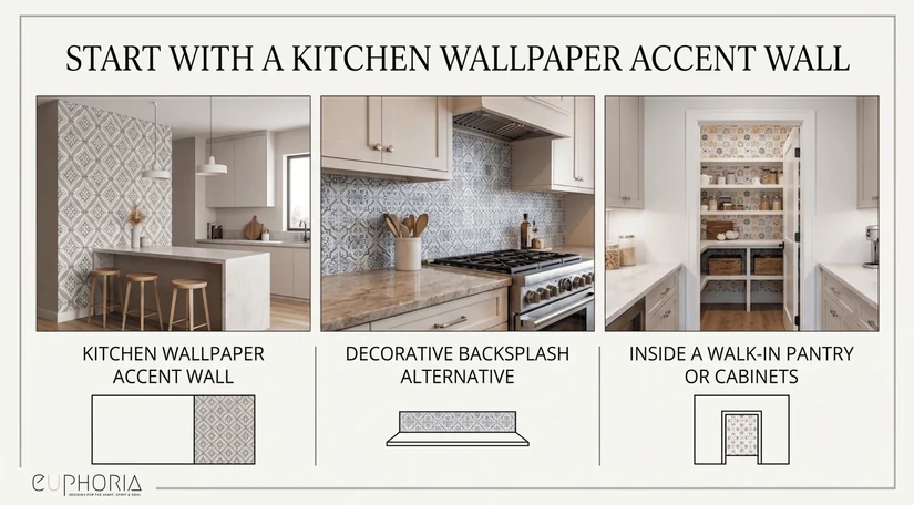
An accent wall is the easiest and most forgiving place to begin. As a wallpaper accent wall kitchen placement, the best positions are behind a breakfast nook, a coffee bar, a wall of open shelves, or any wall that sits away from direct heat and regular water contact. It should be the thing noticed when walking in, not something competing with four other surfaces for attention.
2. Let the Feature Wall Lead When Everything Else Stays Simple
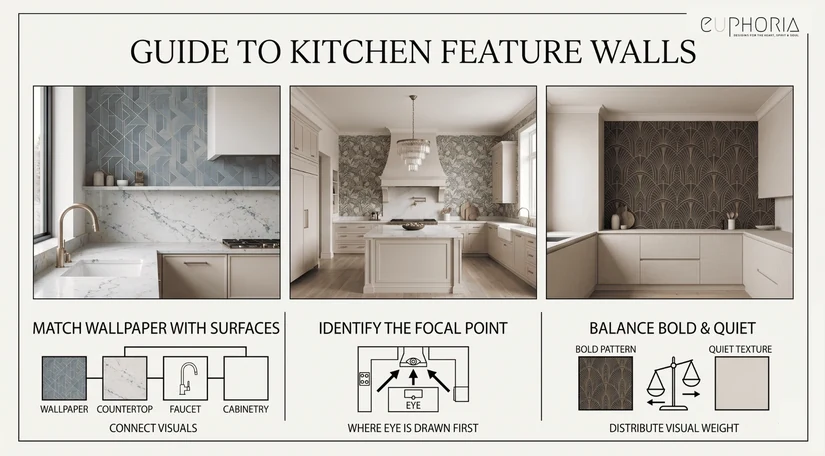
When choosing wallpaper for a kitchen feature wall placement, it works best when cabinets, tiles, and counters are simple. If the kitchen already has bold stone veining, very patterned tiles, or colourful cabinetry, the wallpaper should be quieter and more textural rather than a second statement surface. The question to ask: which surface should people notice first? That surface should be the boldest. Everything else should settle behind it.
3. Protect It Properly Before Using Wallpaper as a Backsplash
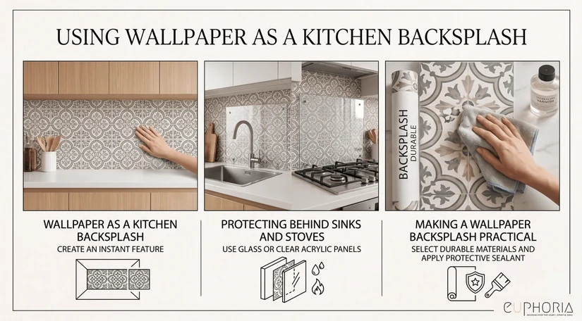
Yes, with conditions. The backsplash zone directly behind the hob and sink is the water zone and the most demanding area in the kitchen. If you want a wallpaper kitchen backsplash, use waterproof or washable wallpaper and protect it near the sink, hob, or heavy cooking zone with a glass panel or another wipeable surface.
The printed effect can look excellent, but the material behind the glass handles the decoration, while the glass handles the protection. Without that glass layer, even the best waterproof wallpaper for kitchen walls will show grease and water marks over time in a heavy-use zone.
4. Wrap the Island Panels for an Easy and Removable Update
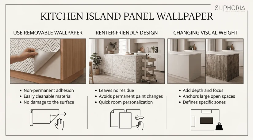
Island panels are one of the smartest places to use self-adhesive waterproof wallpaper for kitchen updates, particularly in rental properties or homes where the kitchen is unlikely to be renovated soon. The surfaces are low-risk for water and heat, the wallpaper is easy to remove and replace, and even a simple pattern on the island sides can shift the visual weight of the room considerably.
5. Look Up and Use the Ceiling When Wall Space Runs Out
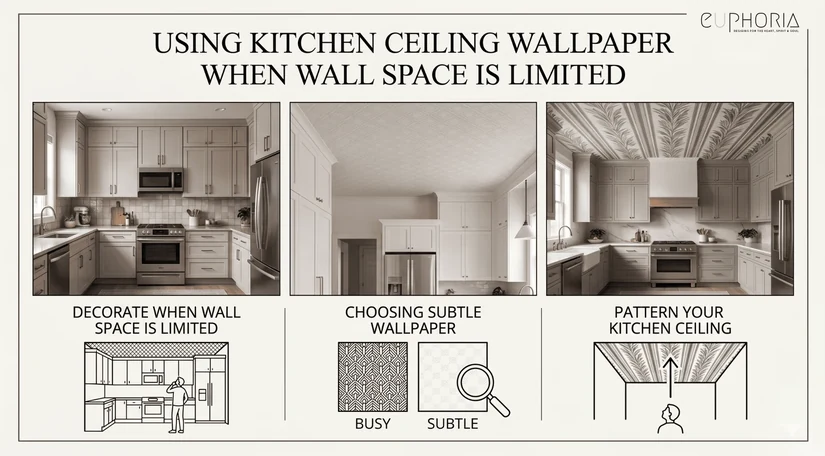
When cabinets take up most of the available wall area, the ceiling becomes the most underused surface in the kitchen. Kitchen ceiling wallpaper ideas in this context work well with a fine pattern, a subtle geometric, or a plain textured wallpaper in a soft colour. Keep the backsplash and cabinet colours simple if the ceiling is carrying any pattern, and consider how pendant lighting will interact with the print throughout the day.
6. Line the Cabinet Interiors and Shelf Backs for Hidden Detail
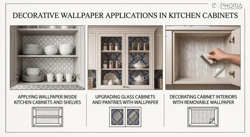
Some people search for wallpaper for kitchen cabin, but the practical use is almost always wallpaper for kitchen cabinet interiors, the back panels of glass-front cabinets, open shelving backs, or pantry walls. These are low-risk placements that add a layer of detail when cabinet doors are open or when shelves are viewed at an angle. Peel-and-stick wallpaper works particularly well here because it can be changed without any damage to the cabinet interior.
Should You Choose Bold or Subtle Kitchen Wallpaper?
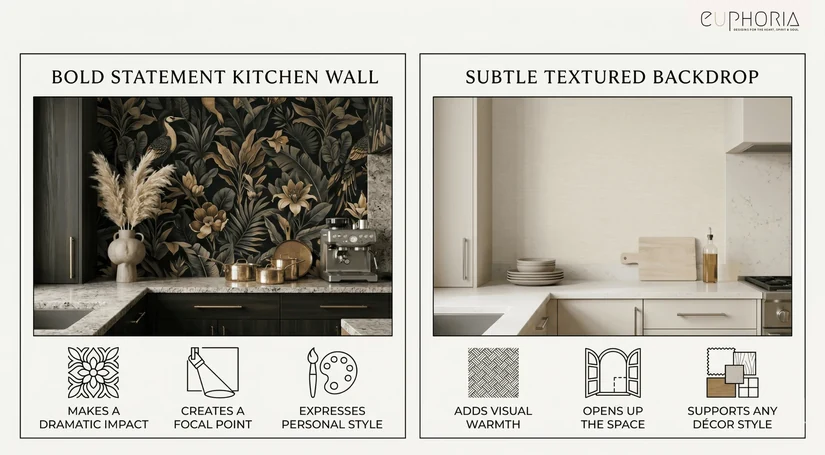
This is the question most people are actually asking when they look at kitchen wallpaper ideas, and the answer has very little to do with personal taste alone. It has everything to do with what the rest of the kitchen already has.
Bold kitchen wallpaper works when:
- The cabinets are a single plain colour with no strong pattern or veining
- The backsplash tiles are simple, such as plain subway, small metro, or solid stone
- The flooring is neutral and unfussy, with no dominant flooring pattern
- The countertop has no strong veining or movement
- The kitchen has enough natural light to absorb the pattern without it feeling heavy
Subtle kitchen wallpaper is safer when:
- The kitchen already has a marble or dramatically veined stone countertop
- The tiles have a strong pattern, colour, or texture of their own, increasing the risk of a backsplash clash
- The flooring has warm wood grain or a strong pattern
- The cabinets have an ornate frame or detailing
- The kitchen is small, and the walls are close together
The general principle is that one dominant surface should lead the room. The statement wall, the backsplash, the countertop, and the floor should not all be competing for attention at the same level.
Pick one, and let the quiet background of the other surfaces support it with calm design choices. A soft pattern on the wall beside simple cabinetry and a plain tile is a completely different visual experience from the same pattern competing with busy flooring and a strongly veined countertop.
A bold abstract wallpaper beside a plain white subway tile and a quartz counter with minimal veining can be stunning. The same abstract wallpaper beside a strongly patterned encaustic tile floor and a marble counter with dramatic veining becomes exhausting. Bold wallpaper design for kitchen spaces works best when it has clear, clean support around it.
Which Kitchen Wallpaper To Choose Based on Cabinet Colour
Most people searching for kitchen wallpaper already have their cabinets. The cabinetry is usually the most expensive fixed element in the room, which means the wallpaper needs to work with it, not against it.
| Cabinet Colour | Best Wallpaper Match | Avoid |
|---|---|---|
| White cabinets | Floral, green, blue, abstract, marble-effect wallpaper | Very pale wallpaper with no contrast |
| Grey cabinets | Beige, warm metallic, textured, botanical green wallpaper | More cold grey without warmth |
| Black cabinets | White, gold, botanical, soft geometric wallpaper | Black wallpaper across every wall |
| Wood cabinets | Beige, green, country, textured wallpaper | Orange-heavy prints |
| Navy cabinets | White, gold, blue-white, soft botanical wallpaper | Very dark wallpaper in low light |
| Green cabinets | Cream, beige, subtle floral wallpaper | Competing green prints |
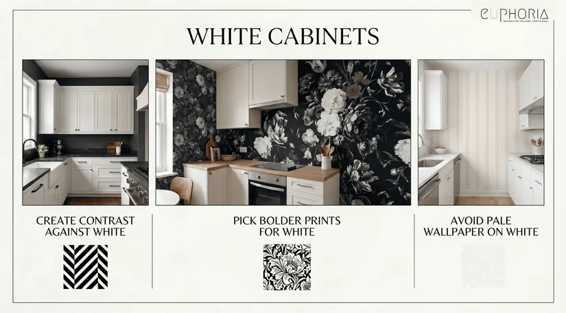
White cabinets are the most flexible base because almost any wallpaper colour reads cleanly against them. The risk is choosing wallpaper that is too pale, which loses the contrast needed to give the wall any presence.
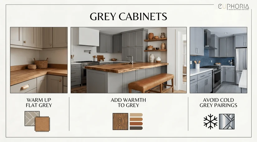
Grey cabinets need warmth in the wallpaper to stop the room from feeling flat. A beige, botanical green, or warm textured wallpaper brings the grey back to life. A cold, grey wallpaper beside grey cabinets simply doubles the flatness.
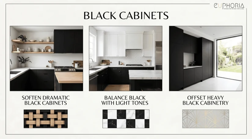
Black cabinets are dramatic enough on their own, so the wallpaper should provide relief rather than competition. White, soft gold, botanical, and light geometric prints work well beside black cabinetry because they offer contrast without softening the boldness of the cabinet colour entirely. If the kitchen has matte black handles throughout, a botanical or cream wallpaper keeps the scheme cohesive rather than adding further darkness.
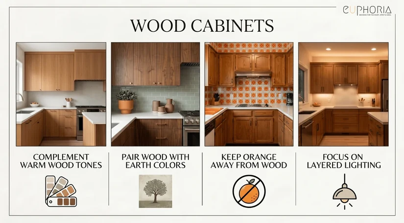
Wood cabinets are warm by nature. Beige, sage green, country prints, and tactile textures sit well beside natural wood. Orange-heavy prints clash with the honey or amber tones in most wood cabinet finishes.
For readers planning a calmer kitchen palette, our Japandi kitchen design guide explains how wood, matte quartz, light, and visual silence can shape a more balanced kitchen, and those principles apply directly to choosing wallpaper that feels restrained rather than busy.
The worktop matters as much as the doors, which our guide to kitchen countertop materials explains.
How to Make Kitchen Wallpaper Look Expensive
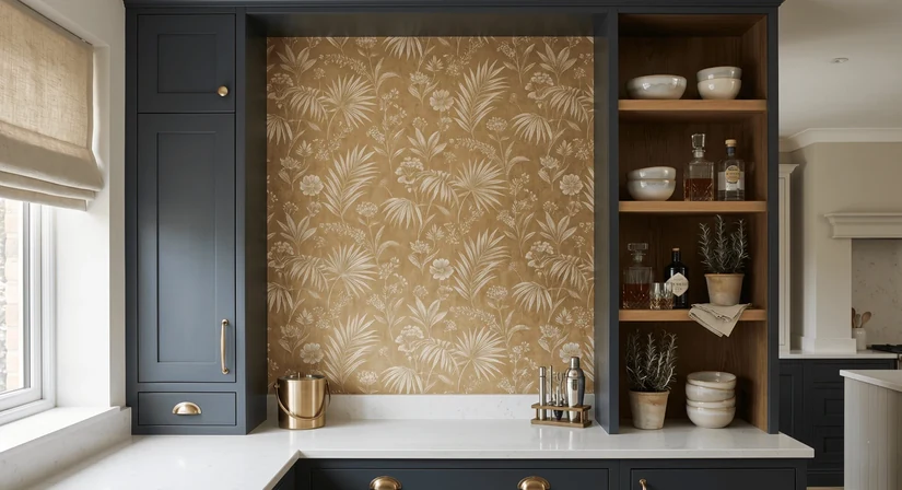
Expensive-looking kitchen wallpaper is rarely about the price tag. It is about restraint, the right material pairing, quality lighting, and a styling approach that lets the wallpaper breathe. As interior designer Ilse Crawford, a regular contributor to Wallpaper magazine and design educator at Design Academy Eindhoven, has said: “Luxury is not about excess, it is about choosing well and letting things be.” That applies precisely to kitchen wallpaper decisions.
- Use wallpaper on one clear, uninterrupted surface. A full wall with no visual interruptions reads as intentional. A wall broken up by random hooks, small frames, and appliance cables reads as an afterthought.
- Match the undertone in the wallpaper to the cabinet hardware. Warm gold or brass handles beside wallpaper with cool blue undertones will look mismatched. Pull the dominant colour in the wallpaper toward the hardware finish, and the room pulls together.
- Choose matte texture over cheap shine. A flat, textured surface in a rich colour reads as far more expensive than a shiny, reflective surface at twice the cost. Metallic kitchen wallpaper works when the shine is controlled, not when it is everywhere.
- Use gold kitchen wallpaper as an accent, not as the whole room. A single pantry wall or bar corner in a warm gold print is luxurious. The same gold on every kitchen surface becomes maximalist in a way most homes cannot absorb without feeling like a hotel lobby.
- Frame the wallpaper with open shelves, trims, or cabinetry. A framed wall of kitchen wallpapers, contained by panel moulding, a shelf trim, or cabinetry on either side, reads like a considered design decision. Good shelf styling on the surfaces beside it reinforces the intention. The same wallpaper running to the edge of a door frame without any visual containment looks unfinished.
- Keep the counter simple so the pattern has room. A heavily veined marble counter beside a patterned wallpaper asks a lot of the viewer. A clean quartz or stone counter beside a detailed wallpaper gives the print the visual depth and breathing room it needs.
- Layer soft texture with natural material wherever possible. A soft texture on the wall beside a linen blind, wooden shelf, or ceramic object creates the kind of visual depth that reads as expensive. These are natural materials that cost less than a premium wallpaper but do more to make it look like one.
For Dubai homeowners specifically, material choices need to account for heat, humidity, and the brightness that comes with year-round sun. Our UAE summer interiors guide covers finish and texture considerations that feel cooler and more appropriate in bright homes, and those same principles apply when choosing kitchen wallpaper that will not feel heavy or visually overheated in strong light.
More of that thinking is in how to make your kitchen look expensive.
Kitchen Wallpaper Mistakes That Make the Space Look Busy
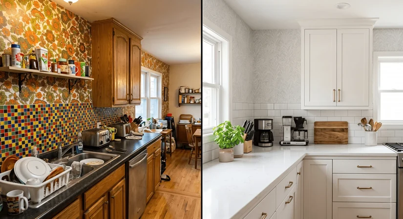
Most of these mistakes come from making one good individual choice that does not fit the system of choices already in the kitchen.
| Mistake | Better Fix |
|---|---|
| Bold wallpaper beside bold backsplash | Let one surface lead; quiet the other |
| Large print in a tiny kitchen | Use a fine pattern or limit to one wall |
| Dark wallpaper with weak lighting | Add warm task lighting or choose a lighter print |
| Glossy wallpaper beside glossy cabinets | Choose matte or textured wallpaper |
| Wallpaper behind the stove without protection | Use a glass panel or move the wallpaper to another wall |
| Pattern that ignores cabinet undertones | Pull one colour from the cabinets or counters |
| Too much decor on open shelves | Keep shelves edited and practical |
| Paper wallpaper in splash zones | Choose washable, vinyl, PVC, or waterproof options |
The easiest way to make kitchen wallpaper work is to let one surface lead. If the wallpaper is the statement, the backsplash, island, floor, and open shelves should support it.
A clashing backsplash beside a bold wallpaper is one of the most common and most avoidable problems; if the tile is doing something interesting, the wall behind it should do very little. The same applies to busy flooring: strong wood grain, encaustic tile, or a patterned floor beside a patterned wallpaper creates too many competing layers.
Grout colour is also often overlooked. A strongly coloured or very dark grout beside a patterned wallpaper adds another competing layer. Matching grout to the tile or keeping it soft is a small detail that makes a bigger difference than most people expect.
A glossy finish is another underestimated mistake. A glossy finish on the wallpaper beside glossy cabinet doors doubles the shine in a way that feels hard and clinical rather than refined. Matte or soft textures read better in most kitchen environments.
Wall preparation is the last thing people think about, and one of the most important. Wallpaper applied to a damp wall, a wall with flaking paint, or an uneven plaster surface will fail regardless of the wallpaper quality. Fix the wall first.
If the wall behind the hob is the problem area, compare it against our kitchen backsplash ideas.
Best Kitchen Wallpaper Choices by Home Type
Wallpaper advice is most useful when it is matched to the actual home, not just to an abstract style preference. These pairings reflect real-life conditions.
| Home Type | Best Wallpaper Choice | Why |
|---|---|---|
| Rental apartment | Self-adhesive waterproof wallpaper for kitchen | Easy to remove and replace at the end of tenancy |
| Family kitchen | Washable kitchen wallpaper | Better for everyday cleaning and accidental splashes |
| Small apartment kitchen | Light fine-pattern wallpaper | Keeps the space visually open |
| Luxury villa kitchen | Textured, metallic, or tone-on-tone wallpaper | Adds depth without visual clutter |
| Open-plan kitchen | Blending wallpaper in connected colours | Keeps nearby rooms cohesive |
| Breakfast nook | Floral or country kitchen wallpaper | Adds warmth in a low-risk area |
| Pantry or cabinet interior | Peel-and-stick wallpaper | Adds detail without covering the main walls |
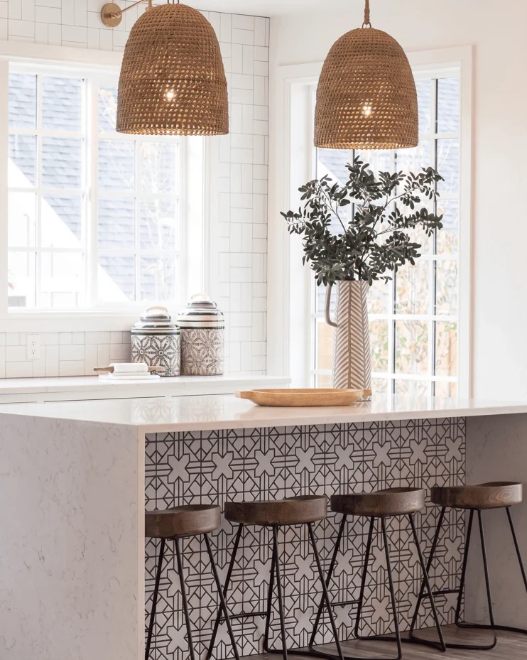
For rental kitchens specifically, self-adhesive waterproof wallpaper for kitchen surfaces removes without damaging the wall surface beneath, is available in a wide range of prints and materials, and can be replaced when design preferences shift or the tenancy ends. Island panels, cabinet backs, and pantry walls are all good placements for this type.
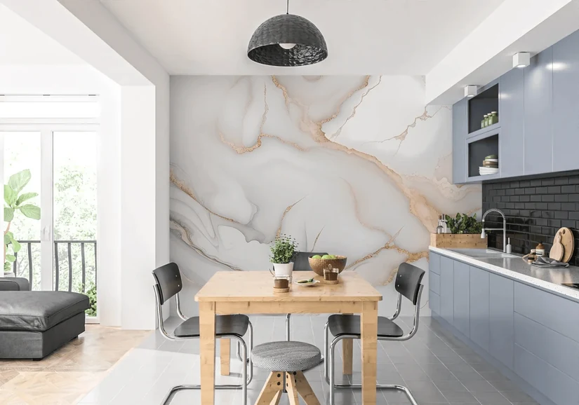
Family kitchens prioritise washable kitchen wallpaper above almost any other quality. Pattern and colour matter, but a wallpaper that cannot be wiped clean without smearing or fading will not last in a room where food is prepared daily.
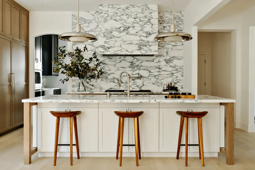
Luxury villa kitchens have the most design flexibility, but the risk of getting it wrong is also higher when the investment in the kitchen overall is significant. Textured and tone-on-tone options are the safest choices because they add depth without introducing any colour or pattern that might clash with expensive fixtures.
Quick Kitchen Wallpaper Decision Checklist
Before buying anything, run through this checklist. It takes five minutes and can save a very expensive mistake.
Before choosing kitchen wallpaper, check:
- Is the wall close to the stove or sink?
- Does the kitchen have proper ventilation?
- Is the wallpaper washable, vinyl, PVC, or waterproof?
- Does the print compete with the backsplash?
- Does the colour match the cabinet undertone?
- Will the pattern still look good with appliances and open shelves?
- Have you tested a sample in morning and evening light?
- Are you choosing one statement surface or too many?
- Does the wallpaper match how often the kitchen is actually used?
- Can the wallpaper be cleaned without damaging the print?
If any of these questions raises a doubt, work through that specific question before committing. The sample test under real lighting is the one most often skipped and the one that most often reveals a problem before it becomes permanent.
Choose Kitchen Wallpaper That Works as Hard as It Looks
Kitchen wallpaper done well is one of the most effective changes a kitchen can go through without touching the cabinets, counters, or tiles. The ones that look beautiful and hold up over time share a common quality: they were chosen to fit the kitchen, not to impress in a showroom.
The best kitchen wallpaper is the one that works with the cabinets, survives the cooking habits of whoever uses the kitchen, suits the light at different times of day, and gives the room one clear design moment without making the space feel crowded or difficult to live in.
If you are planning a kitchen refresh in the UAE and want guidance on which kitchen wallpaper ideas will work in your specific space, light conditions, and lifestyle, our kitchen interior design services in Dubai are built for exactly this kind of decision. Our team at Euphoria Interiors can advise on material, placement, colour, and styling to make sure the choice works long after the installation is finished.