Commercial area
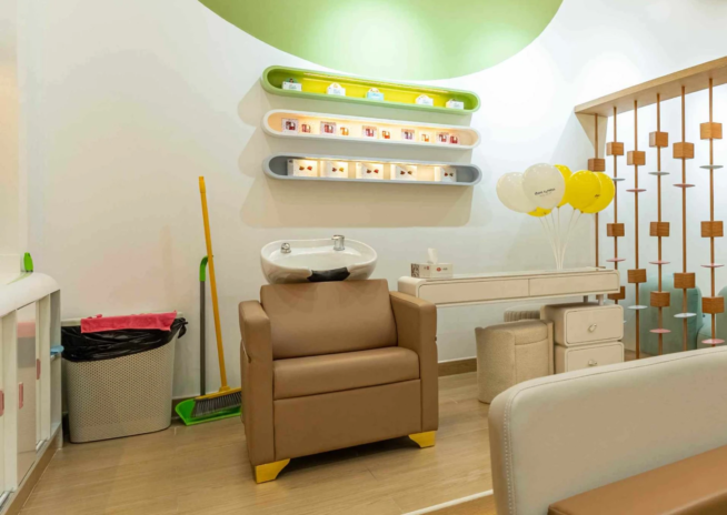
Seven zones, one small floorThe salon reads as one room and works as seven. Cutting, wash, pedicure and activity zones sit inside 581 square feet, spaced to hold the mandatory 900mm between chairs.
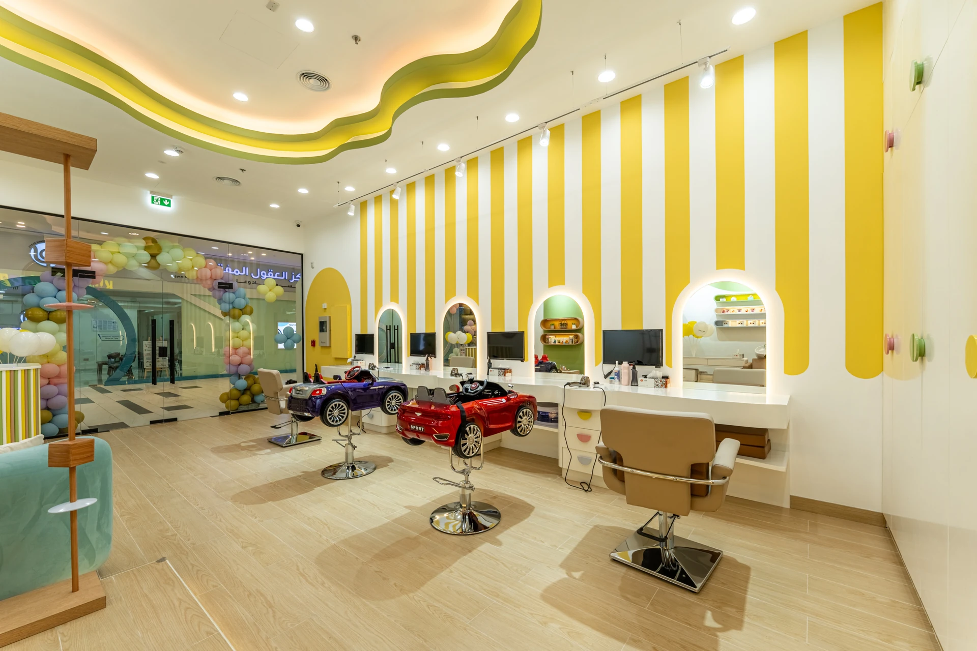
Kiddie Express is a 581 sqft kids and teen salon in Silicon Central Mall, Dubai Silicon Oasis, and almost every decision in it was made twice. Once for how it looks, and once for what happens when a queue of children moves through it on a Saturday. Salons for children fail in a predictable way.
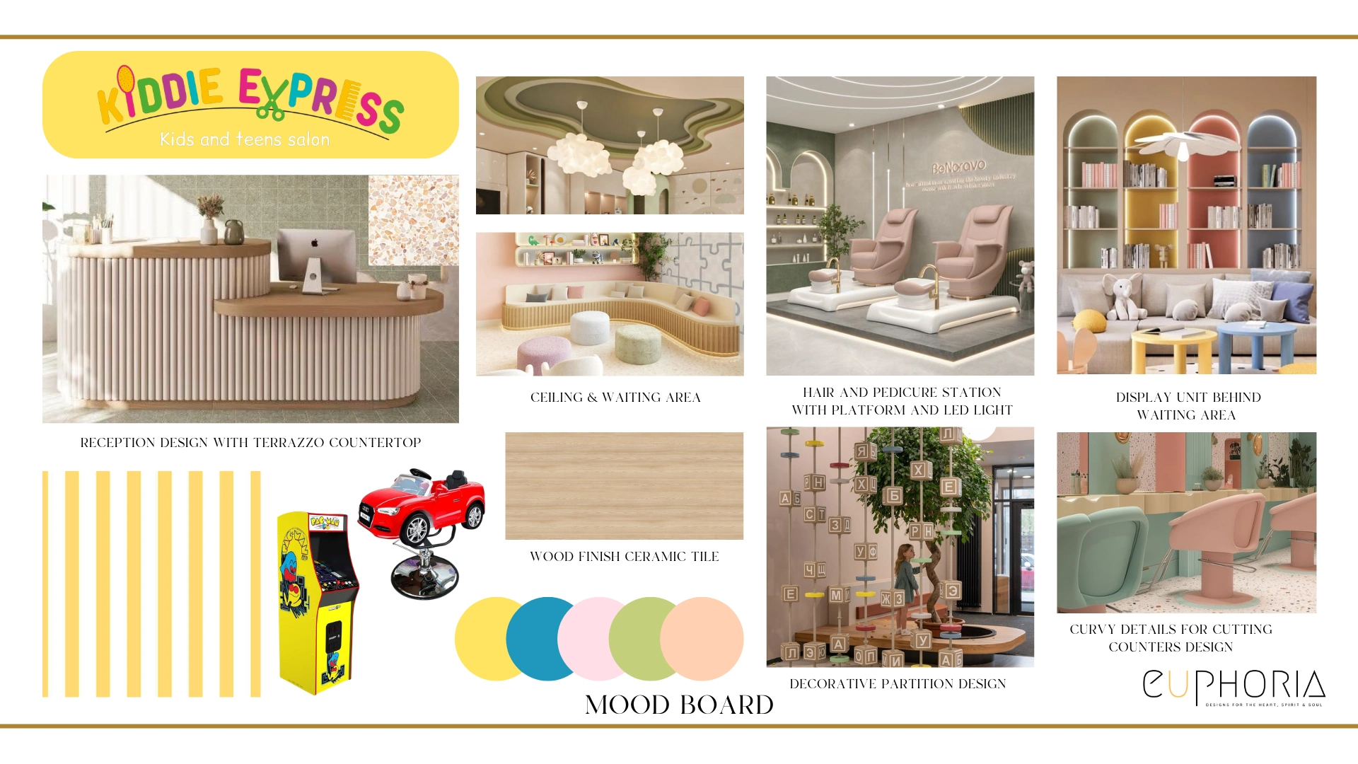
They are styled to photograph as fun, then the edges turn out sharp, the floor marks within a month and the staff spend the day walking around the furniture. The brief kept the existing yellow, green and blue palette and pushed it toward a soft Memphis contemporary look, playful without reading as a toddler's playroom, because teenagers sit in these chairs too. Curved forms and rounded edges run through the joinery, so the furniture is safe for children.
Porcelain tiles take the footfall and terrazzo carries the colour. Seven working zones sit inside a footprint most operators would describe as one room.

Why they choose Euphoria Interiors for Kids & Teen Salon design?
The salon reads as one room and works as seven. Cutting, wash, pedicure and activity zones sit inside 581 square feet, spaced to hold the mandatory 900mm between chairs.
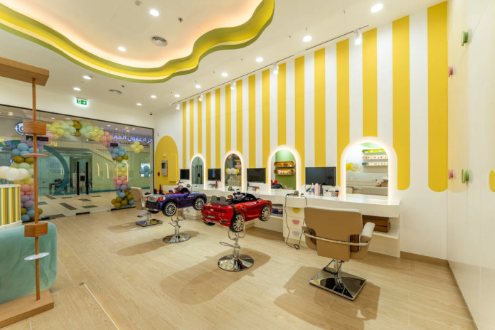
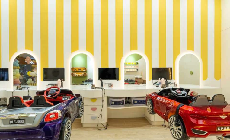
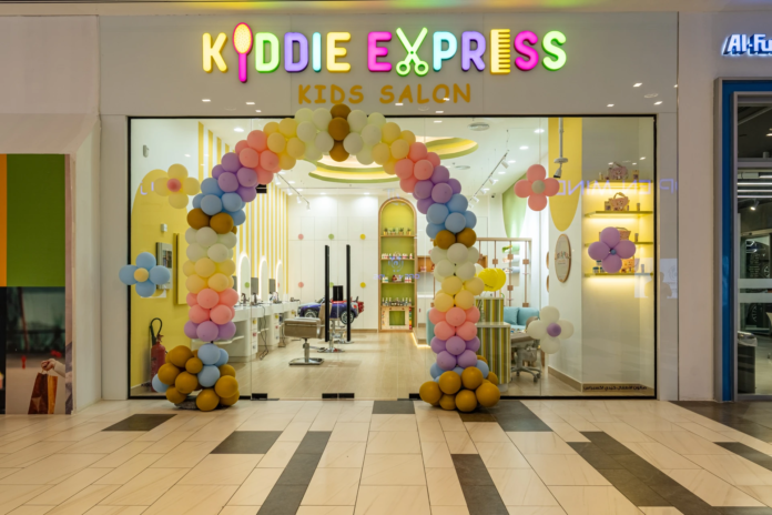
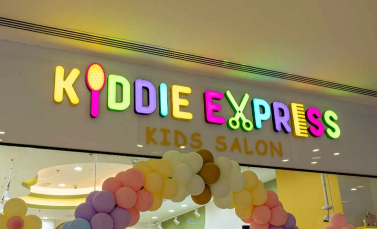
A mall shopfront gets one glance from a parent walking past with a restless child. The retained yellow, green and blue reads as unmistakably for kids from a distance.
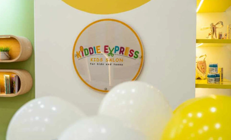
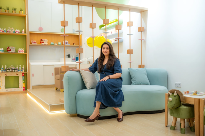
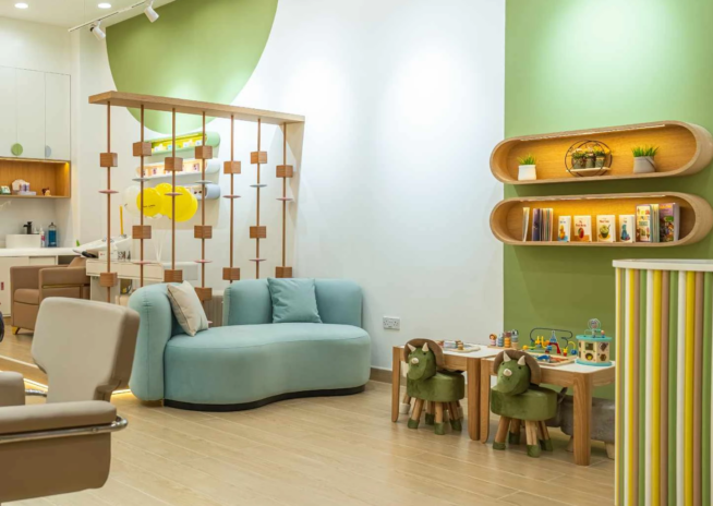
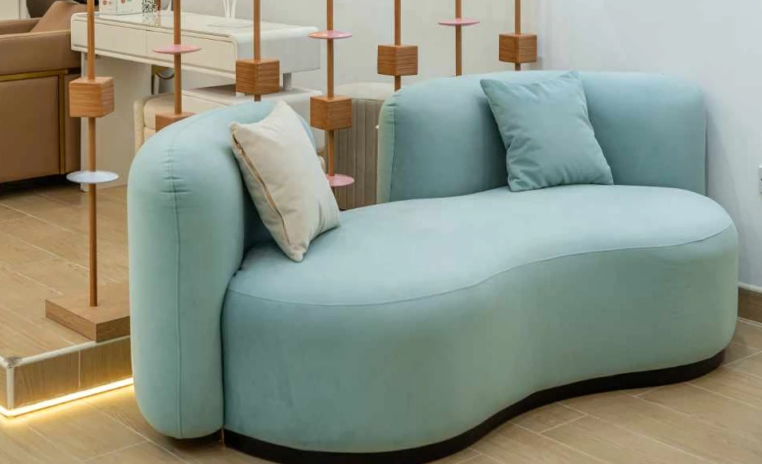
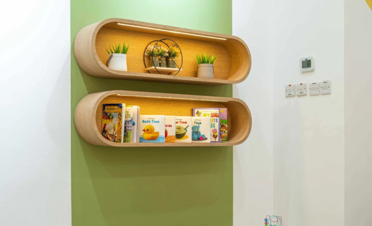
The zone most kids salons treat as leftover space. Parents are here for the whole appointment, so it has real seating and clear sightlines to the chairs, which stops the hovering.
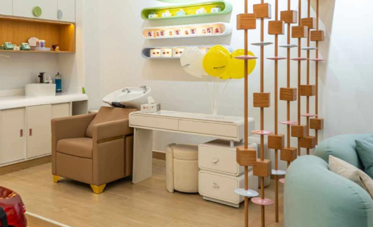
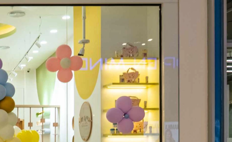
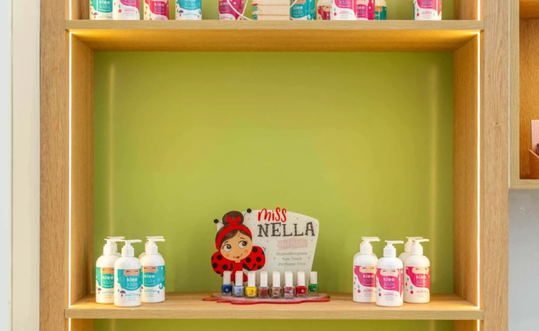
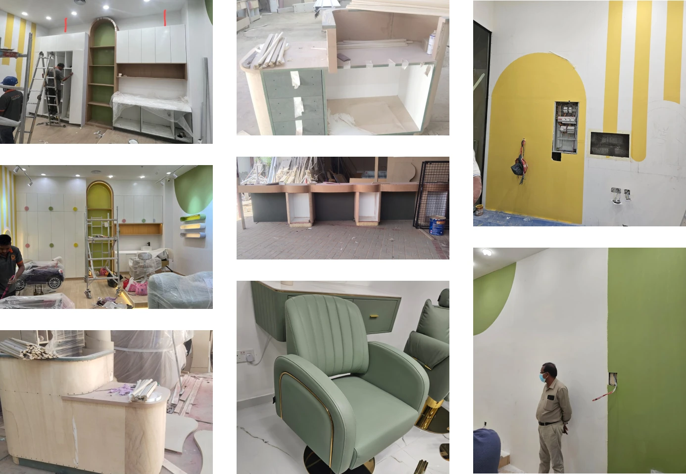
The retail run, and the one element corrected on site. The first cabinet was calculated to meet the ceiling, so it was reworked to sit clear of it without closing the room in.
Success story
Our project
3D Walkthrough
Studio profile
The client approached this as an operator first. High footfall, long trading hours and a young customer base who will test every surface in the room, so durability and longevity were named in the brief ahead of aesthetics. What they wanted was a salon interior design that stays fun and engaging for children and teenagers without becoming something an older child feels embarrassed to sit in.
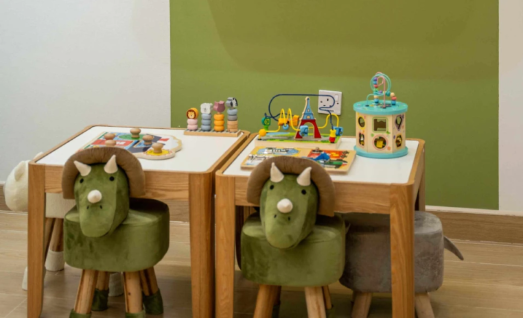
The existing yellow, green and blue palette was to be retained and balanced with modern detailing so the room works across the full age range. Every service needed its own zone, reception, parents' waiting, hair cutting stations, a wash area, a pedicure station, a kids activity and painting corner, and a display and retail run. Interactive features such as TV screens were requested to hold a restless child through a haircut.
Safety came ahead of everything, no sharp edges, easy movement, nothing a child can pull over. Materials had to be low maintenance and suitable for commercial use. And the layout had to earn its 581 square feet several times over.
The floor area was the smallest problem. Seven functional zones inside 581 square feet is tight, but tight is arithmetic. What actually held this project up was compliance.
Salon chairs carry a mandatory 900mm spacing, which fixes the geometry of the cutting area before any design thinking starts. The partition was rejected twice, first because the metal and wood build did not satisfy safety and fire requirements, and it had to return in compliant materials at a reduced height. Building management approvals moved slowly, which for an operator is not an inconvenience, it is rent on a unit that is not trading yet.
Three things also went wrong on the design side and are worth naming. The hair stations were drawn at 100cm rather than the standard working height. The display cabinet was calculated to run into the ceiling.
And the reception counter, as first designed, was not wheelchair accessible, which is a serious miss in a family space where a parent may well arrive in a chair. Conflicts between the TV screens and the mirror positions added a fourth.
In a room this size none of these could be quietly absorbed. Each one had to be redrawn.
Euphoria Interiors reworked the plan around the fixed points rather than around the mood board. The 900mm chair spacing was set first and every other zone was planned into what remained, which is the reverse of how most small commercial fit outs get drawn and the reason all seven zones landed without any of them feeling like an afterthought. Curved furniture and rounded edges were adopted across the scheme, solving two problems with one decision, since rounded corners protect children and also let two people pass in a gap where a square corner would force one of them to wait.
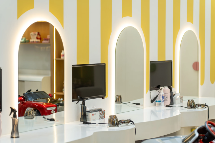
The partition came back in fire compliant materials at a lower height, which turned a rejection into a gain, because a lower divider keeps sightlines open between the waiting area and the chairs. The reception counter was redesigned to meet accessibility standards. The screens were repositioned so they entertain children without blocking a single mirror, and the display cabinet was reworked to clear the ceiling.
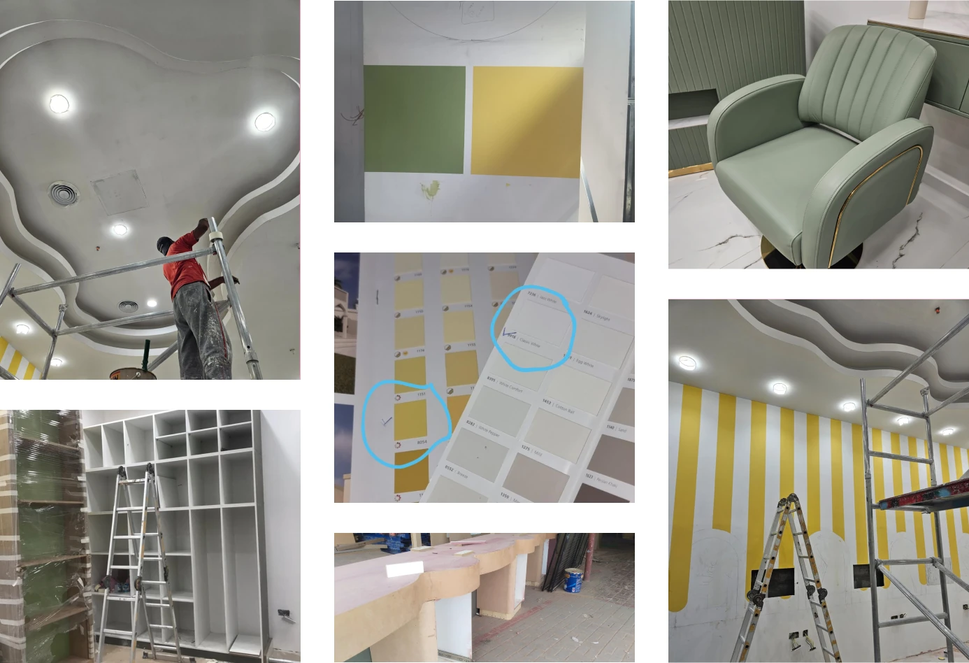
Porcelain tiles carry the zones that take the heaviest traffic, and the colour work sits in finishes that can be refreshed rather than replaced. The playful language was pulled back just far enough to hold teenagers as well as toddlers. The client approved the result without major changes, which after two partition rejections was not a given.









Creative Head
3D Lead
Project Coordinator
Quantity Estimator
Client Happiness Associate
Get your space designed,
without the stress.

Because true luxury isn’t just what you see —, it’s what you feel every day.
You start with what cannot move. In a salon the fixed constraint is the mandatory 900mm between chairs, so the cutting stations were positioned first and everything else was planned into the space that survived. Zones then share circulation instead of each claiming their own. The parents' waiting area looks across to the chairs rather than sitting behind a wall, the retail display doubles as the edge of the reception zone, and the activity corner occupies a pocket that would otherwise be dead floor. Curved furniture matters more here than it sounds, because rounded corners let two people pass in a gap where square corners would not. Small commercial spaces rarely fail on area. They fail on circulation, which is a different problem and a much cheaper one to fix at drawing stage.
Safety at Kiddie Express is built into the shape of things rather than added on as a warning. Every piece of furniture carries curved or rounded edges, the materials were selected for durability and for being free of anything hazardous, and the partition was remade in fire compliant materials at a reduced height after the first version did not pass. None of that reads as childproofing when you walk in, which is exactly the point. The look stays soft Memphis contemporary, playful in colour and modern in line, so the room works for a teenager as easily as for a small child. Nurseries signal their safety visually. A salon that also serves teenagers cannot afford to, so the safety has to live in the detailing instead.
Because the parent is the customer deciding whether there is a second visit. A child sits in the chair for twenty minutes. The parent is in the room for the entire appointment, often with a younger sibling and a bag. At Kiddie Express the waiting zone was given proper seating and clear sightlines to the chairs, so a parent can watch without standing over the stylist, which is better for everybody including the stylist. The activity and painting corner and the interactive screens do the same job from the other direction, holding a restless child so the appointment runs to time. A salon that designs only the service area ends up with parents crowding the working floor, and that slows the whole operation down.
Four things, and all of them were caught before they became permanent. The hair stations were drawn at 100cm instead of the standard working height, which would have left stylists working at the wrong level all day, so the height was corrected. The display cabinet was calculated tall enough to meet the ceiling and was reworked to sit clear of it. The reception counter was not wheelchair accessible in the first design and was redesigned to meet accessibility standards. The partition was rejected twice on safety and fire grounds before coming back in compliant materials at a lower height. Approvals from building management also ran slower than planned. Naming these matters, because a fit out that claims nothing went wrong is usually describing a project nobody checked closely enough.
The thinking transfers more usefully than the plan does. What made Kiddie Express work was the sequence, regulated dimensions set first, circulation second, colour and character last, and any child focused commercial space can be planned the same way. The zoning logic travels well too, keeping the waiting area within sight of the service floor, giving retail display a position that does not eat circulation, and choosing finishes by how often they will be scrubbed rather than how they photograph. What will not transfer is the exact layout, because it was cut to fit 581 square feet in Silicon Central Mall and a different shell brings different fixed points. A conversation with one of our designers is the faster way to find out what carries across to your unit.
 Villa interior design service
 Penthouse interior design service
 Townhouse interior design service
 Duplex interior design service
 Studio interior design service
 One bedroom villa interior design service
 Two bedroom villa interior design service
 Three bedroom villa interior design service
 Four bedroom villa interior design service
Areas we serve across Dubai