
You have three sage green samples sitting on your worktop, yet none feels easy to approve. One looks grey in daylight, another shifts blue when the kitchen lights come on, and forest green suddenly feels like a lot of colour for twenty cabinet doors. So, do you trust the sample for your green kitchen or choose safe white?
While working through the colour questions behind this article, I took one recurring problem back to our designers: why can the same green feel right on a sample and wrong once the kitchen comes together? Their answer was not to search for a universally safe shade. They kept returning to the fixed flooring and stone, the amount of cabinetry carrying the colour and the light falling on it when the kitchen is actually used.
That changed how I compared the examples below. I stopped judging sage, olive and forest green in isolation and started looking at the complete material palette.
Not every muted green is automatically timeless either. Keep reading because these green kitchen ideas will help you compare shade, surface, light, and commitment before settling on a colour you see every day.
45 Green Kitchen Ideas To Help You Choose The Right Shade And Style
Start with the decisions most likely to change how your green kitchen looks, then compare the shades, pairings, and surfaces that suit the room.
For the wider picture, start with our kitchen design ideas.
1. Test The Green Kitchen Colour Under The Lights You Actually Use
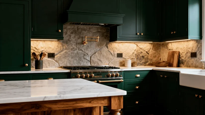
Have you ever liked a green in the morning and questioned it again that evening? Check the green kitchen cabinet sample in daylight and under the lights you use while cooking.
In a 2021 experiment, Reza Shahidi and fellow researchers at Hamadan University of Medical Sciences tested 33 participants across six colour-and-light sessions. Cool white light increased perceived brightness and reduced colour warmth in the tested interiors.
Your kitchen lighting can affect how a green kitchen feels, too, so approve the colour where it will actually be used.
2. Put The Green Beside The Kitchen Flooring And Worktop First
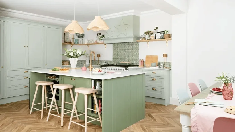
A green that appears balanced on a sample card can shift once it sits beside cool stone, warm timber or strongly coloured flooring. If you are planning the whole room rather than the cabinet colour alone, our kitchen design ideas covers the wider layout, cabinetry, lighting and material decisions.
This broader approach also shaped our Maison Bleu project, where a smart kitchen had to fit one cohesive design language across a large residence. Place the cabinet, flooring, worktop and backsplash samples together before narrowing the green.
Our kitchen design guide covers the planning steps behind these choices.
3. Decide How Much Of The Kitchen Really Needs To Be Green
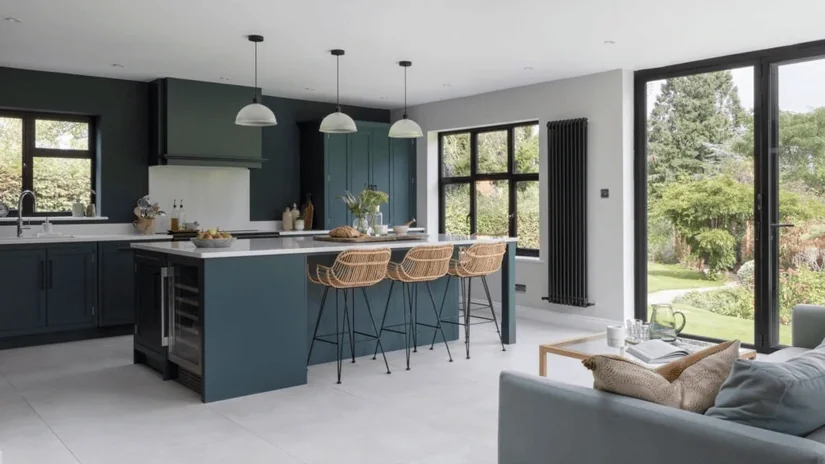
Do you need every cabinet to be green? Probably not. A green kitchen can carry the colour across the entire cabinetry, only on the lower cabinets, along one wall of cabinets, on the island, or on tall pantry units.
A small colour sample feels very different once it covers a large cabinet area. Stand at the kitchen entrance and look at the cabinetry you notice first. That is a better place to start deciding how much green the room can handle.
4. Keep Darker Green On The Lower Cabinets In A Narrow Kitchen
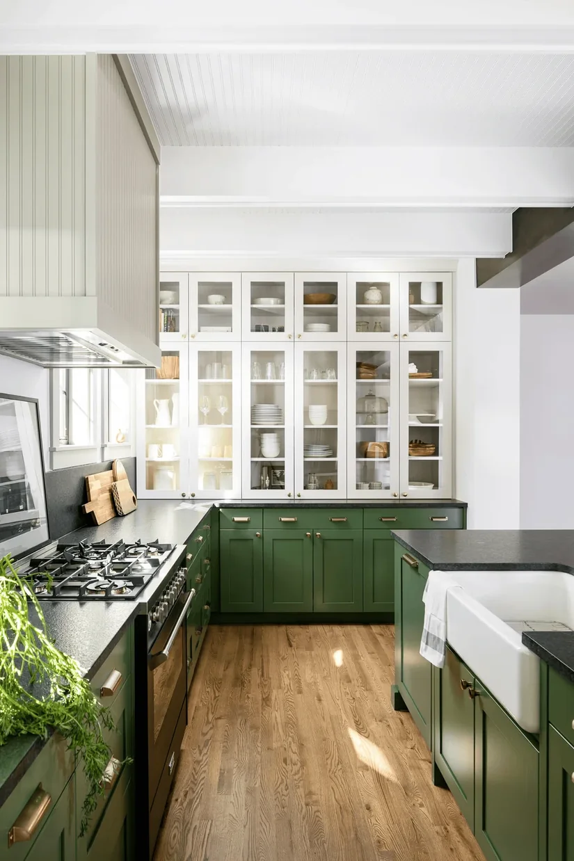
In a narrow or galley kitchen, darker green lower cabinets can carry the colour while cream, warm white, or pale timber keeps the upper half lighter.
When I took narrow and galley kitchen examples to our designers, the recurring question was not simply if the palette was two-tone. It was where the darker cabinetry stopped in relation to eye level, daylight and the main sightline through the room.
Look at a fully green version beside one with green only below eye level. Which feels easier in the actual width of your kitchen?
5. Count The Other Dark Surfaces Before Choosing Forest Green
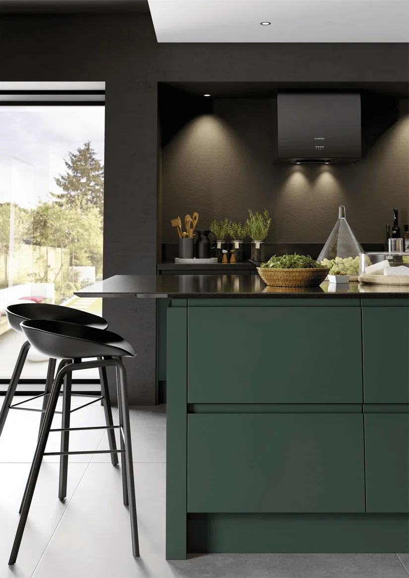
Is forest green really the problem, or is the kitchen already carrying too many dark surfaces? Forest green cabinets beside a dark floor, black worktop, and dark upper cabinets feel very different from deep green lowers with pale stone.
Christoph von Castell, Heiko Hecht, and Daniel Oberfeld at Johannes Gutenberg University Mainz tested 20 observers across eight surface-luminance conditions. Brighter side walls made rooms appear 7.88 cm wider, while brighter rear walls appeared 6.84 cm farther away.
The study looked at room surfaces, not cabinets, but the lesson is useful: count the large dark areas before adding another.
6. Start With A Green Kitchen Island If Full Green Cabinets Feel Too Permanent
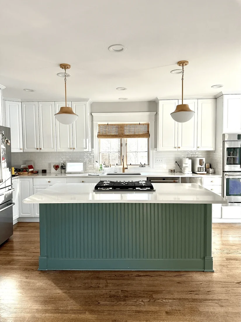
An island does not need several matching green accessories to belong in the room. When I take island-led palettes to our designers, they test the view from the kitchen entrance and the adjoining dining area before adding another colour repeat.
Sometimes the island already connects through timber, stone veining or hardware. Sometimes one repeat in artwork or upholstery helps. View the scheme from both directions and add that repeat only if the island still feels visually isolated.
These floating kitchen island ideas show how much an island alone can carry.
7. Try A Green Kitchen Backsplash Before Repainting The Cabinets
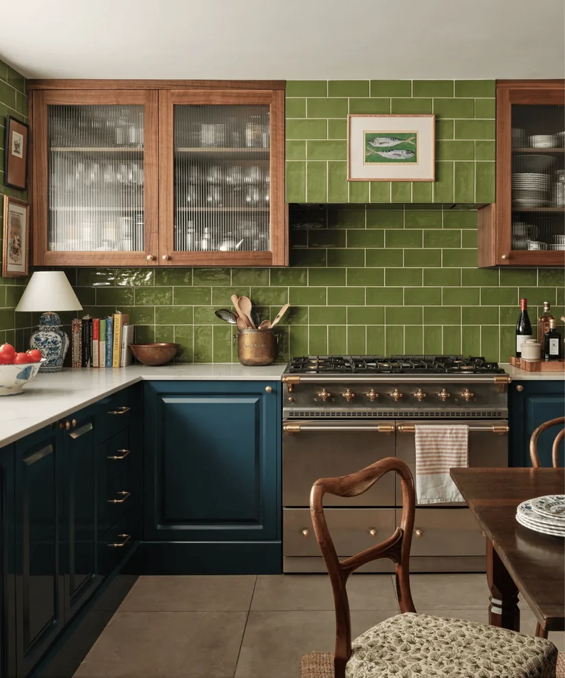
A backsplash gives you a substantial vertical area of green without replacing every cabinet front, but one loose tile is not enough to judge it. Gloss, grout colour and tile shape change the reflections and lines visible across the finished wall.
Hold a full tile sheet upright between the exact cabinet and worktop samples. Check it in daylight and under the task lighting used for cooking. That mock-up gives you evidence for the finished combination rather than asking you to approve a tile shown on its own.
Our kitchen backsplash ideas cover the materials worth considering.
8. Do Not Settle For A Green You Already Dislike
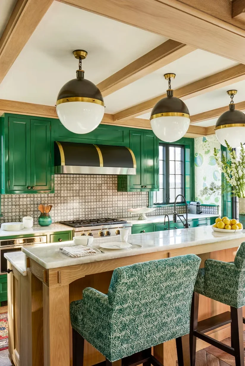
Some cabinet collections only offer one or two green finishes. What happens when the standard option is almost right but still looks too grey, cool, or saturated? Do not start changing the wall, stone, backsplash, and hardware just to rescue one cabinet colour.
List everything you are adjusting to make that green work. If one finish is forcing four other decisions to change, reconsider the green before ordering the cabinets. These ideas for green kitchen cabinets show how door styles and layout change the same colour.
9. Choose A Warmer Sage When Grey-Green Feels Too Flat
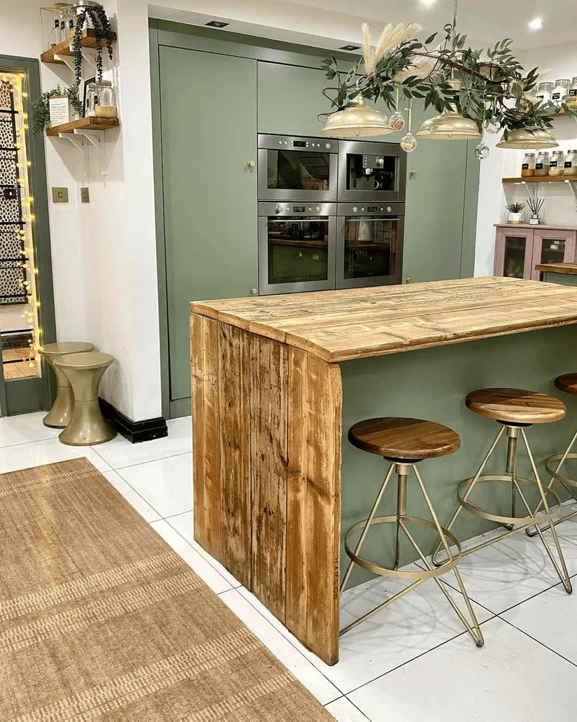
Why does the word “sage” cover so many colours that barely look related?
I grouped the sage samples by undertone and checked the differences with our designers. Some were predominantly grey, while others carried noticeably more yellow or green. The exercise made the marketing name less useful than the physical sample.
If a cool sage feels flat beside cream, oak, or warm stone, try a warmer version. Put two clearly different sage samples beside the worktop and compare them there, not on separate paint cards.
Sage sits well in a calm, natural scheme, which our Japandi kitchen design guide explains.
10. Add One Stronger Detail To Sage And Pale Oak
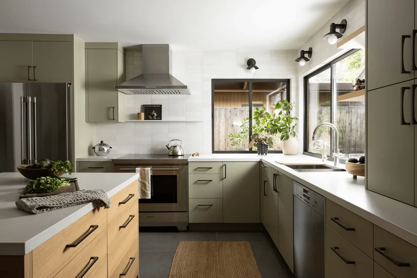
Sage, pale oak and light stone can begin to merge when the major surfaces are close in lightness. I asked our designers what they check before adding a darker accent, and the answer was separation between the main materials, not contrast for its own sake.
Arrange the complete palette and view it from several metres away. If the cabinet and timber lose their visible edges, introduce one clearer detail through hardware, stone veining or a deeper work surface.
11. Test An Olive Green Kitchen Again Under Evening Lighting
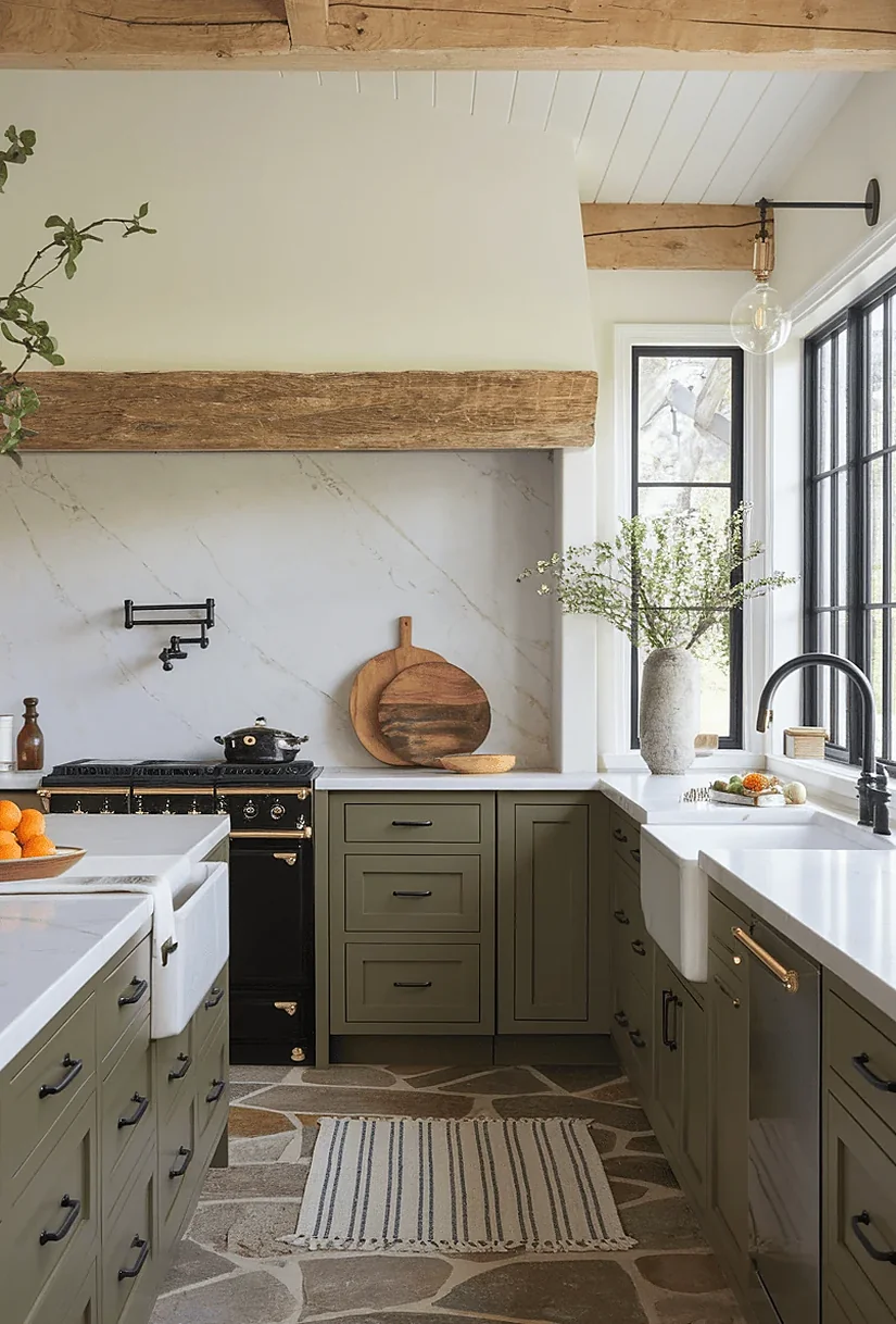
Olive often contains yellow or brown notes, so warm timber and earthy stone may reinforce that direction rather than neutralise it. Reza Shahidi and his fellow researchers found that warm and cool white lighting changed perceived warmth and brightness in simulated coloured interiors.
The study did not test kitchens, but it supports checking the same olive-and-timber pairing under your evening lights. If the green turns more yellow than you expected, compare a less warm olive before changing every surrounding material.
12. Use Cream With Green When Bright White Feels Too Sharp
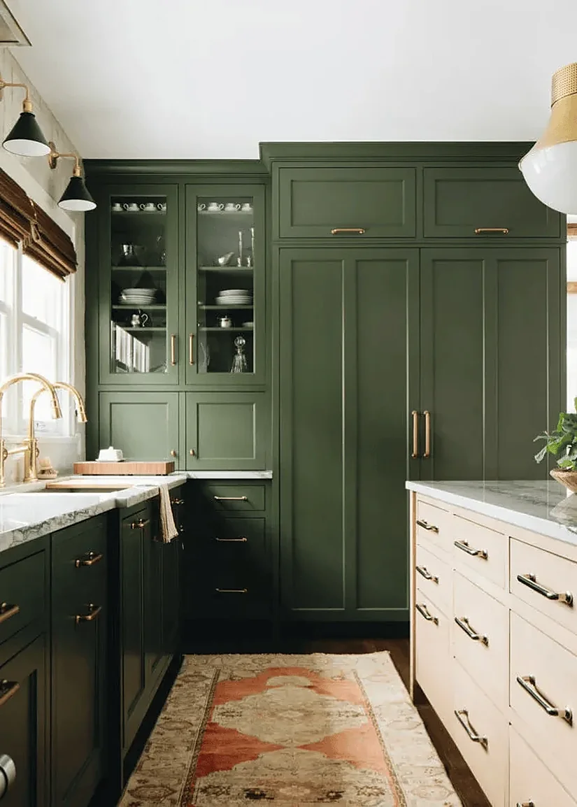
Bright white generally creates a greater lightness difference against olive than cream, but that does not make it automatically better. When I compare both options with our designers, the useful question is how much separation the whole palette needs.
Put the same olive, flooring and stone beside cream and bright white, changing only the white. Choose cream for a gentler transition or bright white for a clearer break. The decision should come from the complete material board, not the white sample alone.
13. Keep The Stone And Backsplash Quieter With Forest Green Shaker Cabinets
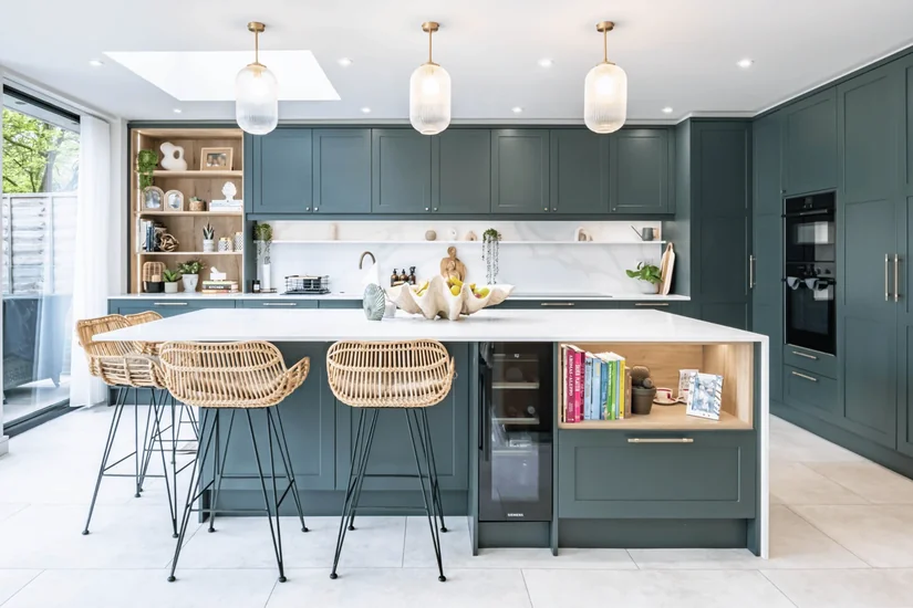
Forest green and Shaker doors already introduce strong colour and repeated frame lines. When I checked patterned stone and tile combinations with our designers, they did not remove pattern automatically. They first decided which surface should lead.
Place the cabinet door, a full tile sheet and a representative stone section together. Cover each patterned surface in turn. Keep the combination that leaves one obvious focal material instead of asking the cabinets, stone and backsplash to compete equally.
For more door styles, see our kitchen cabinet designs.
14. Use Dark Green Below And Lighter Kitchen Cabinets Above
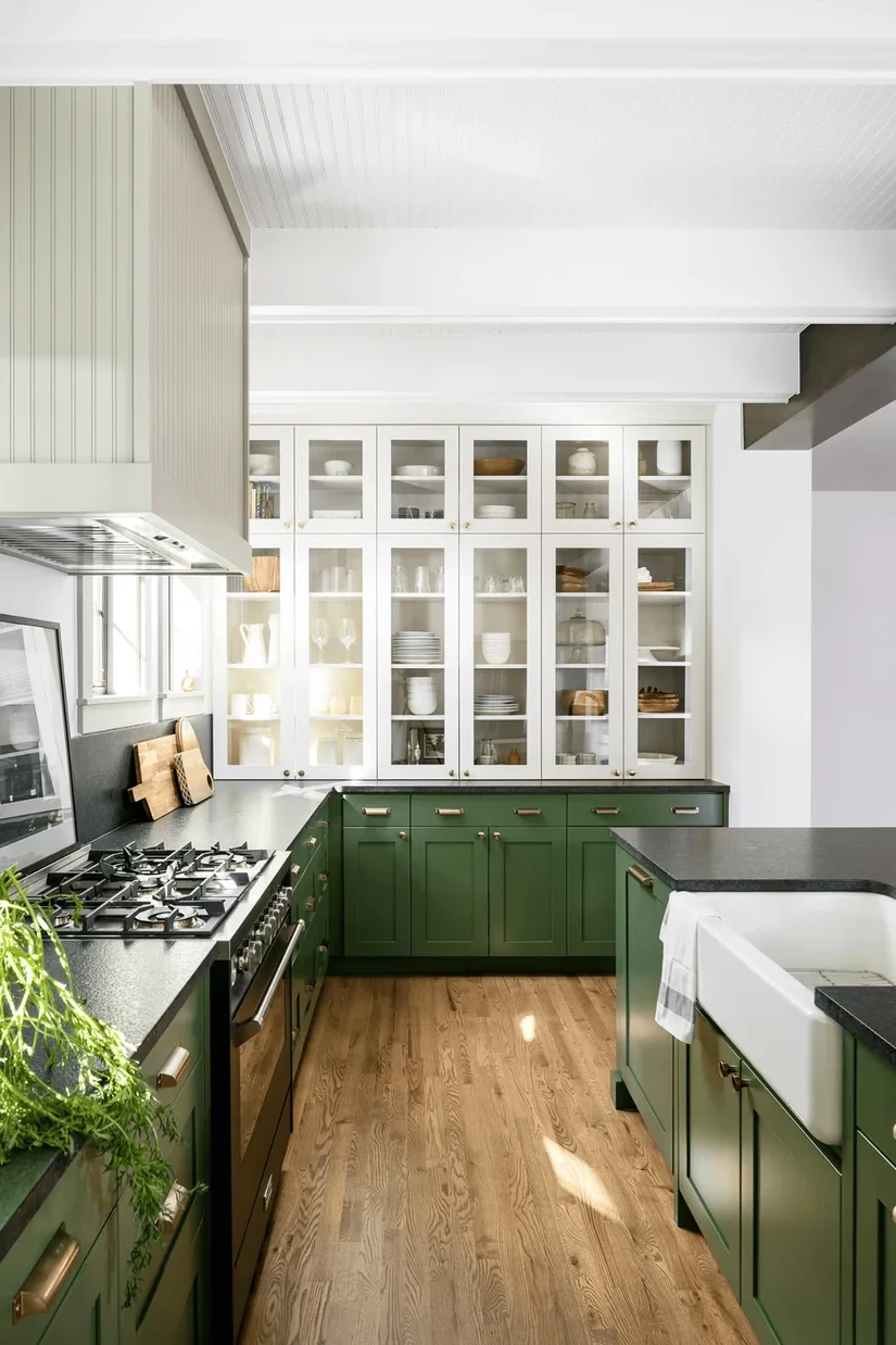
Deep green lower cabinets create a strong base, while cream, warm white, or pale timber upper cabinets keep the top of the kitchen lighter. This gives you a dark green kitchen without surrounding the whole work area in a deep colour.
Look at the cabinetry in two levels. Which one should carry the stronger colour? Once you decide that, choosing between several similar dark greens often becomes much easier.
15. Choose Emerald Green Only If You Want The Kitchen Cabinets To Stand Out
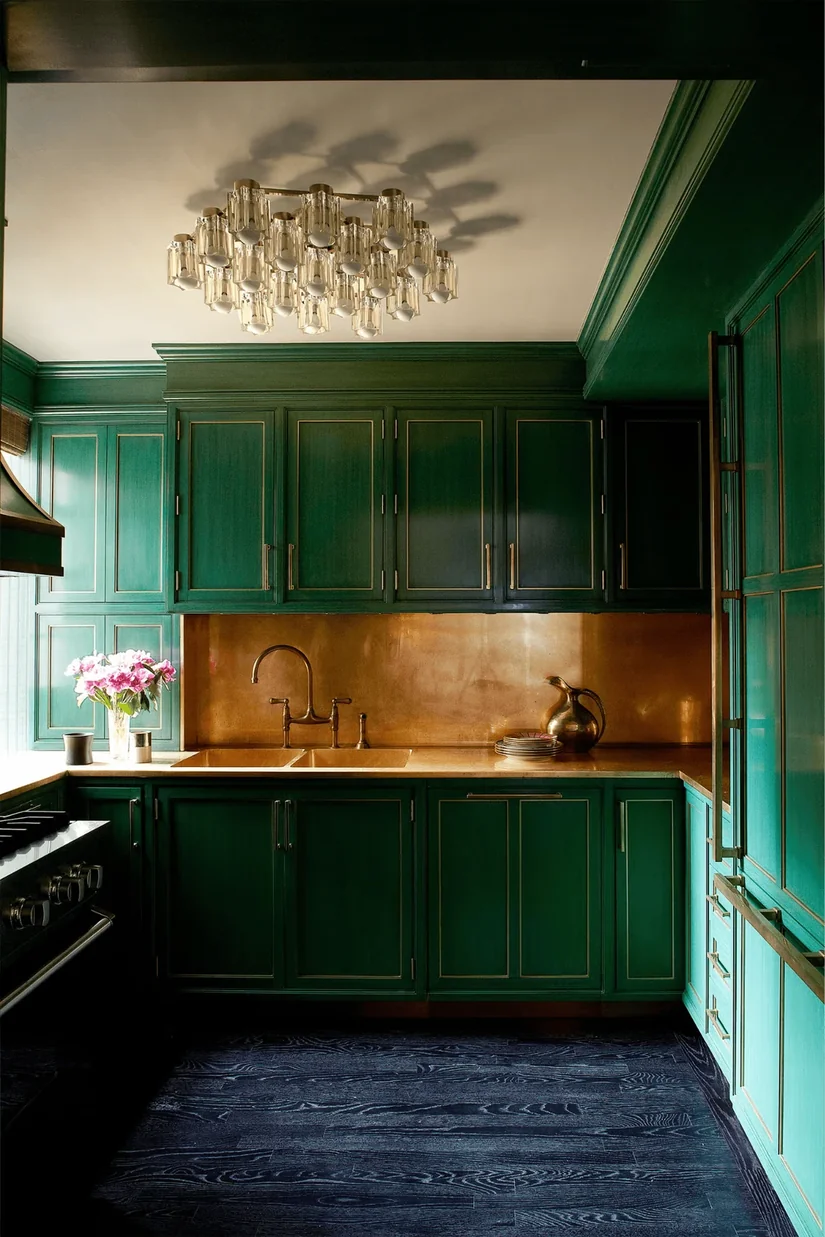
Emerald is usually more saturated than sage or khaki, so it can read as a stronger colour feature. The room still decides what receives attention, though. A 2024 eye-tracking study of coloured interiors found that hue, saturation and brightness influenced colour attractiveness.
It was a museum study, not kitchen research, so use it as a reason to test rather than a rule. View the emerald with the final stone and backsplash. Keep it only when the cabinets are intended to lead the room.
16. Compare Matte And Gloss Green On A Vertical Sample
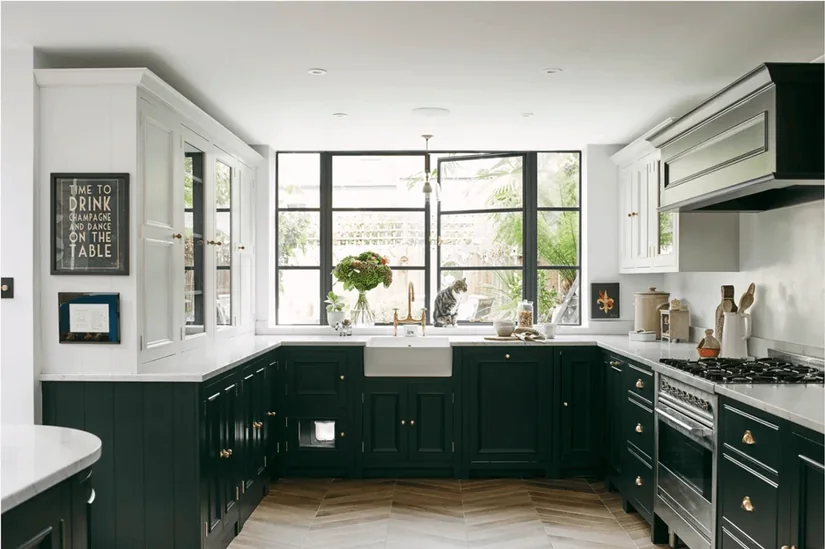
Compare matte and gloss in the orientation the cabinet doors will actually use. When I asked our designers how they review finish samples, they confirmed that each one should be held upright and moved through the kitchen’s real lighting.
Gloss shows more defined highlights, while matte softens them, but neither is automatically easier to maintain. Check the manufacturer’s care guidance first. Then view both samples at eye level from the entrance and work zone before choosing the finish.
17. Try Pistachio If Every Sage Green Looks Too Grey
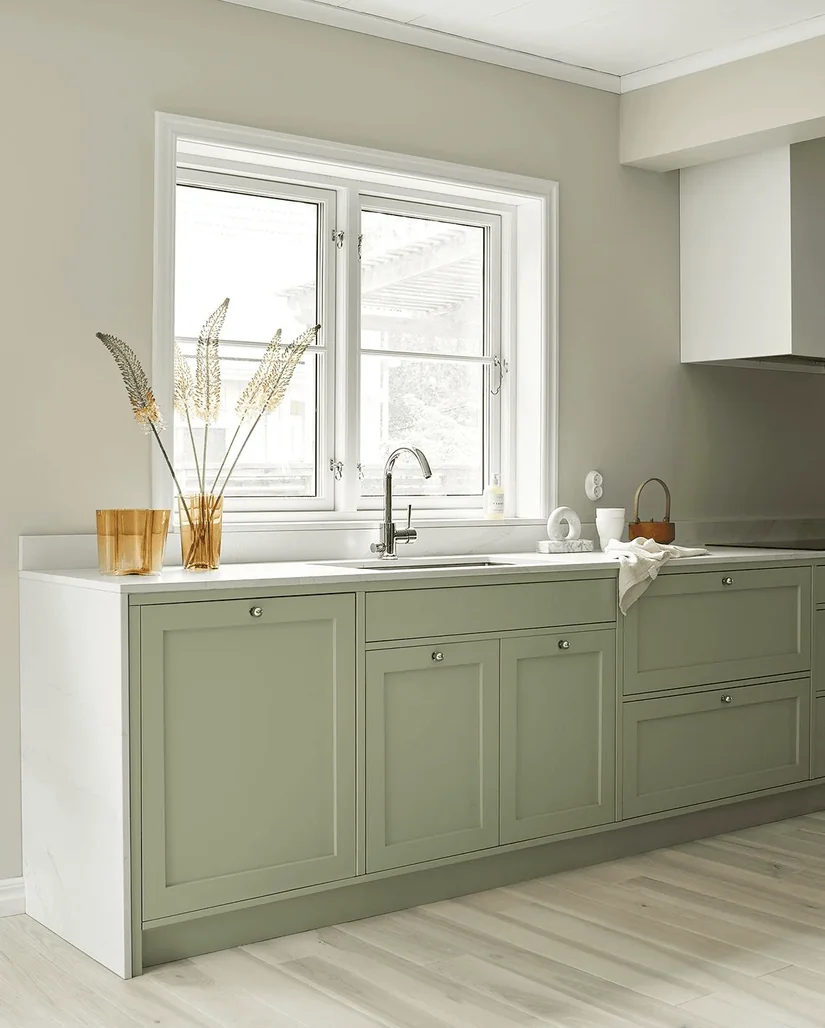
Pistachio is not a better sage. It answers a different colour preference. In the samples I compared, pistachio had a clearer yellow-green presence, while many of the sage options were greyer and more muted. The labels alone did not describe those differences reliably.
Put pistachio, sage, cream, timber and stainless steel on one board. If pistachio still feels clearer under the kitchen lights, you have evidence that the muted green family, rather than green itself, was the problem.
18. Pair Mint With Stainless Steel For A Cleaner Modern Look
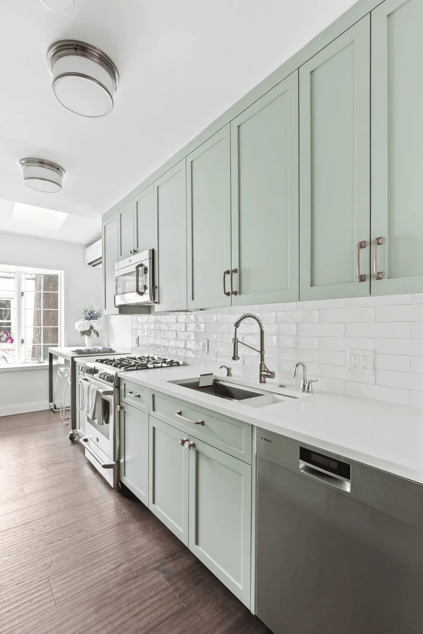
Mint does not create a vintage kitchen on its own. When our designers were checking these mint examples, the period impression came from the complete combination of cabinet profile, appliance style, hardware and neighbouring colours.
Pair mint with restrained cabinet fronts, stainless steel and minimal hardware. Then remove the decorative pastels before judging it. If the permanent materials still read as modern, the mint was not what created the retro association.
19. Use Khaki Green When You Want The Materials To Stand Out More
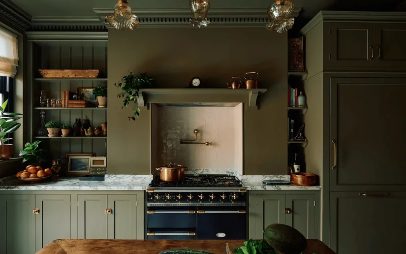
Khaki can act as a quieter green, but I would not claim that it automatically allows the stone and timber to lead. Place it beside the exact warm stone, wood and metal you plan to use, then compare it with one more saturated green.
If your attention returns to the grain or veining first, the khaki is doing the quieter job you wanted. The side-by-side comparison is the proof, not the colour name.
20. Use Crisp White When You Want The Green To Look Sharper
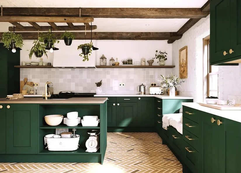
Crisp white can separate green more strongly than cream because the lightness difference is often greater. The effect still depends on the flooring, worktop and lighting.
Build two small palettes using the same green and permanent materials, changing only the white. Photograph both from the same position under the same light. Choose the version that creates the intended contrast without making the white feel disconnected from the rest of the kitchen.
21. Compare The Green And Wood Undertones Together
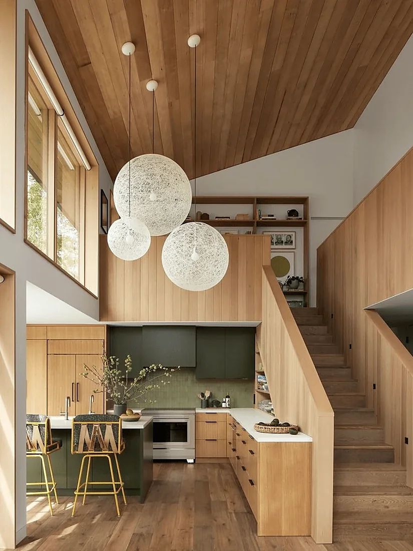
Saying “green works with wood” does not tell you enough. Olive beside walnut, sage beside pale oak, and blue-green beside smoked timber all create different results.
While reviewing material boards with our designers, I learnt that the shade name becomes less useful once the real timber is present. The same green can read differently beside pale oak, walnut or smoked wood because each changes its surrounding colour context.
Place the wood beside the cabinet sample. Does the green feel connected to it or oddly separate? Use that answer before deciding you simply need a “sage” or “olive” kitchen.
22. Use A Pale Worktop When Deep Green Kitchen Cabinets Already Feel Strong
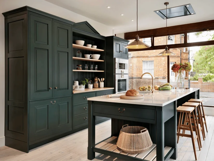
In a deep green kitchen, the cabinets already cover a large area, so a lighter countertop can add contrast without taking away the green you wanted.
And no, the worktop does not have to be bright white. Warm pale stone, softly veined quartz, and light marble can all look different beside deep green. Our guide to kitchen countertop materials can help you compare those surfaces when the options start blending together.
Once you narrow them down, place the worktop and cabinet samples side by side. They will be seen together every day, so judge them together too.
23. Let One Pattern Lead The Kitchen
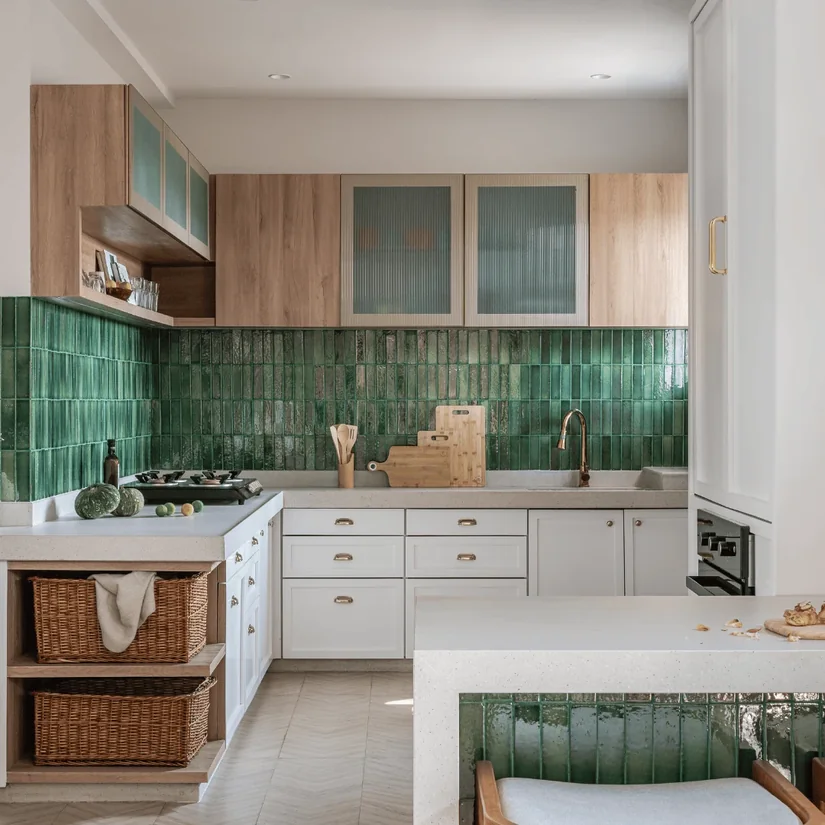
Bold marble, Shaker cabinets, patterned tiles, and decorative hardware can all look good separately. Put them together, and the green kitchen may suddenly feel too busy.
Cover the patterned tile or stone sample for a moment and look at the palette again.
If the green suddenly feels easier to live with, the cabinet colour may never have been the problem. Too many surfaces were competing. Keep one strong pattern and make the others quieter.
24. Choose Brass Only When The Kitchen Needs More Warmth
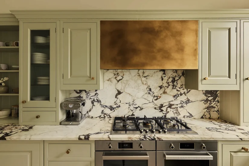
If the green cabinets and stone lean cool, brass can add the warmth the green kitchen is missing. But when the palette already feels clean and modern, nickel or stainless steel may sit more naturally with it.
So, how do you choose? Put brass and one cooler metal beside the green and stone samples, and look at the full combination. Which finish actually improves it? That answer is more useful than choosing brass simply because green and gold are often paired together.
25. Add Black Through Small Details Before Using A Large Black Surface
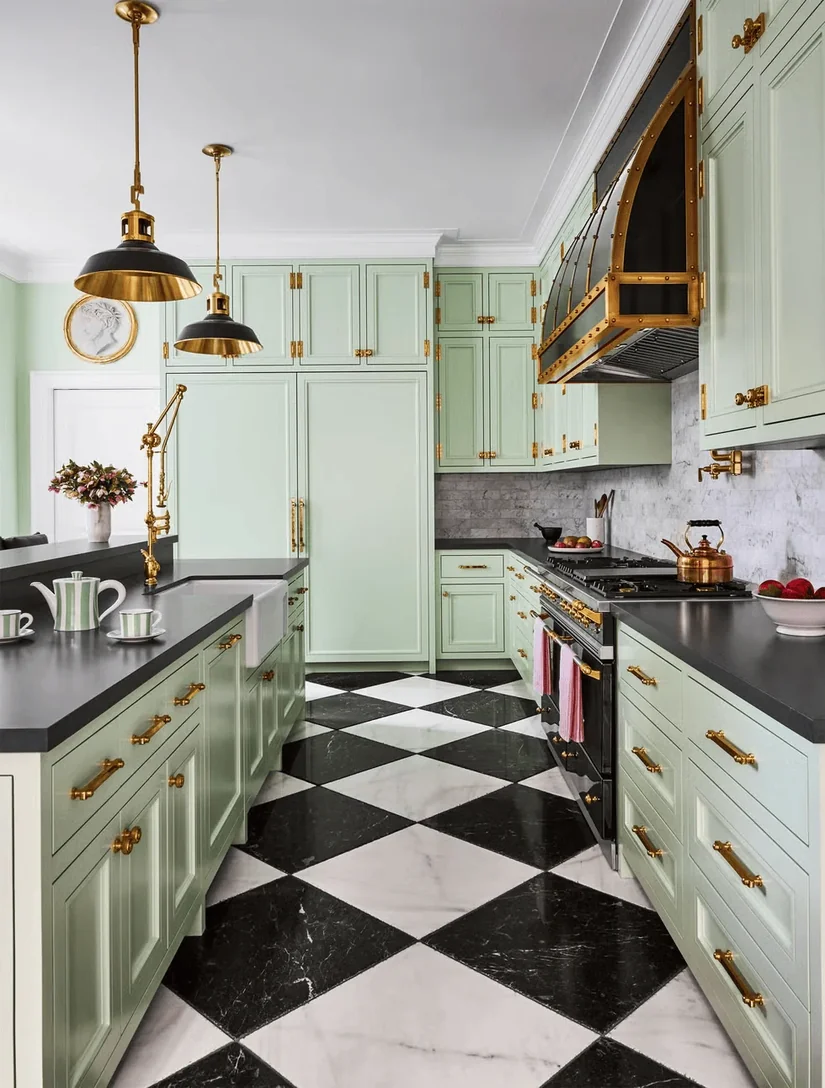
Use black through handles, a slim tap, pendant details, or window frames before adding another large dark surface.
A dark green kitchen may already have enough visual weight without a broad black worktop and black backsplash, too.
Mark every black area in the planned kitchen. If the room starts feeling heavy, remove one of the larger dark surfaces first. Thin black details may give you enough contrast on their own.
26. Use Stainless Steel To Make An Olive Green Kitchen Feel More Contemporary
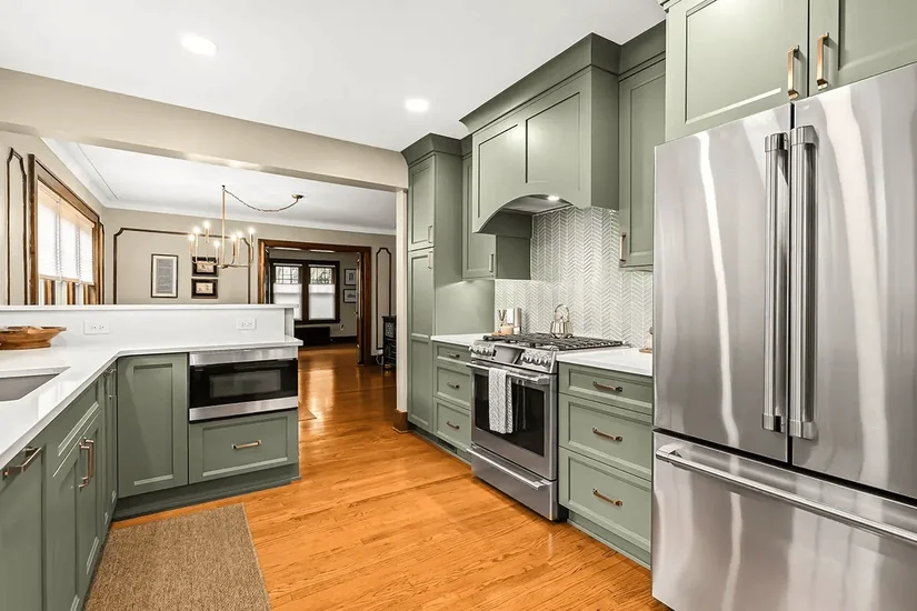
Olive green does not automatically need rustic styling. Stainless steel appliances, a work surface, or a simple metal backsplash detail can pull an olive green kitchen towards a cleaner, contemporary look.
Do not start adding rustic decor simply because the cabinets are olive. Look at the cabinet shape, stone, timber, and metal first.
The same olive green can feel very different depending on the materials surrounding it.
27. Break Up Olive And Terracotta With A Lighter Surface
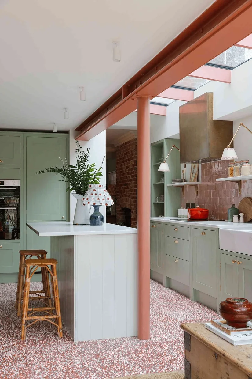
Olive or moss green with terracotta creates a warm, earth-led green kitchen.
The combination can become heavy when terracotta flooring, green cabinetry, and warm timber all cover large areas.
Count how many large surfaces are already warm. If several dominate the room, add cream, pale stone, or soft plaster to give the eye a lighter break.
The goal is to keep the warmth without making every major surface equally strong.
28. Match The Softness Of Pink To The Green
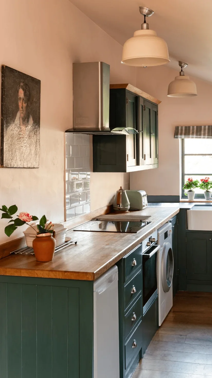
Dusty or plaster pink can soften a muted green kitchen through one wall, a small tiled area, or a stool.
A soft pink beside muted green creates a quieter colour combination. Bright pink beside murky olive creates a much stronger contrast.
The mood you want decides which level of contrast makes sense.
Put the colours together and compare how strong each one feels. “Pink and green” alone tells you very little about the finished kitchen.
29. Decide If The Blue Undertone Is Wrong Or Simply Unexpected
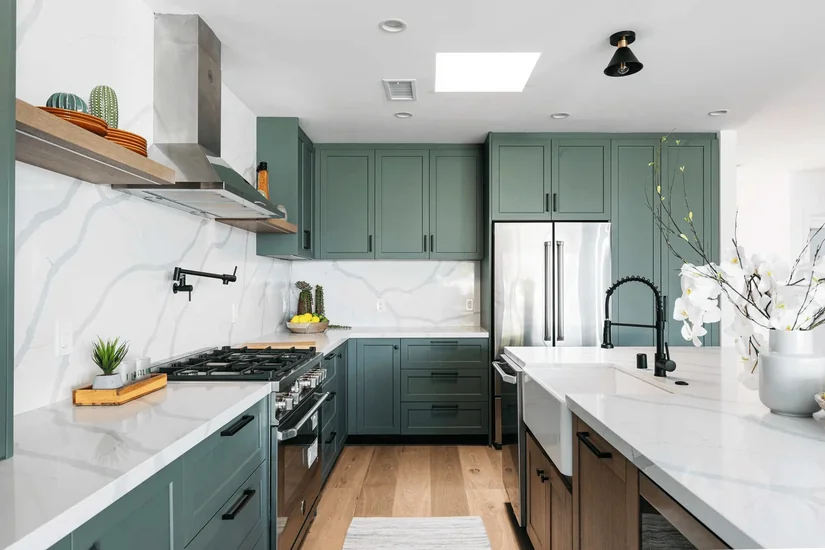
Your green kitchen paint colour keeps looking blue. Does that mean the shade is wrong?
Not always. If you like the cooler direction, continue it with navy, dusty blue, or blue-grey instead of forcing warm materials into every surface.
If you genuinely dislike the blue undertone, stop trying to convince yourself it will improve later.
Work out if the colour is actually wrong for you or simply different from what you expected.
30. Give Mustard Or Ochre One Clear Place In The Kitchen
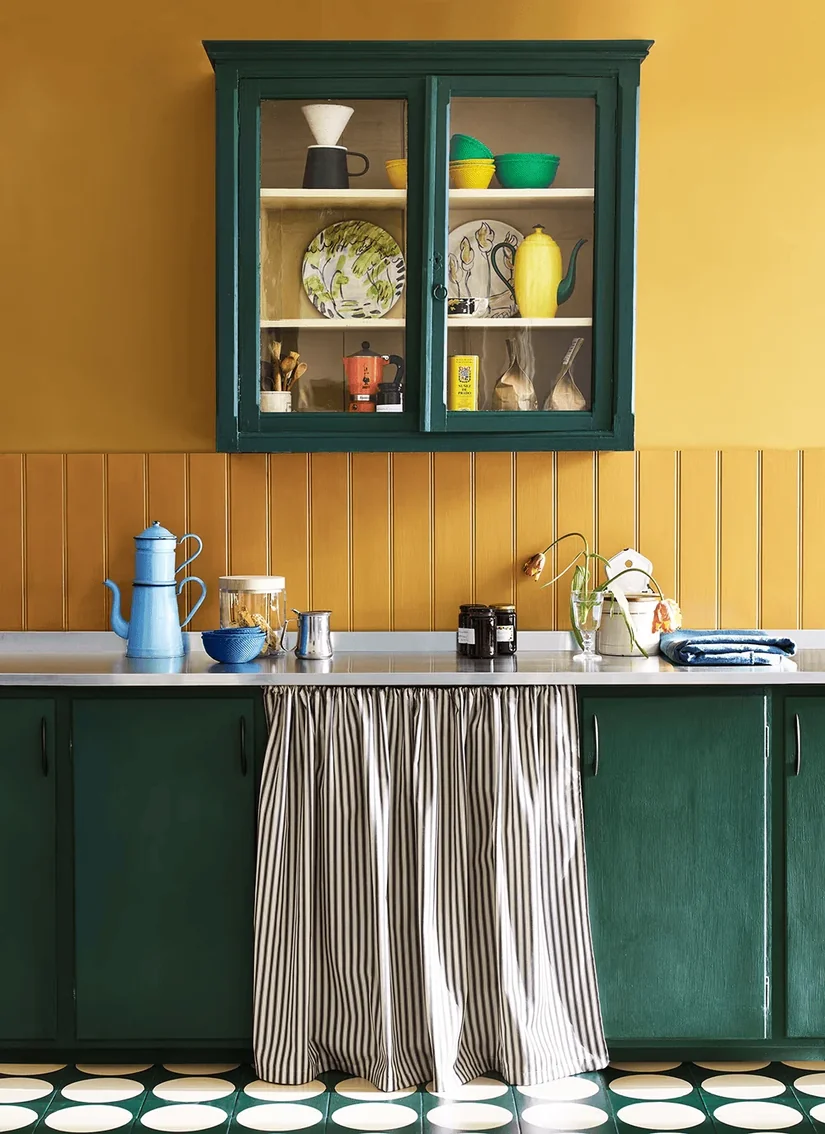
Mustard or ochre can warm up muted green, but it does not need to appear everywhere. Use it through one stool, artwork, textile, or decorative object.
For example, if the mustard belongs on the stools, leave it there. It does not need to appear on the kettle, wall art, and tea towels.
Give the secondary colour one job. This keeps the green kitchen decor from turning into a repeated colour theme.
31. Use Three Greens That Are Clearly Light, Medium, And Dark
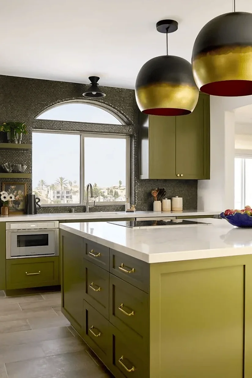
A tonal green kitchen is easier to read as intentional when the shades are clearly separated in lightness.
Use one deep green, one medium green, and one pale green.
Line the samples up from darkest to lightest. If the middle shade is difficult to place between the other two, the colours are probably too similar.
Three nearly identical sage tones may appear to be an attempted match that did not quite align. Clear differences make the layering look intentional.
32. Pair Detailed Green Tiles With Simpler Kitchen Cabinets
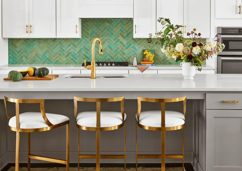
Small square or handmade-look green tiles already bring detail through grout lines, reflections, and slight changes across the surface.
Now put them beside a heavily detailed cabinet door. Does the kitchen still need both?
Simpler cabinet fronts can give textured green tiles more room to stand out. When comparing tile, stone, mosaic, and other kitchen backsplash ideas, look at how much detail each surface adds.
Hold a full tile sheet beside the cabinet door. The tile pattern and door detailing need to work together, not look good only on separate samples.
33. Check The Full Stone Slab Before Using It On The Backsplash
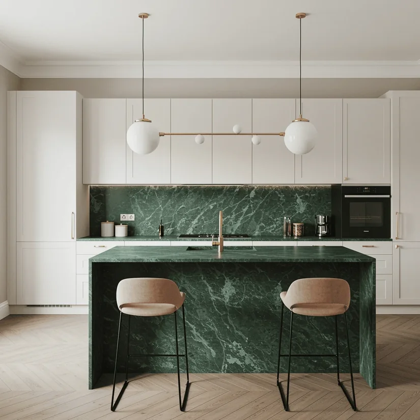
The Natural Stone Institute’s stone-selection guidance includes samples and mock-ups among the considerations for evaluating natural stone. That matters here because a small chip cannot show the distribution of veining across the slab section that will sit at eye level.
Check more than a small stone sample because the full slab may contain far more movement or much less green veining than the section you first liked.
Look at the actual slab area intended for the backsplash where possible. The material name cannot tell you which veins will end up at eye level.
34. Let A Green Stone Island Be The Main Green Feature
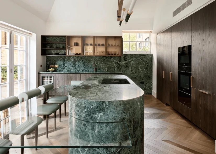
A green marble or strongly veined stone island already brings colour and pattern into the kitchen.
It may not need green stools, ceramics and a matching pendant as well.
Remove the matching green accessories and look at the island again.
If the stone already catches your attention, let it remain the main green feature. Repeating the same colour everywhere can weaken the impact rather than strengthen it.
35. Paint The Walls Green If The Existing Cabinets Still Work
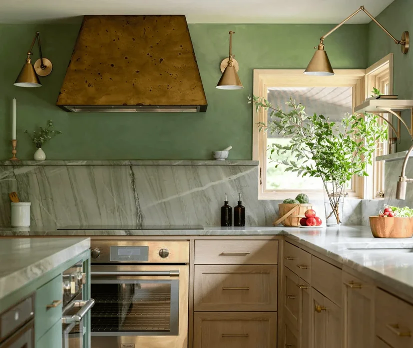
Are the cabinets actually the problem? If your timber, cream, or neutral cabinets are still in good condition, green wall paint can give you a green kitchen without replacing the doors.
Check how much wall will actually remain visible because a narrow strip above the backsplash carries far less green than one large uninterrupted wall.
Map the visible wall area first. The amount of green you will see may change how pale or deep the shade needs to be.
36. Check How Much Of A Green Kitchen Ceiling You Can Actually See
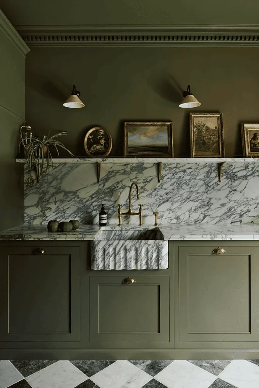
A pale or muted green ceiling can add colour above neutral cabinets without changing anything below eye level.
Do not assume the effect based on a small ceiling sample.
Check the ceiling height, light fixtures, and views from adjoining spaces. Then stand outside the kitchen and look back.
How much of the ceiling is actually visible? A colour covering a ceiling you barely see will behave very differently from one visible across an open-plan room.
37. Let A Green Appliance Stand Apart Instead Of Trying To Match It
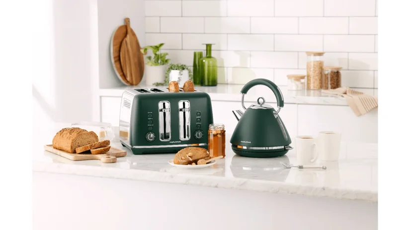
A green cooker, range, or refrigerator can become the main colour feature in the kitchen.
Do not automatically try to match the cabinet colour to it.
Put two almost-identical greens together, and every small difference becomes more noticeable. A clear contrast may look more intentional than a near match that never quite aligns.
Place the appliance finish beside the cabinet sample before ordering the cabinetry.
38. Test Green Inside Glass Cabinets With The Objects You Will Display
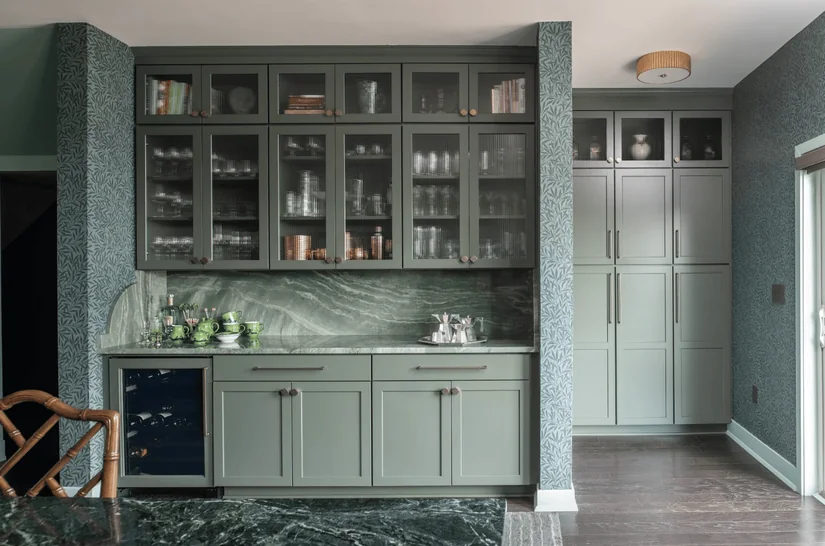
Green behind glass cabinet doors or open shelving gives you a smaller, framed area of colour.
A deeper green background can also make pale ceramics and clear glassware stand out more clearly.
Do not judge the cabinet while it is empty.
Place the objects you plan to display inside it first. The shelves, ceramics, and glass may cover enough of the green to change how strong the colour feels.
39. Use Green Decor To Test Your Colour Preference, Not To Copy Green Cabinets
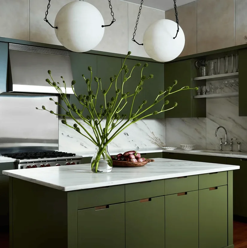
Use one or two green pieces large enough to judge the hue, such as a stool, pendant or substantial piece of cookware, rather than scattering many small accessories across the room.
This can tell you if you enjoy seeing that colour family in the kitchen. It cannot reproduce the scale of twenty cabinet doors, so treat it as an early preference test and still use a large cabinet sample before committing.
40. Use Simpler Cabinet Fronts For A Cleaner Modern Green Kitchen
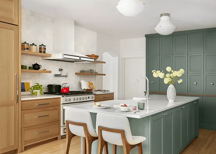
Simple slab or restrained cabinet fronts allow the green itself to stand out without another layer of door detailing. Integrated appliances, simpler hardware, and cleaner worktop lines can continue the same modern direction.
So, where should the modern look come from? If the cabinet shape is already clean and simple, you may not need to add more decorative details to make the kitchen feel contemporary. Our modern kitchen design ideas show how form, materials, and finishes can shape different modern kitchens.
Let one clear direction guide the remaining choices instead of asking every feature to prove the kitchen is modern.
Our simple kitchen design guide covers that pared back approach.
41. Choose Two Traditional Details Instead Of Using Every Traditional Feature
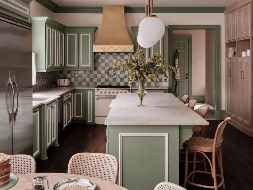
Shaker green cabinets, timber, warm stone, and aged metal already communicate a traditional kitchen clearly.
The traditional character is visible, so every other surface does not need to repeat it.
Choose the two features that carry the style most strongly. For example, keep the Shaker cabinets and aged handles, then use a quieter backsplash.
Too many ornate details can make a green kitchen feel crowded rather than traditional.
42. Put Green On One Cabinet Wall In A Small Kitchen
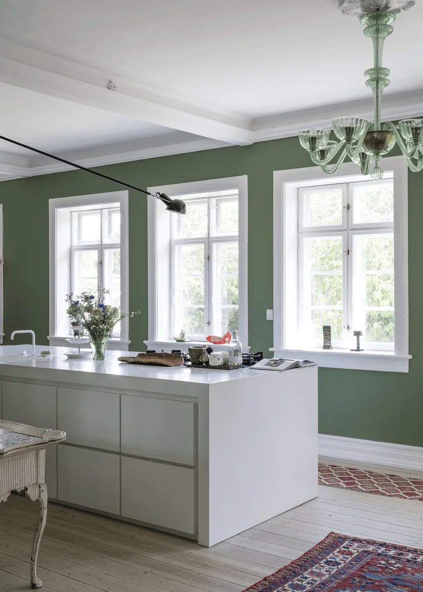
What green is best for a small kitchen? Sometimes the better question is how much green you need.
In a small green kitchen, one painted cabinet wall can create a clear focal point while the other surfaces remain lighter.
Dark green is not automatically excluded.
Look at the cabinetry you see first when entering the room. Concentrating green there may work better than endlessly searching for the palest possible sage.
43. Fix The Kitchen Lighting Before Blaming The Green
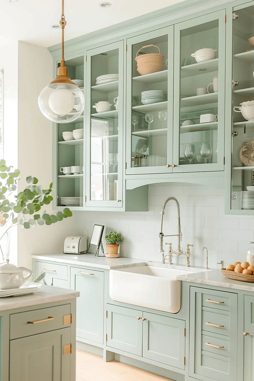
Some people replace deep green with pale sage because their green kitchen feels dim, even when the lighting and colour are separate problems.
Switch on the lights you actually use while cooking, and look at the green from the worktop.
Still too heavy? Then question the colour.
But if the work surfaces remain poorly lit, a paler cabinet shade is being asked to solve a lighting problem. Fix the useful light first, then judge the green again.
44. Repeat The Green Once In The Living Or Dining Area
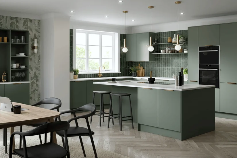
An open-plan kitchen is judged from the living or dining area as often as it is from the worktop. Our The Next Chapter project presents the dining and kitchen under one design philosophy, which is a useful reminder to check a green kitchen from adjoining rooms.
Repeat green once only when that wider view needs a connection, perhaps through dining upholstery or artwork. Then stop. The aim is continuity, not turning the entire open plan into a matching green scheme.
45. Use The Deepest Green On One Tall Cabinet Wall
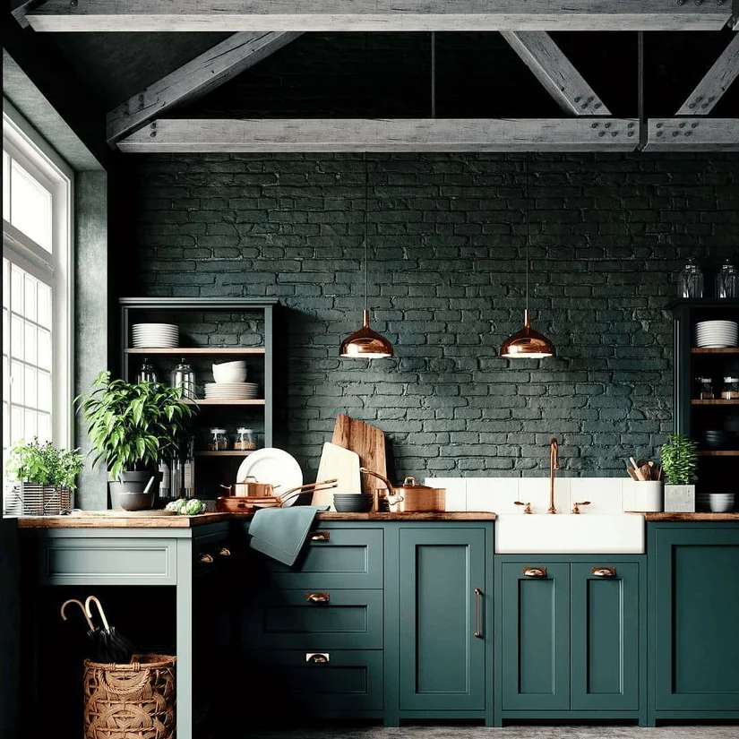
Deep green can be concentrated on a pantry or appliance wall so the worktop zone remains lighter, but this is an option rather than a rule. When I reviewed tall-unit schemes with our designers, the useful check was the view from the entrance: one dark block often read more clearly than separate dark cabinets scattered around the room.
Mark both versions on the elevation and compare them before fixing the boundary of the green.
The Green Kitchen You Will Second-Guess Least Is The One You Test Properly
After taking the recurring questions in this list back to our designers, the most consistent answer was a process rather than a named green: test the complete material set under the actual lighting and from every room that sees the kitchen.
Sage, olive and forest green can all work, but the shortlist only becomes meaningful once you consider the fixed flooring, worktop, cabinet area, undertone and balance of light and dark surfaces. Before approving a permanent finish, place the cabinet, flooring, worktop and backsplash samples together inside the kitchen. Judge them as one palette rather than four separate purchases.
If your lighting, cabinetry, stone, and existing finishes keep pulling the colour decision in different directions, Euphoria Interiors can plan them as one kitchen rather than a series of separate choices.
Our kitchen interior design services bring the cabinetry, materials, layout, and wider design direction together before those permanent decisions are finalised.
For the finishing touches that lift the result, read how to make your kitchen look expensive.