Living & dining area
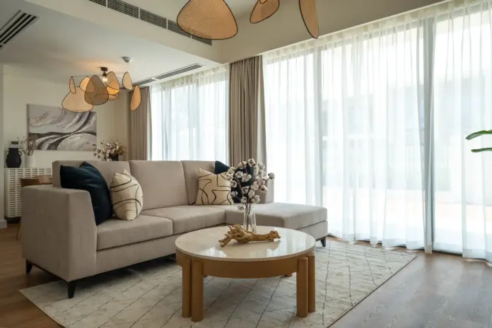
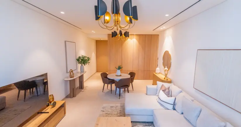
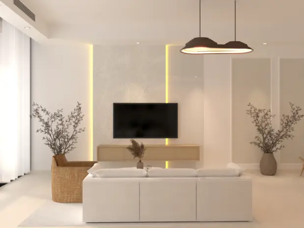
Open plan, one continuous languageAn open plan holding a cream three seater sofa, warm oak dining table with cream boucle chairs, layered cove lighting overhead and woven pendant lights throughout the space.
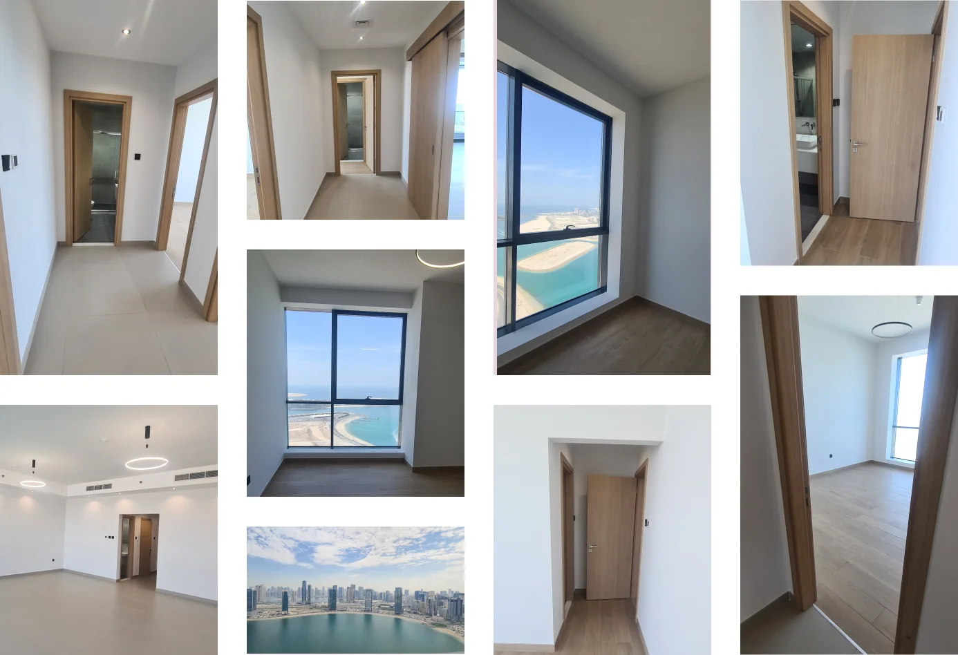
La Plage Residence is a 1700 sqft 3BHK Minimalist Coastal apartment in Al Mamzar, Sharjah, designed for a client who wanted a calm, uncluttered home where the sea light does the work colour usually does. The brief was Japandi inspired, a neutral palette with white as the primary base, warm wood tones running through the plan, and subtle green as the only accent.
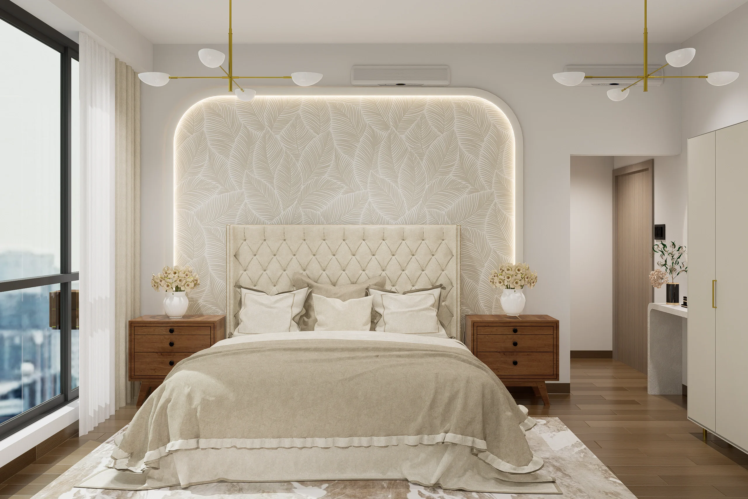
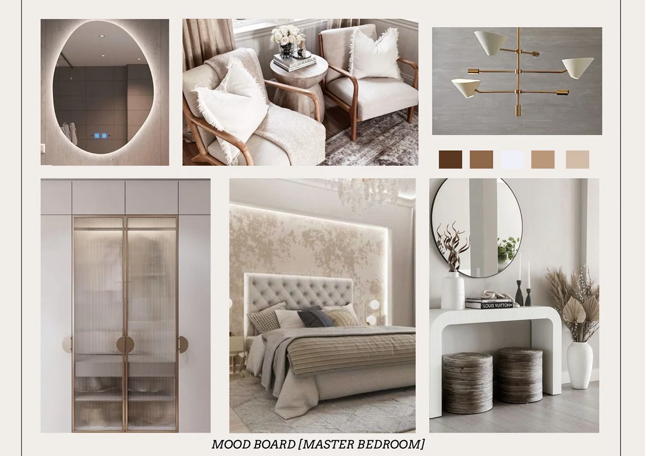
The living reads open and airy, framed by the beach facing daylight. The dining sits under considered pendant lighting with a single feature wall behind it. The master bedroom lifts into soft linens, macrame and rattan textures, giving the calm palette warmth up close.
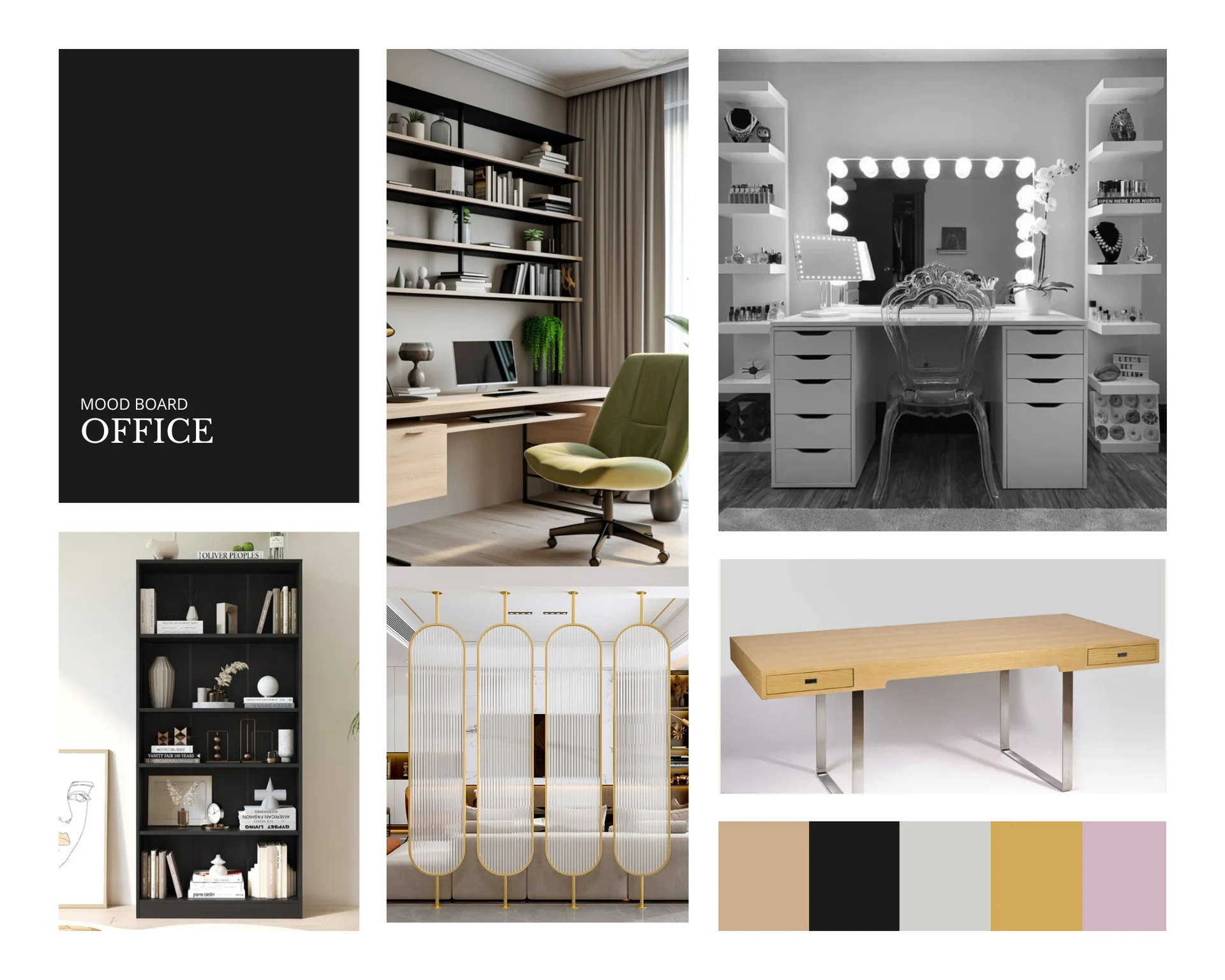
A dual purpose room holds a dressing and vanity area on one side and a workspace on the other, separated by a minimal modern divider rather than a built wall. Every space is planned to receive the coastal daylight as the main feature rather than to compete with it.

Why did they choose Euphoria Interiors for their apartment interior design?
An open plan holding a cream three seater sofa, warm oak dining table with cream boucle chairs, layered cove lighting overhead and woven pendant lights throughout the space.


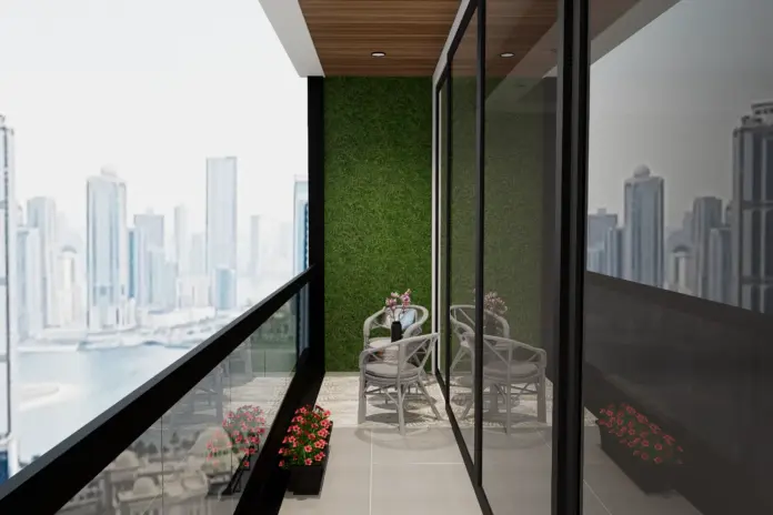
Two wicker armchairs and a small side table set against an artificial grass green wall backdrop, framed by floor to ceiling glass balustrade overlooking the Sharjah city skyline.
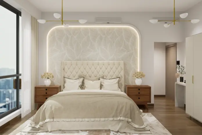
A cream tufted headboard against tropical leaf pattern arched feature wall with warm cove lighting, warm oak bedside tables, dual sputnik chandeliers and layered neutral bedding composition.


Warm oak veneered doors along a considered passage, a curved plaster console table styled with pampas grass, and a soft geometric patterned runner that carries the atmospheric register.


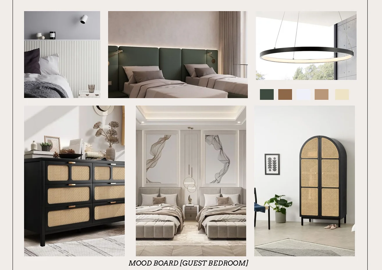
Twin beds under sage green accent throws, framed botanical art pair overhead inside arched cove lit niches, a black rattan dresser and modern ring pendant hanging overhead.


A dual workstation set against a warm plaster feature wall, vertical gold accent screen dividers, black gold ring pendant lighting overhead and considered vanity dresser composition alongside.


Soft sage green upper cabinetry with warm oak lower cabinetry, heavily veined marble backsplash carried across all working walls, integrated appliances and neutral tile flooring below throughout.

Studio profile
The brief arrived fully settled, which is rarer than it sounds and worth more than most clients realise. The client wanted a calm, minimal home inspired by Japandi discipline, dressed in a coastal palette that suits a beach facing apartment in Al Mamzar.
White as the primary base, warm wood tones running through the plan, subtle green as the only accent, and enough texture to keep the restraint warm rather than clinical. Clean, uncluttered and serene were the words used, and the request underneath them was for a home that promotes relaxation rather than one that performs it. In practice that meant three bedroom apartment design where nothing is added simply to fill a wall. One functional demand sat behind the aesthetic.
A single room had to hold two activities, a dressing and vanity area on one side and a working office on the other, without either half feeling squeezed in around the other. The office had to hold a creative practice, so it needed room for colour while the rest of the home stayed deliberately quiet.
It would be dishonest to describe this project as difficult. The client's vision was clear from the first conversation and it aligned closely with the direction the team wanted to take, which made decisions quick and approvals quicker. That is worth stating plainly rather than manufacturing drama for a case study.
The real challenge in a project like this one is different, and it is easy to underestimate. Minimalism removes the safety net. When a home carries pattern, colour and objects competing for attention, small errors disappear into the noise. When the palette is white with warm wood and a single accent, every proportion is visible. A rug that is fractionally too small reads as a mistake.
A wood tone half a shade off looks like an accident rather than a choice. Restraint is not a lighter workload, it is a narrower margin for error. The second challenge was functional. One room had to hold a dressing and vanity area and a working office at the same time, two activities with different light, storage and privacy needs, in a plan where adding a solid wall would have undone the openness the rest of the home depends on.
Euphoria Interiors treated the dual purpose room as a zoning question rather than a partitioning one. Instead of splitting it into two smaller rooms, the space was divided with a minimal modern divider, one half given to a dressing and vanity area and the other to a workspace.
The divider marks the change without closing either side off, so both halves keep the daylight and the room still reads as one volume. It is the most useful single move in the plan, and it came from asking what each activity actually needs rather than how many walls the room could absorb. The palette carried the rest. White as the base, warm wood for temperature, subtle green as the only accent, and coastal texture doing the work that colour usually does.
Woven rugs, soft linens, rattan and macrame placed where a room would otherwise feel bare, which is what keeps the minimalism warm instead of clinical. Sourcing stayed pragmatic. The furniture came from an accessible mix of suppliers rather than a single luxury route, which matters because it shows that a calm, considered home is not available at only one price point.










Creative Head

3D Lead

Project Coordinator

Quantity Estimator

Business Development Associate
Get your space designed,
without the stress.

Because true luxury isn’t just what you see —, it’s what you feel every day.
Coastal minimalism is a beach facing design language that trades the bright blue and stripe treatment for a calmer, neutral palette. White as the base, warm wood for temperature, subtle green as the only accent, and texture doing the work that colour usually does. Japandi is the discipline that shaped the plan underneath. From the Japanese side it takes restraint, clean lines and the idea that empty space is part of the design rather than a gap in it. From the Scandinavian side it takes soft wood tones and tactile fabrics that keep the calm feeling warm. The combination suits Al Mamzar because the sea light here is strong and generous, and a pared back palette lets that light behave as the main feature rather than compete with a busier scheme.
You zone it instead of dividing it. In this home the room was split into a dressing and vanity area on one side and a workspace on the other, separated by a minimal modern divider rather than a built wall. That keeps the natural light shared between both halves and keeps the room reading as a single space, which matters in an apartment where every wall you add makes the plan feel smaller. The two functions were then planned around what each genuinely needs. A vanity wants consistent light and storage within reach. A desk wants a clear surface, a defined edge and somewhere for work to sit unfinished without spilling into the rest of the room. Get those right and a shared room stops feeling like a compromise between two people.
It does when white is the only decision that gets made. Cold usually comes from a shortage of texture rather than a shortage of colour. At La Plage Residence the white base is warmed by natural wood in the entryway and carried through the plan, then softened by woven rugs, soft linens, rattan and macrame in the master bedroom. None of that changes the palette and all of it changes how the rooms feel to be in. The other factor is light temperature. Neutral coastal schemes tip clinical quickly under cool lighting and stay warm under something softer. If you are worried about a minimal home feeling unwelcoming, the answer is rarely to add colour. It is to add texture, tactile materials and lighting that behaves warmly against the sea light.
Clarity is what compresses a timeline. La Plage Residence covers 1700 sqft across a 3BHK layout in Al Mamzar, Sharjah, and the project ran to ten weeks from first drawing to handover because the client knew what they wanted and stayed confident about it. Approvals came back quickly, revisions stayed small, and nothing had to be redesigned because a settled decision was reopened weeks later. That is the part most people underestimate when they worry about a project overrunning. Timelines stretch on indecision far more often than on execution. The palette helped as well. A scheme built on white, warm wood and one accent carries fewer variables to resolve than a home running four colour directions at once, so each choice settles faster and the plan stays coherent while it moves.
The pieces that set the temperature, not the pieces that fill the floor. In a coastal minimal scheme the rug, the wood tones and the soft furnishings decide whether a room reads warm or bare, so they deserve resolving before anything decorative is considered. At La Plage Residence the furniture was sourced from an accessible mix of suppliers rather than one luxury route, which is a useful reminder that restraint is a design decision and not a compromise. After that, buy for the light. A beach facing home receives strong daylight that shows every finish honestly, so a material that looked convincing in a showroom under warm spotlights deserves a second look in the actual room before you commit to it.
 Villa interior design service
 Penthouse interior design service
 Townhouse interior design service
 Duplex interior design service
 Studio interior design service
 One bedroom villa interior design service
 Two bedroom villa interior design service
 Three bedroom villa interior design service
 Four bedroom villa interior design service
Areas we serve across Dubai