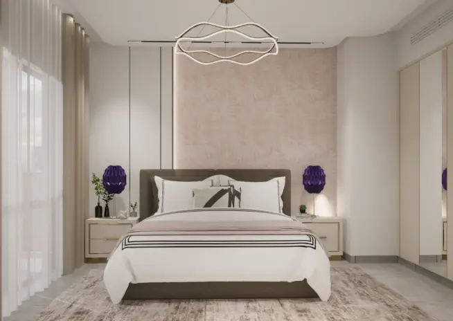
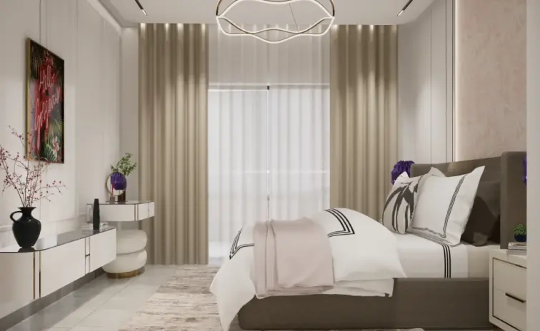
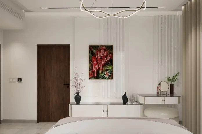
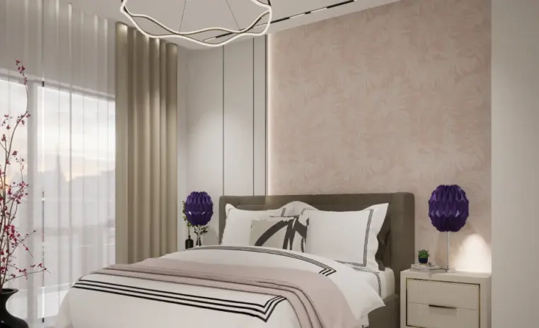
Master bedroom
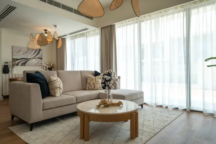
The counterweight to everywhere elseA textured wall behind a taupe bed, a mirrored wardrobe shutter pushing light back, and the purple faceted lamps the client kept. Neutral by design, not by default.
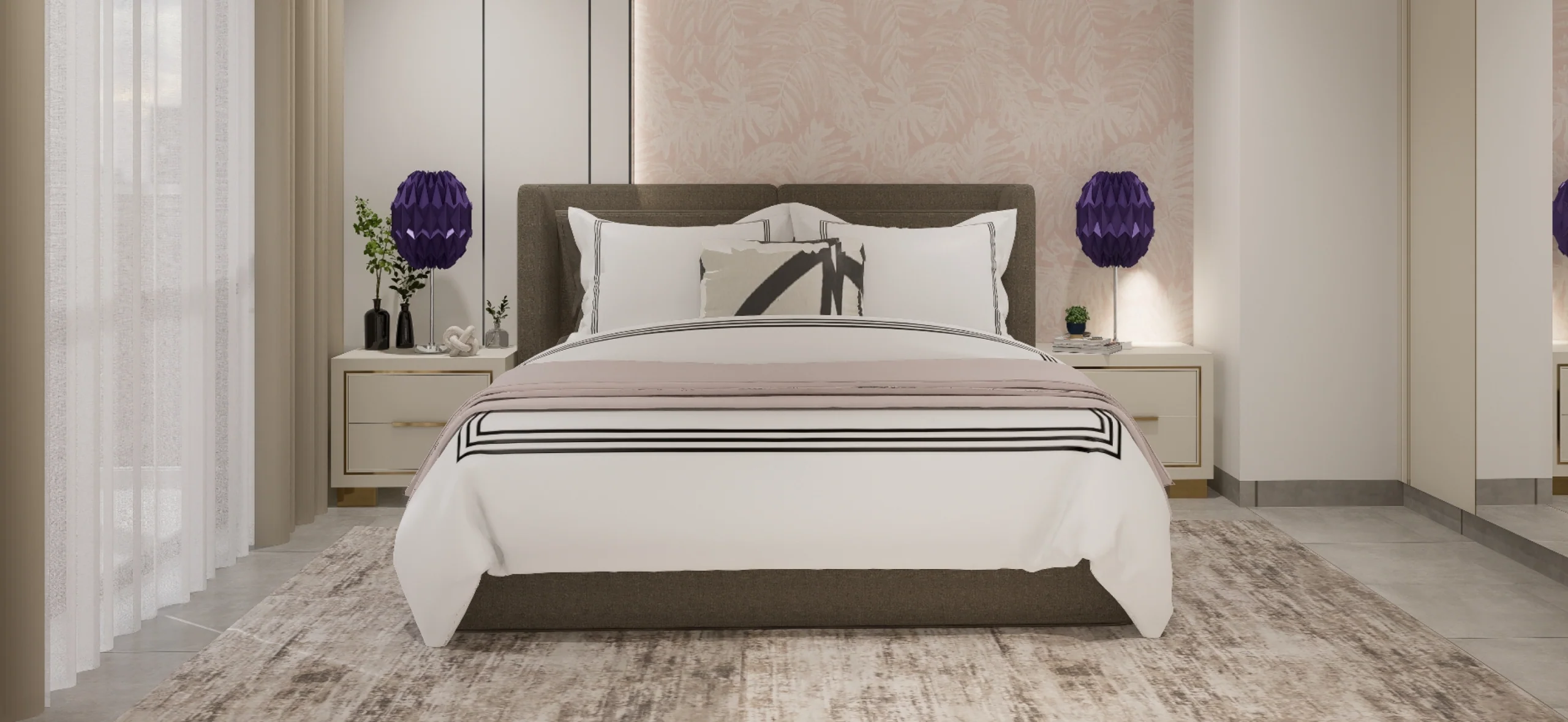
Casa Loca is a 1410 sqft 3BHK Modern Neo-Classical apartment in Al Furjan, Dubai, redesigned to hold both personality and calm inside one home. The client kept selected existing furniture, lamps and wallpaper, so the brief was less about starting again and more about editing. Every room got its own answer rather than one rule applied to all four zones.
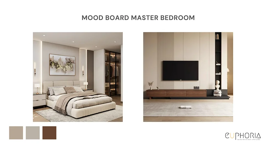
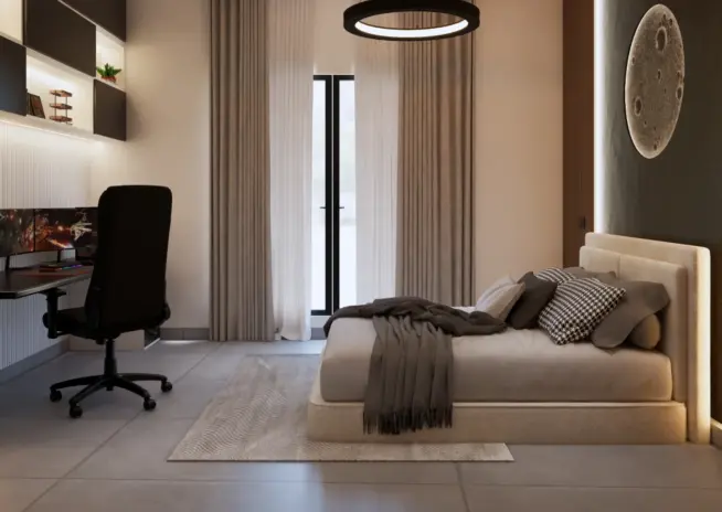
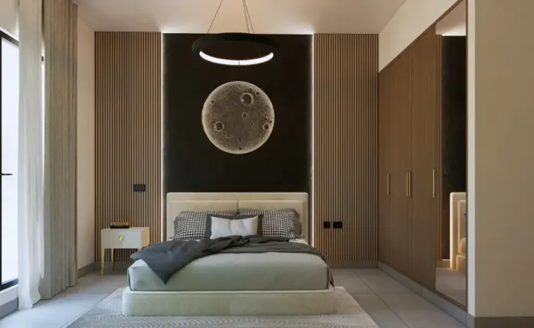
The kids bedroom takes a dark palette and lets layered lighting keep the room from closing in. The corridor was simplified to let the existing wallpaper sit against subtle mouldings without either competing. The master bedroom stays neutral so the bolder rooms elsewhere feel intentional rather than relentless. The smallest bedroom was repurposed as a family lounge, planned around the L shaped sofa that was already owned. The kitchen kept its walls but gained a redesigned counter, a marble top with sparkle detail, refreshed backsplash and high gloss shutters, delivering the kind of restrained modern kitchen upgrade that improves function without requiring construction.

Why they choose Euphoria Interiors for 3BHK design?
A textured wall behind a taupe bed, a mirrored wardrobe shutter pushing light back, and the purple faceted lamps the client kept. Neutral by design, not by default.
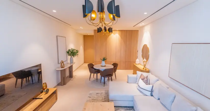
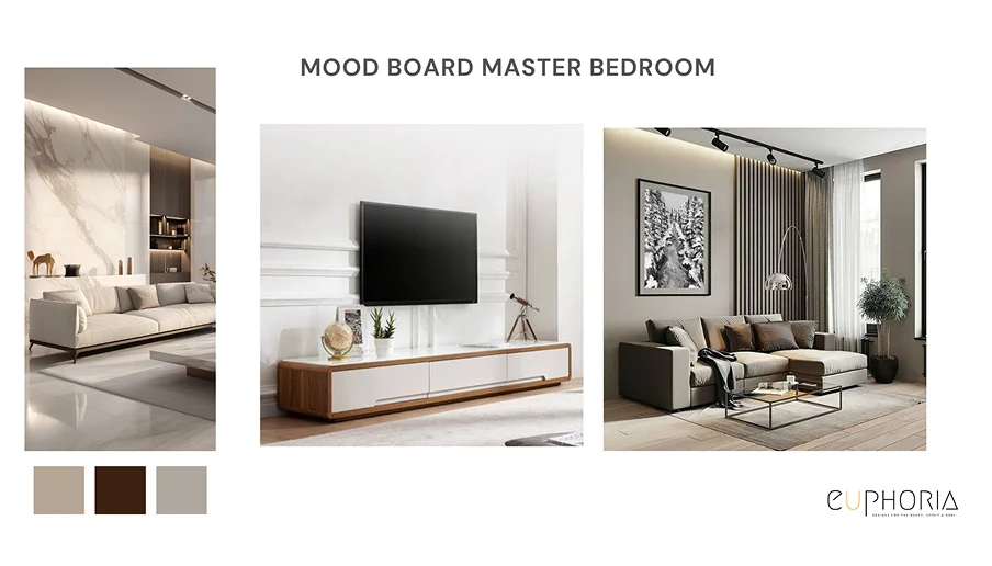
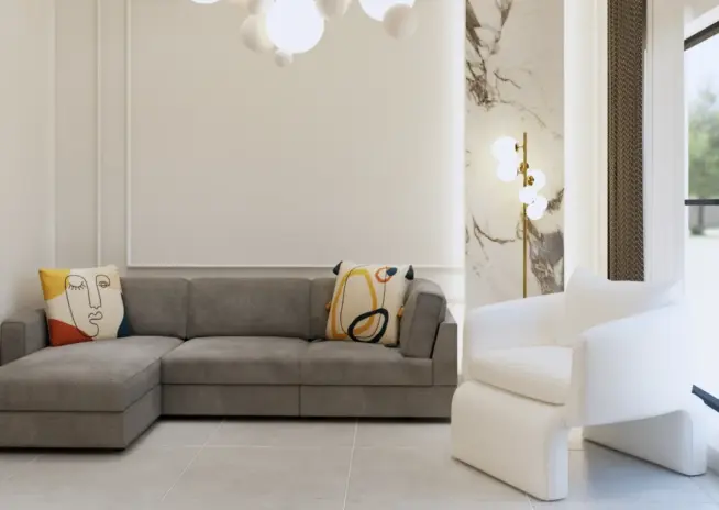
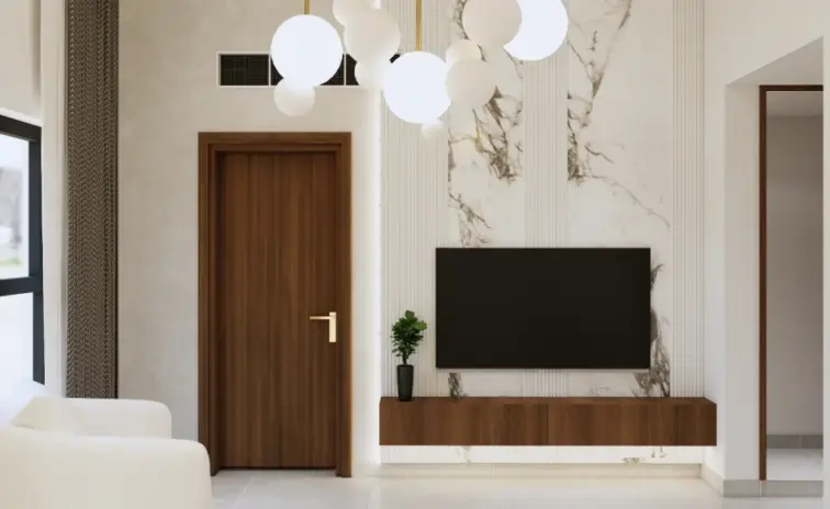
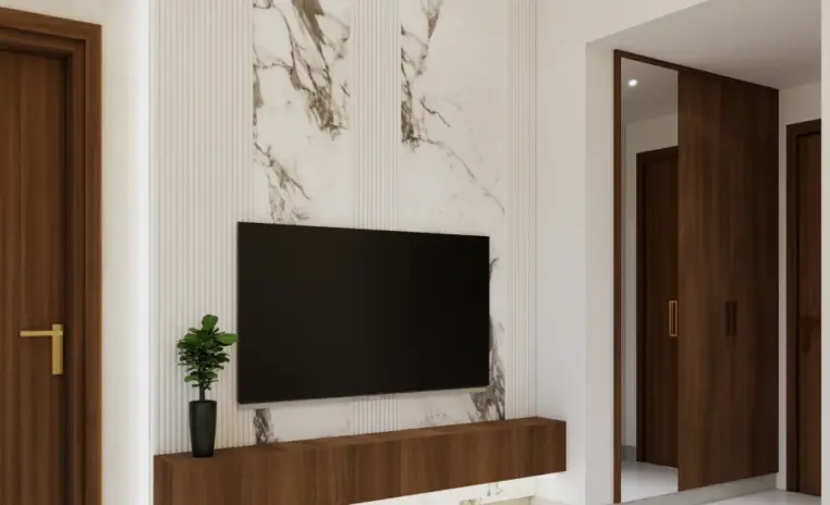
Fluted panels give the neo classical line, a marble pier closes one end, a curved chair softens it. The retained L shaped sofa sets the room's proportion.

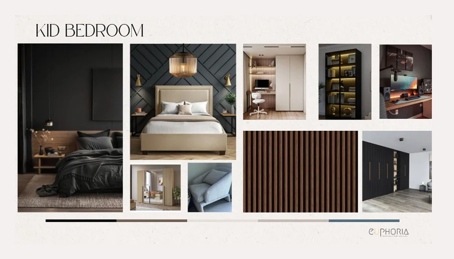
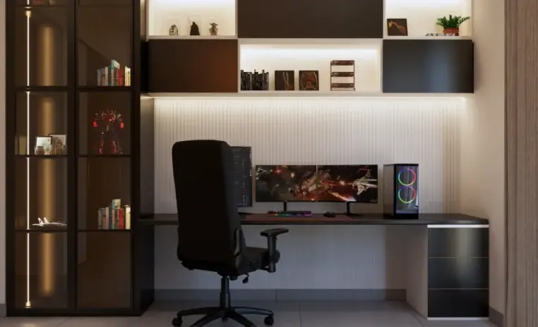
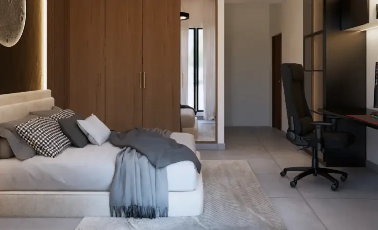
Layered lighting, softer internal finishes and an illuminated moon set into the dark wall keep the depth without letting the room press down. The palette earns its own room.
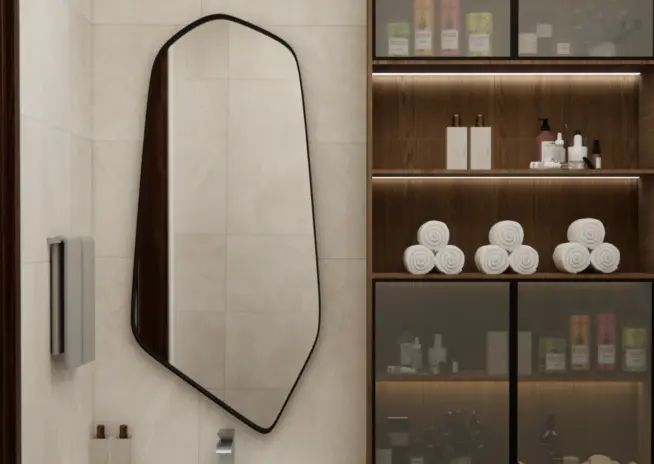
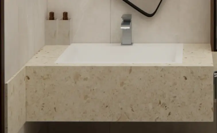
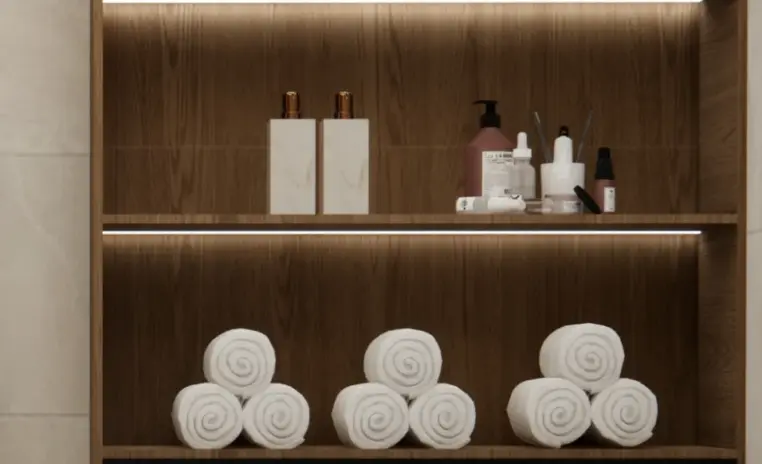
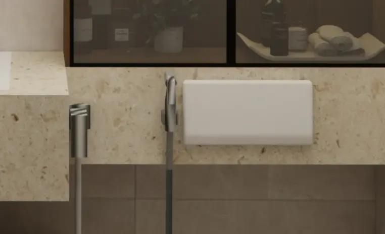
The dark theme extends into the washroom without repeating itself. Textured tile, warm brass fittings and considered lighting keep the small footprint feeling intentional rather than closed in.
3D Walkthrough
Studio profile
The brief asked for a more functional and refined home and, underneath the wording, for permission to keep being themselves. The client has distinct taste, dramatic leanings, quirky accessories and strong colour, and was not looking to be talked out of it.
There was also clarity that the apartment should feel cohesive, elegant and practical rather than like a collection of statements sitting in three bedrooms. Selected existing pieces had to be integrated rather than replaced, including wallpapers, lamps and furniture already chosen by the client. The kitchen needed better usability inside the same walls.
Storage had to be smarter, and rooms had to be able to do more than one job. Subtle luxury finishes were wanted, but bold accents were not to be sanded off in the process. Taken as a 3 bedroom apartment interior design , the real request was curation. Keep the personality, remove the noise, and make 1410 sqft hold both.
Every decision on this project sat on the same fault line, between the client's love of bold, funky elements and their wish for a clean contemporary home. That tension does not resolve once at concept stage. It reappears in every room, and each time it has to be settled again with a different answer. The kids bedroom was the clearest example.
A dominant black theme was requested and also the fastest route to a room that feels like a cave, particularly in a bedroom that has to work for study and sleep as well as active daily use. The corridor carried the opposite problem. The panelling proposed for it was visually heavy, and a corridor is somewhere you pass through rather than sit in, so anything demanding there quickly becomes tiring. Existing wallpapers, lamps and furniture had to be integrated into a new design language rather than replaced, which limits the palette before it is chosen.
The kitchen was constrained by its own walls, since better function was expected without structural change. And every room needed its own identity while still belonging to one apartment, which is the balance that usually breaks in a home where each space is designed separately.
Euphoria Interiorsanswered each room in its own currency rather than applying one rule across the apartment. In the kids bedroom the black stayed and light did the correcting, layered sources including neon accents, softer internal finishes and statement artwork, so the room holds depth without pressing down on it.
The corridor went the other way and was simplified until the existing wallpaper could sit against subtle mouldings without either of them competing. The master bedroom became the counterweight. A neutral palette and a small number of curated pieces give the apartment somewhere genuinely calm, which is what makes the bolder rooms readable rather than relentless.
Space planning did the rest. The smallest bedroom was repurposed as a family lounge, planned around the L shaped sofa the client already owned, which turned an underused room into the one used most. In the kitchen the counter was extended and the layout adjusted so casual seating became possible inside the existing walls, with a black marble top, a refreshed backsplash and high gloss shutters carrying the finish. Not everything survived. The idea of camouflaging the door beside the lounge television was dropped in favour of a simpler answer, and some bolder preferences were moderated to keep the apartment breathing.









Creative Head

3D Lead

Project Coordinator
Quantity Estimator
Client Happiness Associate
Get your space designed,
without the stress.

Because true luxury isn’t just what you see —, it’s what you feel every day.
By giving the boldness a room to live in and giving the apartment somewhere to rest. At Casa Loca the kids room, the corridor and the kitchen carry the strong moves, and the master bedroom deliberately does not. That contrast is what lets the expressive spaces read as choices rather than as noise. The second rule is that only one element per room is allowed to shout. In the kids room it is the dark textured wall with its lit artwork, so the furniture stays soft and neutral. Chaos in a home is rarely caused by bold taste. It is caused by three bold ideas competing for attention inside the same four walls.
Keep them when they carry meaning or still perform, and be honest when they do not. This apartment retained wallpapers, lamps and furniture already chosen by the client, including an L shaped sofa substantial enough to dictate a room's layout. The gain is not only practical. A home built entirely from new purchases tends to feel like a showroom, because nothing in it has any history. The cost is freedom, since retained pieces cannot be adjusted and the new palette has to accommodate them. That trade is worth taking when the retained pieces are strong ones, and worth refusing when they are only comfortable ones. Getting the decision right on each individual piece early in a redesign is what separates a coherent home from one that looks like a compromise, because the new elements are then chosen to sit beside what stays rather than to overwrite it.
With light, texture and one thing worth looking at. Black absorbs light rather than reflecting it, so a room finished in it needs more sources than a pale room and needs them at different heights. Here that means a ring light overhead, warm strips under the shelving, task light at the activity desk and an illuminated moon set into the dark wall, which gives the eye a focal point and a reason for the darkness. Softer internal finishes matter too, because a dark room with hard surfaces reads as cold rather than moody. Textiles, throw cushions and a rug all soften the palette without adding colour. The result is a kids bedroom that carries the dark theme the client wanted but stays a room worth being in for a full day rather than one that starts to press down after an hour.
In a 1410 sqft three bedroom apartment, the smallest bedroom is often the least used square footage in the home. Converting it into a family lounge turns a room that hosts guests a few nights a year into one the household uses daily, which is a better return on that floor area than almost any other change. Here the conversion was planned around the L shaped sofa already in the home, so the room cost less than it would have as a bedroom refit. The trade is real and worth stating. The apartment loses a guest bedroom, so overnight guests either use another room or stay elsewhere, which is a decision the household has to be comfortable with before the conversion is committed to. On balance it is the highest return change in the plan for households that host occasionally rather than frequently.
Usually yes, because most kitchens fail on finish and worktop planning rather than on walls. The Casa Loca kitchen kept its footprint. What changed was the counter, which was extended and re planned so casual seating became possible where there had been none, along with a black marble top with sparkle detail, a refreshed backsplash, high gloss glass finish shutters and an updated hob arrangement. Removing the dishwasher released cabinet space that was more useful as storage for this household. None of that requires demolition. It requires deciding what the kitchen is genuinely used for, then giving the surfaces and the storage to that answer rather than to a standard layout.
 Villa interior design service
 Penthouse interior design service
 Townhouse interior design service
 Duplex interior design service
 Studio interior design service
 One bedroom villa interior design service
 Two bedroom villa interior design service
 Three bedroom villa interior design service
 Four bedroom villa interior design service
Areas we serve across Dubai