Living room
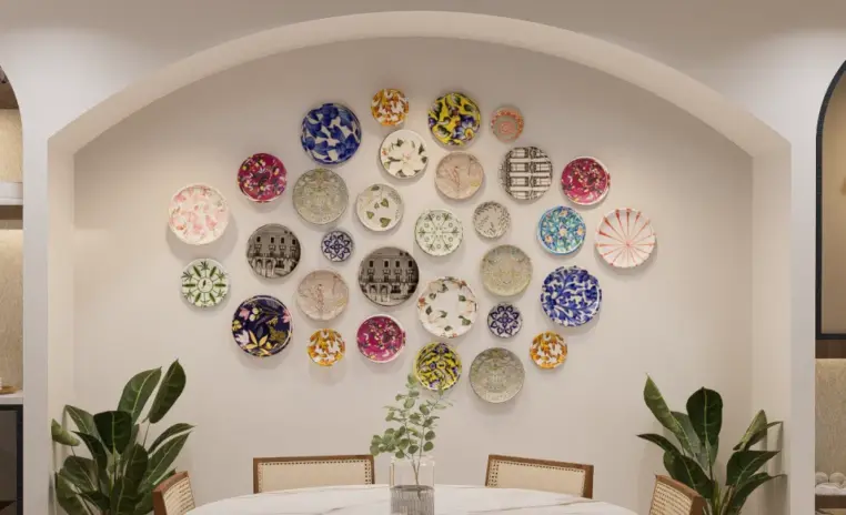
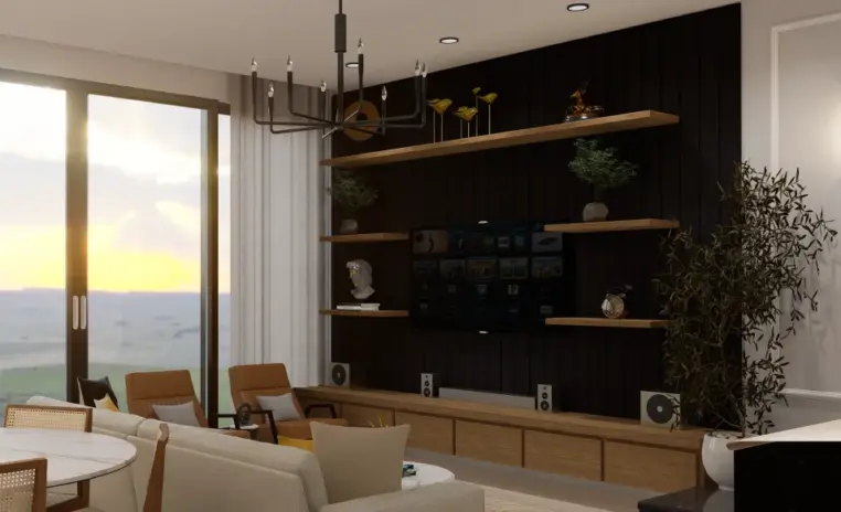
Three functions, one wall, no clutterThe room answers where the mandir, the coffee unit and the display pieces actually go, instead of leaving them competing for surfaces. Three arches divide the wall.
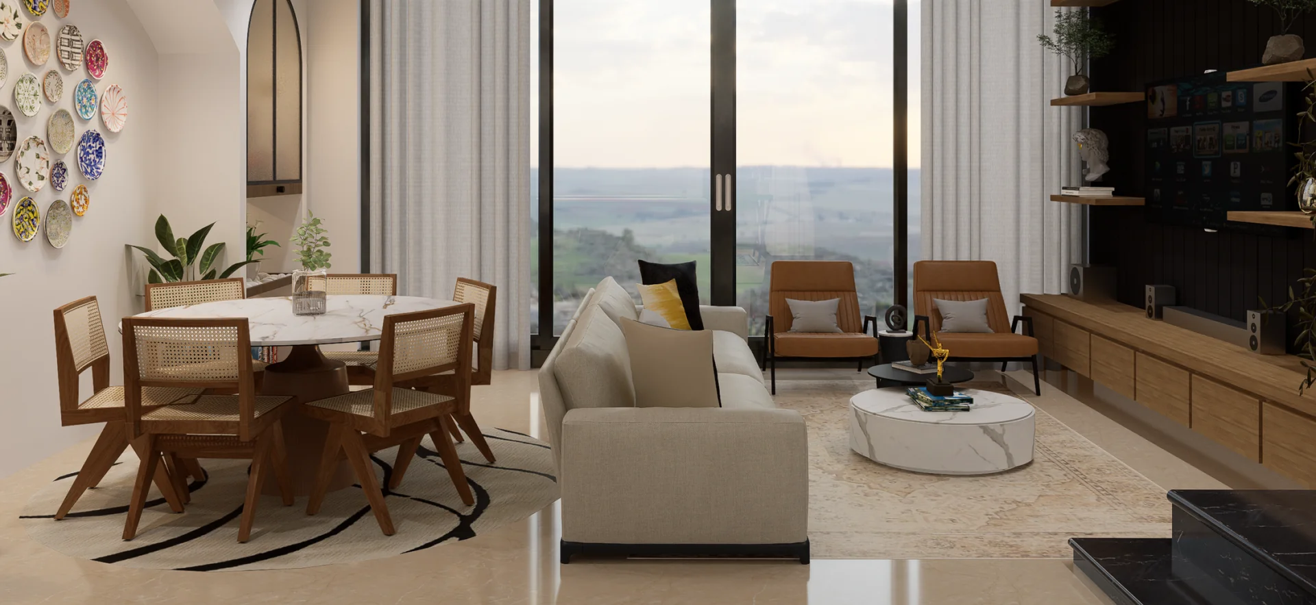
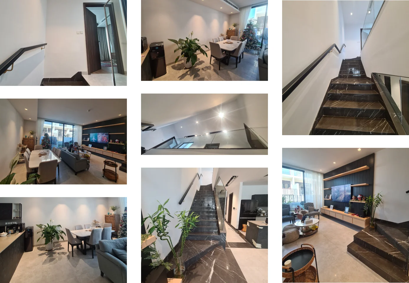
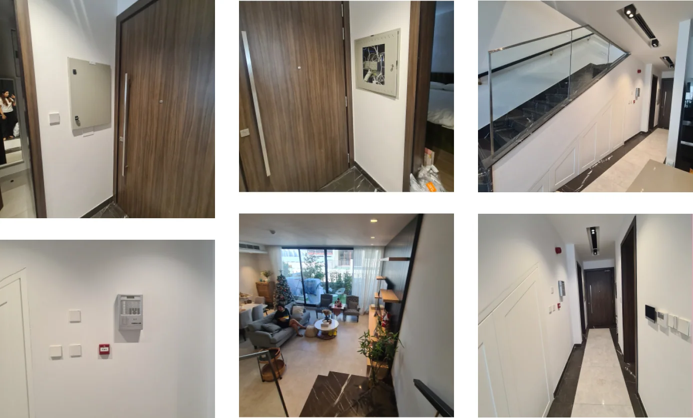
Retro Revival is a 1795 sq ft 4BHK townhouse in Furjan West, Jebel Ali Village, designed for a family who wanted vintage character without living inside a period set. The work covers three connected spaces, the entry foyer, the living room and the staircase, so nothing here can be treated as a separate room. Whatever happens in one is visible from the other two. A palette of white, black and brown runs through all three, and that is what keeps the house reading as one place rather than three moods stitched together.
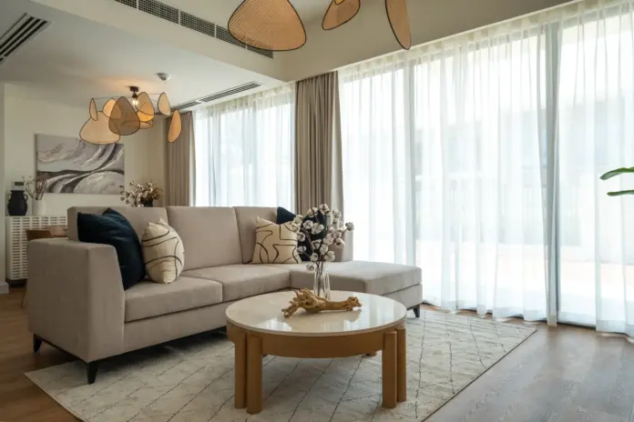
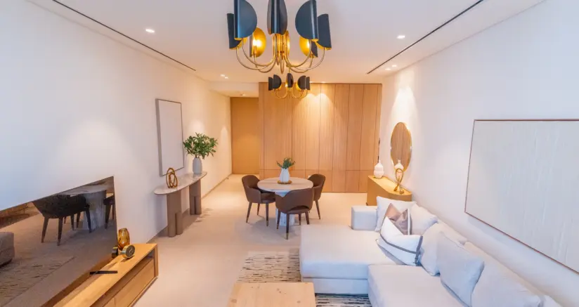
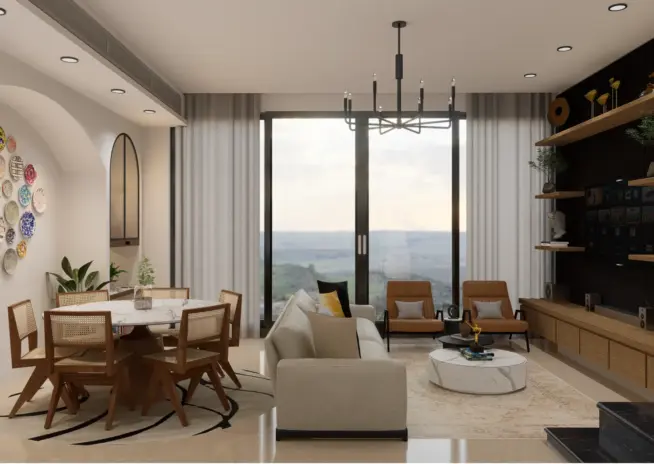
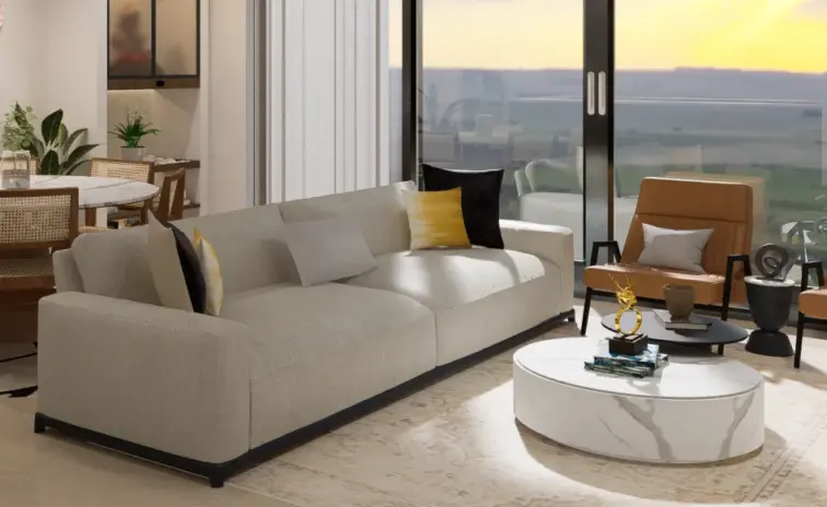
The living room takes its cue from retro living room design and stops short of costume, holding a three-arch feature wall that gives the coffee and bar unit, the traditional plate display and the mandir a proper place each. Rattan warms a scheme that could easily have turned hard.
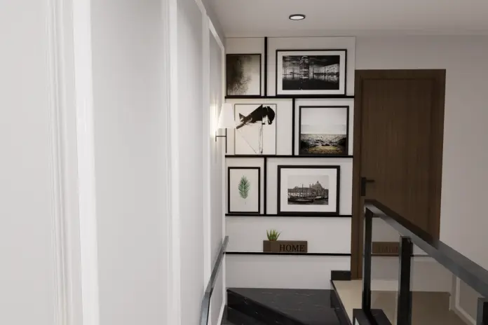
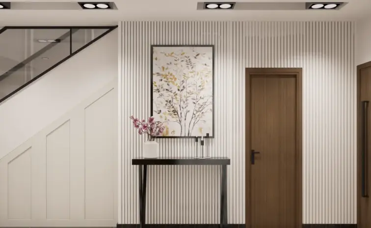
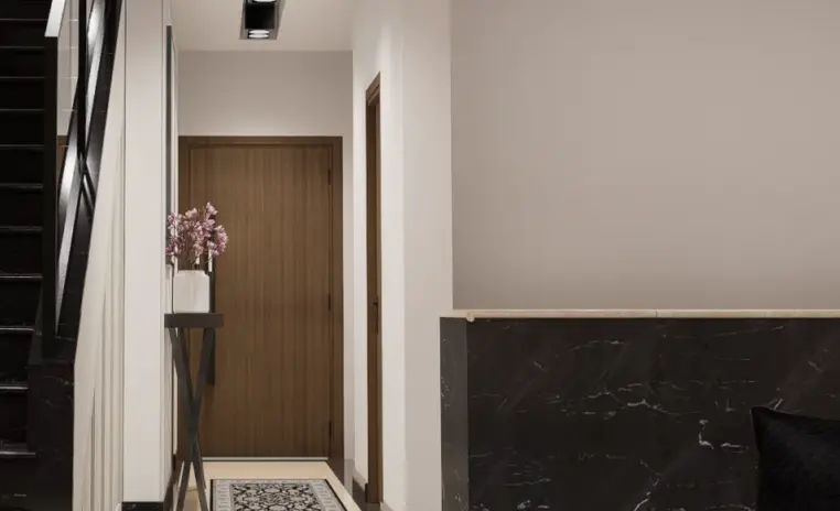
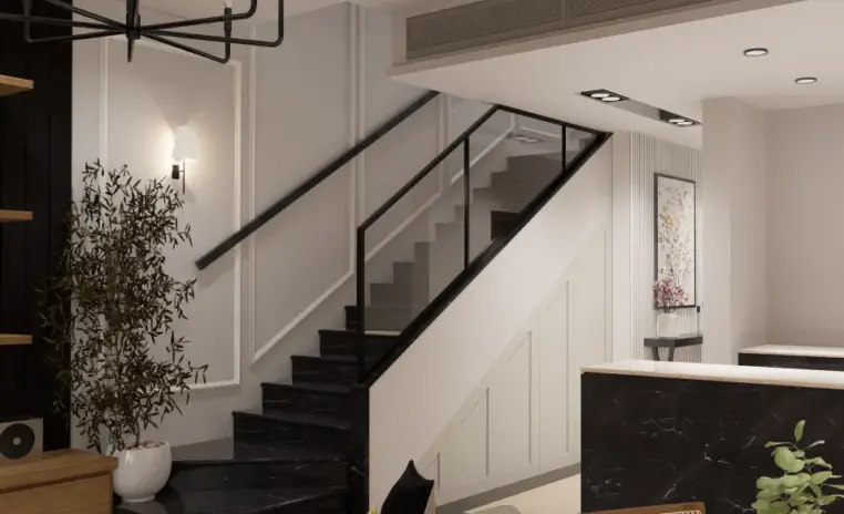
The staircase, usually the surface nobody plans, is the piece guests notice first, worked with mouldings, wallpaper, wall sconces and display shelving. Semi-modern flair, retro charm, and a plan that still holds up on an ordinary Tuesday.

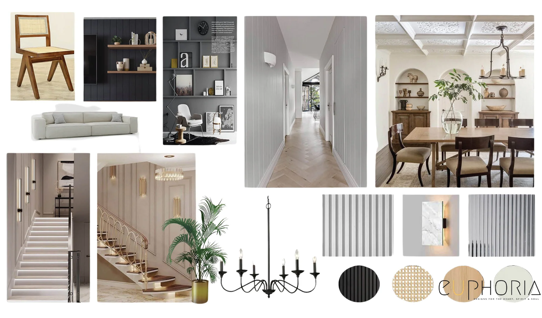
Why they choose Euphoria Interiors for 4BHK Townhouse design?
The room answers where the mandir, the coffee unit and the display pieces actually go, instead of leaving them competing for surfaces. Three arches divide the wall.
Most staircases are circulation and nothing else. This one earns attention, with mouldings, wallpaper, wall sconces and display shelving turning a route between floors into something.
Studio profile
The client asked for a home that looks refined and behaves practically, which sounds obvious and is exactly where most projects quietly fail. The requirement was a townhouse interior design that carries several functions at once without reading as cluttered, across a plan where the foyer, the living room and the staircase are all visible from one another.
A modern lifestyle with subtle vintage charm was the tone, not a full period revival. Storage had to be smart and largely concealed, because visible storage is the fastest way to make a considered room look busy. Detailed joinery and premium finishes mattered to them, as did efficient space planning, since a 4BHK townhouse gives you volume but not automatically usable volume.
The home had to stay visually cohesive across all three areas rather than changing character at every doorway. And it had to be low maintenance, personal and elegant at the same time. That last combination is the one families most often assume they have to choose between.
This project did not fight back, and it is worth saying so plainly. The scope was clear, the existing structure gave a workable base, and the client approved the design at the first presentation. What that removes is drama. What it leaves is the harder, quieter problem: three spaces in a continuous sightline, all of which have to agree.
The foyer, the living room and the staircase are read together from almost anywhere on the floor. A palette that works in isolation can still collapse when two rooms are visible at once, and a feature that looks confident on its own starts shouting when something nearby is already doing that job.
Then there is the wall itself. A mandir, a coffee and bar unit and a display of traditional plates are three different rituals with three different heights, three different lighting needs and, in the case of the mandir, an orientation that is not negotiable. Fitting them onto one wall without producing a row of unrelated boxes is a composition problem, not a decorating one.The last risk is tone. Retro turns into fancy dress the moment restraint slips.
Euphoria Interiors started with the wall that had to carry the most and let the rest of the floor follow it. The feature wall was divided into three arches, one for the coffee and bar unit, one for the display of traditional plates and one for the mandir, with the mandir placed in line with Vastu principles rather than fitted in wherever space allowed. Arches did something a row of open shelves could not. They gave each function a frame, so three unrelated uses read as one deliberate composition instead of three ideas sharing a surface.
The palette was then fixed early and held everywhere. White, black and brown across the foyer, the living room and the staircase means the eye moves through the floor without interruption, which is what makes a plan with continuous sightlines feel settled.
Rattan was introduced to stop the scheme going cold. Natural texture is the difference between a room that photographs sharply and a room people actually sit down in.
The staircase was treated as a feature rather than a corridor, with mouldings, wallpaper, wall sconces and display shelving building a focal point out of a surface most projects skip. The design was approved at the first presentation and turned around in a week.









Creative Head
3D Lead

Project Coordinator

Quantity Estimator
Client Happiness Associate
Get your space designed,
without the stress.

Because true luxury isn’t just what you see —, it’s what you feel every day.
The difference is proportion. A full vintage revival commits to one period and asks the whole house to follow it, which tends to age quickly and leaves you living inside a reference. Retro Revival keeps the structure, the joinery and the space planning contemporary, then introduces retro character through specific moves: the arched feature wall, the plate display, the mouldings and wallpaper on the staircase, and warm rattan against a white, black and brown palette. Those are accents carried by a modern plan, not a costume worn by the house. It is why the townhouse still reads as a current Dubai home rather than a set piece, and why the vintage element feels chosen rather than inherited. Restraint is what keeps the style from tipping over.
By giving each one its own frame. The wall was divided into three arches, and each arch takes a single function: the coffee and bar unit, the display of traditional plates, and the mandir. The mandir was aligned with Vastu principles, which fixed its position before anything else on the wall was decided, so the composition was built around it rather than adjusted to accommodate it afterwards. The arch shape does the visual work. Without it, three different heights, three different lighting requirements and three unrelated purposes sit on the same surface and read as clutter. With it, they read as one designed wall. The approach transfers to any home combining a prayer space with everyday entertaining without hiding one behind the other.
Because it is seen more than almost anything else in the house and planned less than almost anything else. In this townhouse the staircase sits in the same sightline as the entry foyer and the living room, so leaving it plain would have created a visible gap in a floor that is otherwise resolved. The wall was worked with mouldings and wallpaper, wall sconces were added for light with presence rather than pure function, and display shelving gave the surface something to hold. The result is a focal point rather than a route. There is a practical argument too. Guests arrive at the foyer, look up, and form an impression before they have sat down. A considered staircase does a lot of quiet work in those first ten seconds.
Mostly by keeping it out of sight. The brief asked for smart storage and concealed solutions, which in practice means the joinery carries the load and the room does not advertise it. Storage is built into the feature wall and the display shelving rather than added as separate furniture, so a 2012 sqft plan does not lose floor area to cupboards standing in the middle of it. This matters more in a family townhouse than most people expect. Households accumulate, and the point at which a home starts feeling cramped is usually not when the rooms are too small but when there is nowhere left to put things away. Concealed storage buys years before that becomes visible.
Yes, and the parts that transfer are the decisions rather than the finishes. The arched feature wall works wherever several functions need to share one surface, which is common in apartments where floor area is tight. A single palette held across connected spaces works in any plan with open sightlines, and it is usually the cheapest way to make a home feel larger than its floor plan suggests. The staircase treatment applies to any circulation surface that currently does nothing, including a hallway. What would change is scale and material weight, since a 2012 sqft townhouse can carry mouldings and heavier joinery that a compact apartment cannot. A consultation with our designers is the practical way to work out which of these moves suits your plan.
 Villa interior design service
 Penthouse interior design service
 Townhouse interior design service
 Duplex interior design service
 Studio interior design service
 One bedroom villa interior design service
 Two bedroom villa interior design service
 Three bedroom villa interior design service
 Four bedroom villa interior design service
Areas we serve across Dubai