Living room
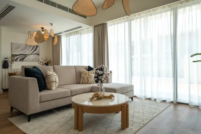
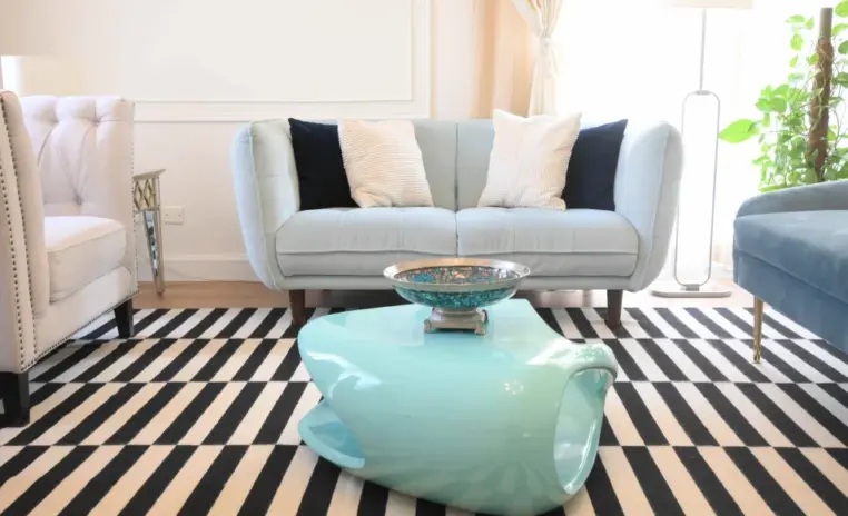
Familiar pieces, finally in agreementThe answer to a fear people carry into a redesign, that everything they own will be judged and discarded. The family furniture stays, and mint chairs, art and turquoise pull it together.
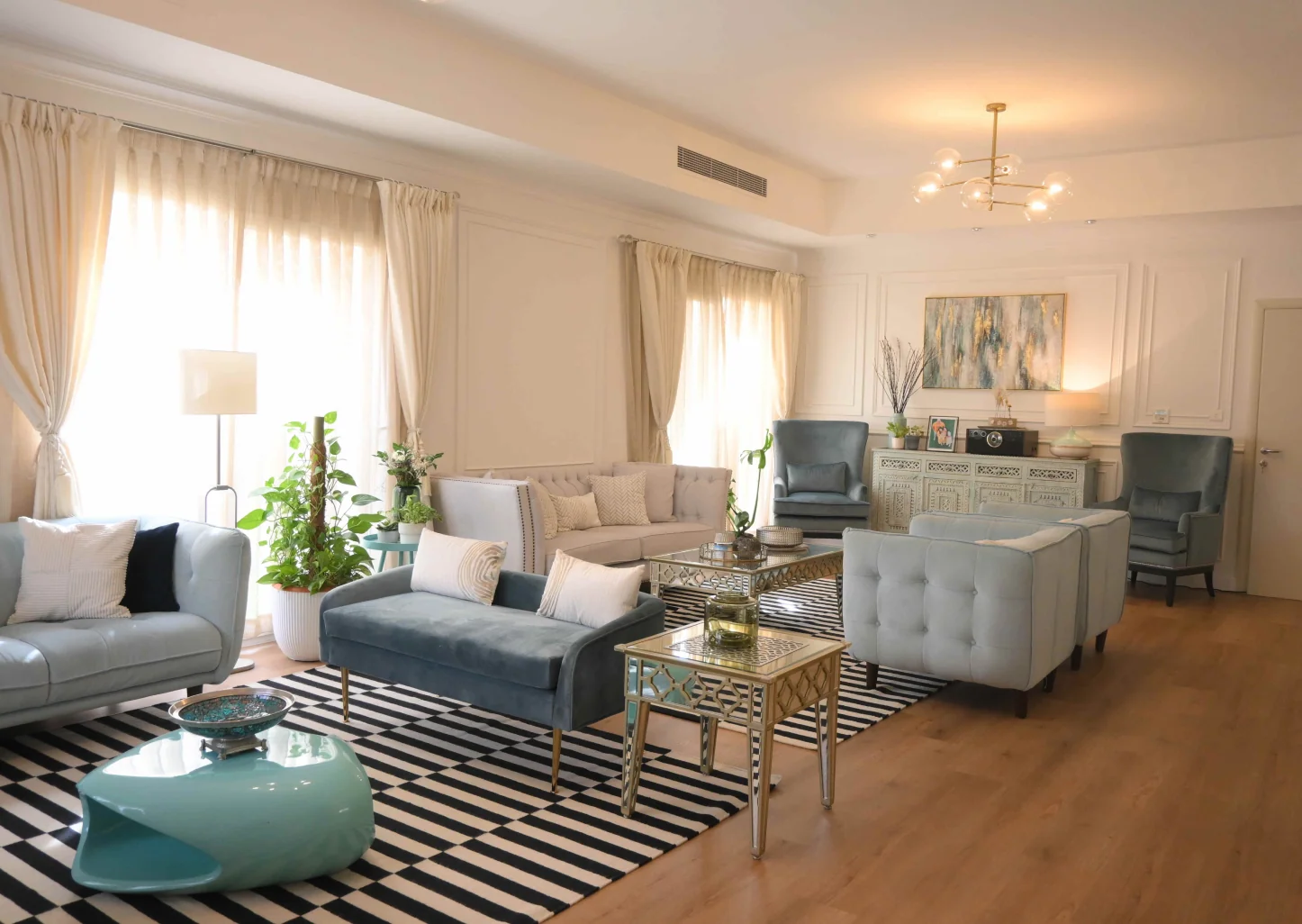
Shimmer Villa is a 3100 sqft villa in Semmer Villas, Dubai Silicon Oasis, where the living, dining and kitchen were refreshed across six weeks. The brief was never a rebuild. This family already owned furniture they liked, and did not want to be told all of it had to go, which is the quiet worry sitting behind most redesign enquiries.
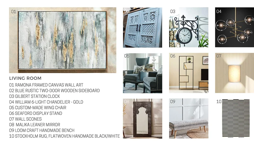
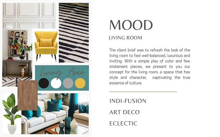
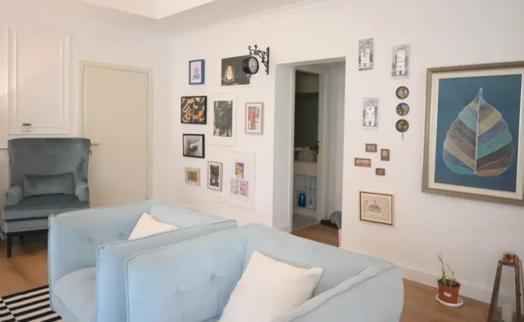
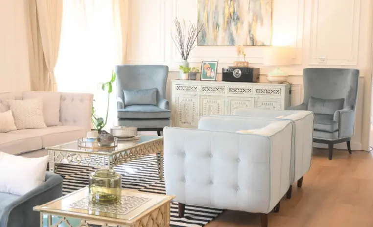
So the existing pieces stayed, and a small number of statement additions did the lifting. A unified colour palette with turquoise as the highlight runs through all three zones, and that thread is what stops a home assembled over years from looking assembled over years. Mint green chairs soften the seating group, curated wall art carries personality rather than filler, and slim framed open shelving finally gives the vintage and cultural pieces the family had collected somewhere to be seen.
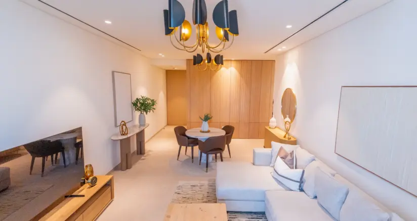
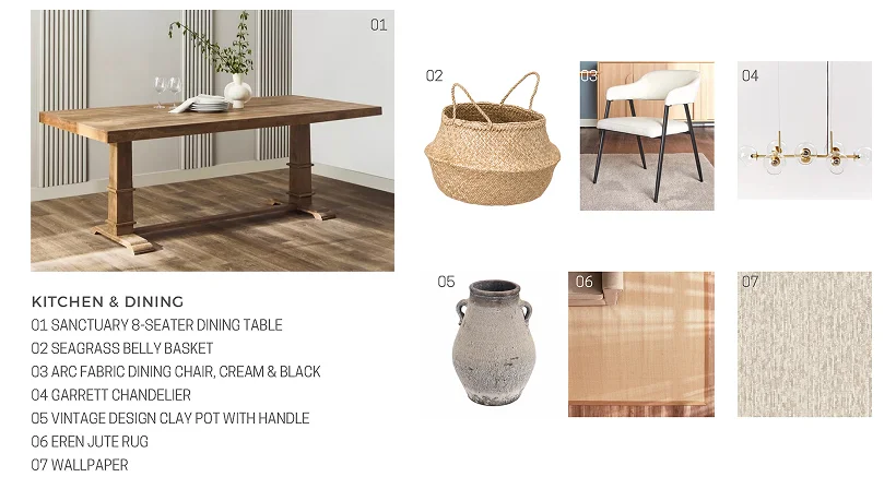
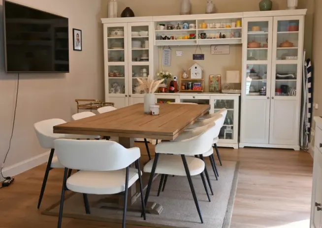
The dining zone was planned around a long guest list, because this is a house that hosts often. Modern transitional classic in language, personal in detail, and lived in from the day it was finished.

Why they choose Euphoria Interiors for Villa design?
The answer to a fear people carry into a redesign, that everything they own will be judged and discarded. The family furniture stays, and mint chairs, art and turquoise pull it together.
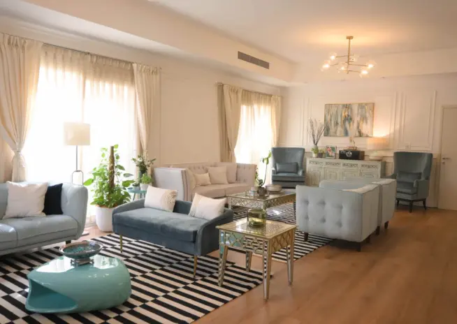
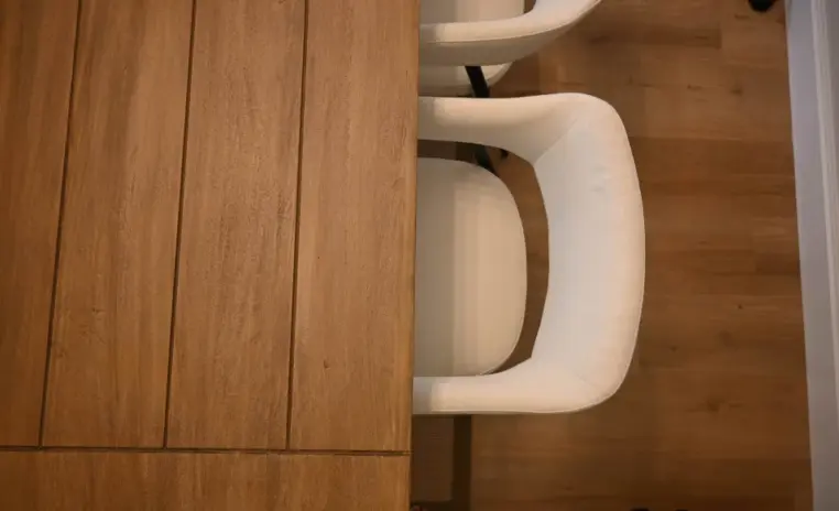
Planned for the evenings when the guest list runs long and nobody eats standing up. The layout takes a crowd without rearrangement, and the palette keeps it part of the living room.
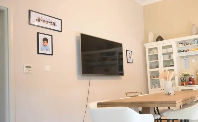
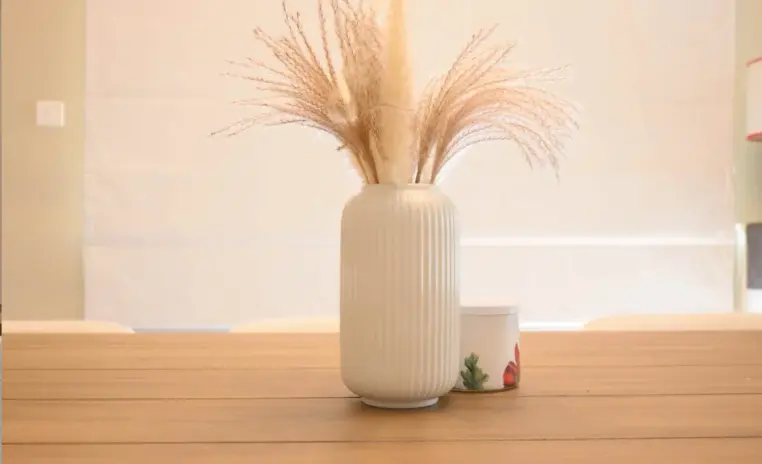
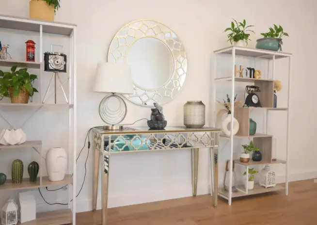
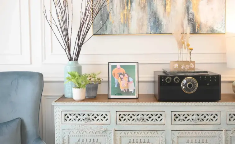
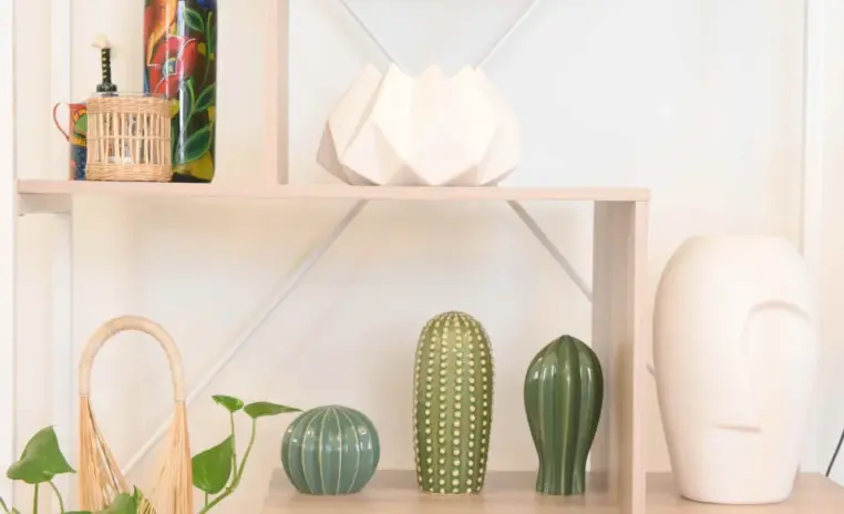
For every box of things kept because they matter and stored because there was nowhere for them. Open frame shelving and a carved sideboard put the vintage finds and family photos in view.
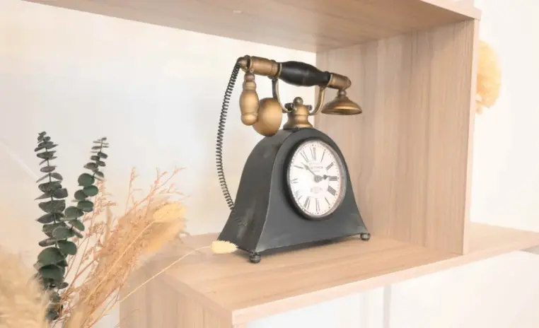
3D Walkthrough
Studio profile
The client did not ask for a new home. They asked for the one they had to stop feeling like a set of separate decisions made years apart. The request was residential interior design that worked around furniture already in the house and added only what the rooms genuinely needed.
A striking focal wall was on the list. So were cultural and vintage inspired accents, because this family wanted their own history visible rather than a showroom look bought wholesale. Finishes and soft furnishings had to be updated, since those are the elements that age fastest and make an otherwise sound room look tired.
The colour direction was to be vibrant but balanced, lively without hardening into a theme. Greenery and considered styling were expected throughout.
The living and dining had to seat a large number of guests comfortably and regularly. And all of it had to stay cohesive and personal at once, across three connected zones and inside a six week programme.
Designing around furniture that already exists is harder than starting from an empty room. Every retained piece brings a fixed colour, scale and level of wear, and none of it was bought to sit together. The turquoise highlight had to be strong enough to unify three zones and restrained enough not to fight the tones already in place.
Pushed too far, the house reads as a theme. Held back, nothing actually changes. The open plan set the second constraint.
Living, dining and kitchen share sightlines here, so a decision taken in one zone is visible from the other two. A focal wall that works head on can still crowd the view from the dining table. Shelving that displays a collection well can turn into background noise in every other part of the room.
Then there was the programme. Six weeks from start to finish leaves no room for a piece arriving in the wrong finish, or a wall treatment that needs a second attempt. Sourcing had to be right the first time, from stock genuinely available in Dubai rather than ordered and hoped for.
Euphoria Interiors began with an audit rather than a mood board. Every piece the family owned was assessed for tone, scale and condition, and the ones that stayed were allowed to set the base palette instead of fighting it. Turquoise was then introduced as a highlight and used sparingly, on the focal wall and in the soft furnishings, so it reads as a thread running through the home rather than a scheme imposed on it.
Statement additions were kept few and specific. Mint green chairs lift the living room without displacing the seating already there. Slim framed open shelving was chosen for the beauty point because it holds a collection while staying visually light, which matters when it sits directly in the sightline of the dining table.
Curated wall art supplies the personality that furniture alone could not. The kitchen was handled through an open shelf layout and integrated storage, so the working surfaces stay clear even though the zone is on show from the dining side.
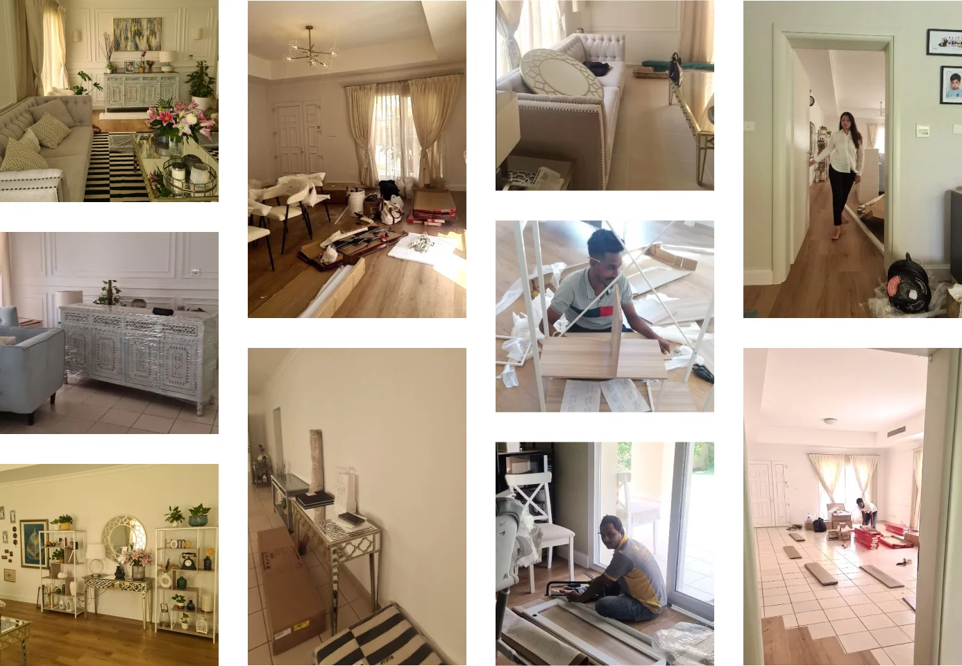
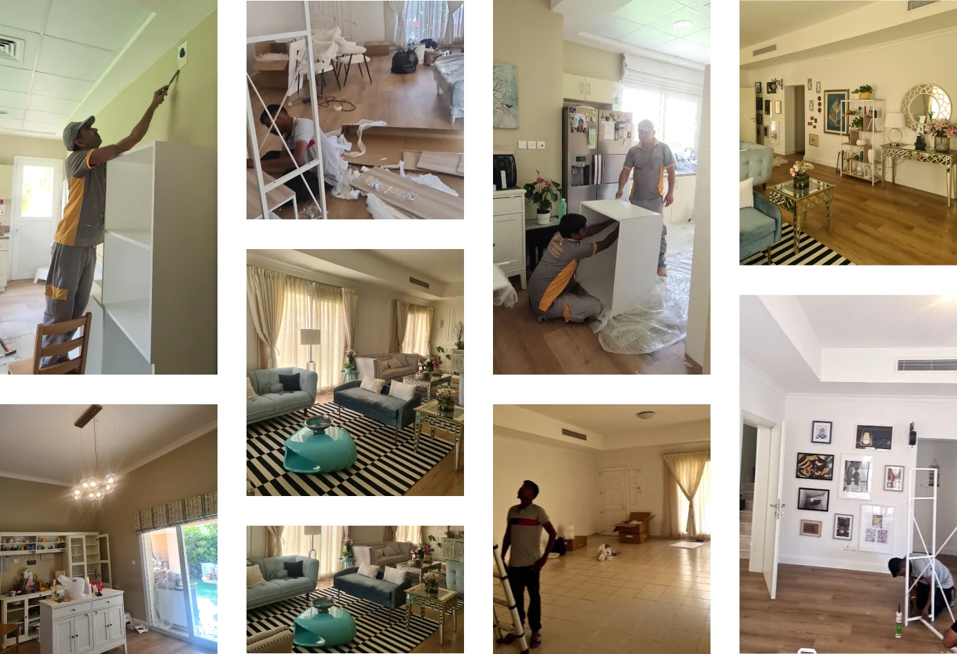
Lighting was updated across all three areas to hold the scheme together after dark. Sourcing was locked to suppliers holding stock, among them Danube, Luxe Home, Home Centre and Ikea, which is how a three zone refresh closed inside six weeks rather than drifting across a season.









Creative Head

3D Lead

Project Coordinator

Quantity Estimator

Business Development Associate
Get your space designed,
without the stress.

Because true luxury isn’t just what you see —, it’s what you feel every day.
Yes, and Shimmer Villa is the case for it. The starting point is an honest audit rather than a clearance. Each existing piece is assessed for tone, scale and condition, and the ones that earn their place become the base the new scheme is built on. That reverses the usual order, where a palette is chosen first and the furniture is then judged against it. Working this way protects the money already spent and keeps the pieces that carry memory in the house. It also demands more discipline from the design, because the additions have to reconcile what is already there rather than start clean. Here that meant a small number of statement pieces, a single unifying colour thread, and updated finishes and soft furnishings, which are the elements that make an otherwise sound room look dated.
By treating it as a highlight with a fixed reach rather than a colour scheme. Turquoise appears on the focal wall and in the soft furnishings, and then stops. The bulk of the room stays in the tones the retained furniture already carried, so the accent has something neutral to register against. The common mistake is repetition. Once an accent colour appears in the cushions, the artwork, the vases and the rug, it stops being an accent and becomes the identity of the room, which is the point at which people tire of it. Restraint also matters across sightlines. In an open plan where living, dining and kitchen are visible at once, an accent that reads as considered in one zone can read as relentless when all three are seen together. Placement was decided from the seated view, not the plan.
It shifts the pressure from the site to the decisions taken before it. Six weeks is enough time to source, install, style and finish, and very little time to correct a wrong call, so the sourcing has to be settled against real availability rather than catalogues. At Shimmer Villa the supplier list was built around stock on hand, including Danube, Luxe Home, Home Centre and Ikea, because a lead time of three weeks on a single chair takes half the programme. Reusing the existing furniture helped considerably, since the largest items were already in the house and did not need to be delivered. The work then concentrated on the elements that change a room quickly, which are the focal wall, the soft furnishings, the lighting and the styling. Handled in that order, six weeks is realistic. Treated as a compressed full fit out, it is not.
Through circulation rather than seat count. The dining zone was planned so the route from the entry to the kitchen and back does not pass through the middle of the table, which is what usually breaks a small hosting layout once the room fills. Chair pull out space was checked against the surrounding furniture instead of the drawing, because a chair that clears on paper and catches on a side table in reality is the detail guests notice. Keeping the living and dining in one visual language matters too. When the palette continues across both zones, people spill naturally between them during a gathering, and the effective capacity of the room becomes larger than the number of chairs at the table. The open shelf kitchen supports the same idea, letting whoever is serving stay part of the conversation.
Because it does two jobs that usually conflict. A collection of vintage and cultural pieces needs to be visible to be worth keeping, and storage that displays tends to add visual bulk to a room that has none to spare. Slim framed open shelving carries the objects while reading as almost nothing itself, so the wall behind stays part of the room and the pieces appear to float rather than sit in a cabinet. With three zones sharing sightlines, that lightness is not a style preference, it is what keeps the display from crowding the dining view behind it. The shelving also gives the beauty point a defined home, which solves the more ordinary problem of daily items migrating across every flat surface in the house. Things that have a place tend to return to it.
 Villa interior design service
 Penthouse interior design service
 Townhouse interior design service
 Duplex interior design service
 Studio interior design service
 One bedroom villa interior design service
 Two bedroom villa interior design service
 Three bedroom villa interior design service
 Four bedroom villa interior design service
Areas we serve across Dubai