Bedroom
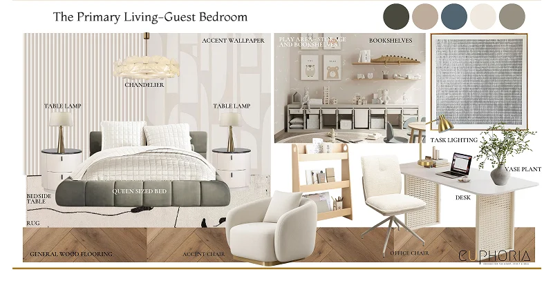
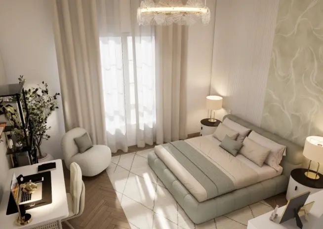
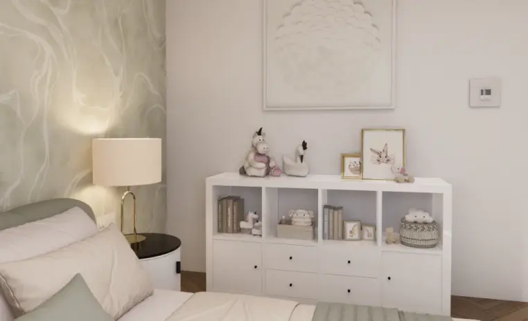
Rounded headboard, curved joinery detailsA rounded headboard against a soft textured wall, curved joinery details behind, warm neutral bedding layered on top, and one considered accent inside the wider palette reading calm.
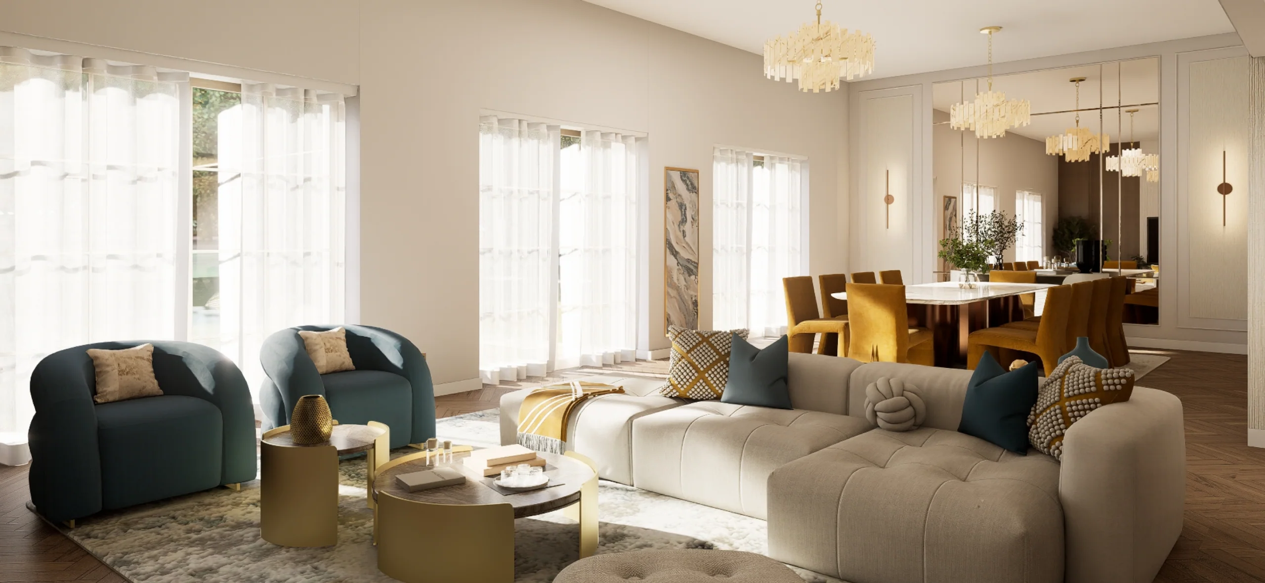
The Primary Living is a 1292 sqft Modern Contemporary villa design at Nad Al Sheba Villas Community, Dubai, with a mid century layer that softens the contemporary base and gives the ground floor its personality.
The register works because a mid century layer softens the base, which is where a contemporary living room design usually falls flat if it commits too hard to either era.
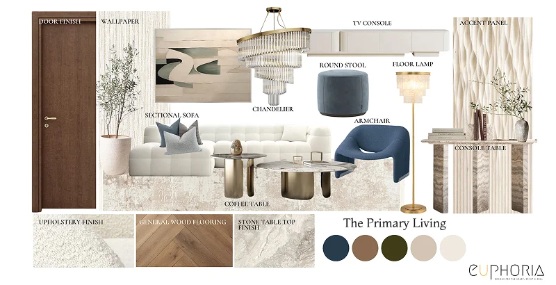
The palette runs neutral cream, warm oak, deep wood and one bold hue used sparingly, layered against textured walls, clean lines and gentle curves throughout the joinery.
The plan holds a living room, a kitchen and dining, a foyer, a guest bedroom, a compact workstation and a considered stair area inside one continuous envelope, with each zone reading as its own room while sitting inside the same material language.
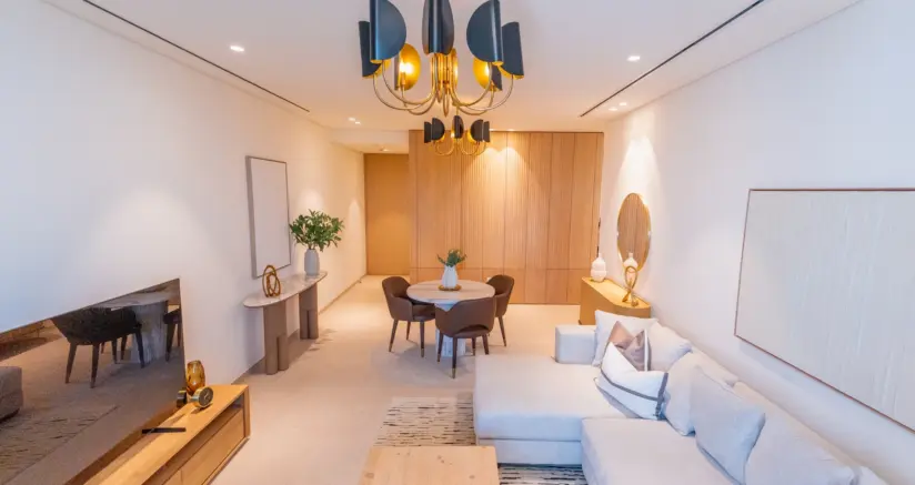
A generous sofa faces a low profile media wall in the living, a ten seater dining table sits alongside a refreshed kitchen with updated cabinet finishes, and the guest bedroom carries a soft playful register without ever leaving the wider palette.

Why they choose Euphoria Interiors for Villa design?
A rounded headboard against a soft textured wall, curved joinery details behind, warm neutral bedding layered on top, and one considered accent inside the wider palette reading calm.
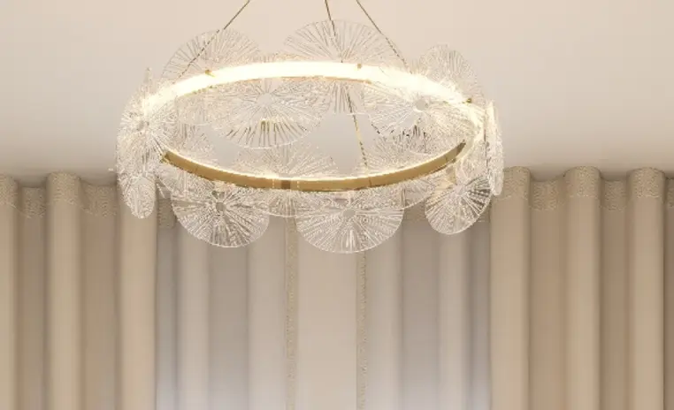
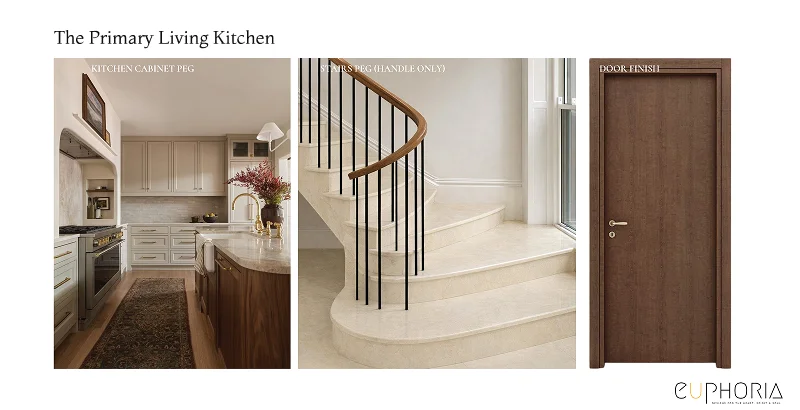
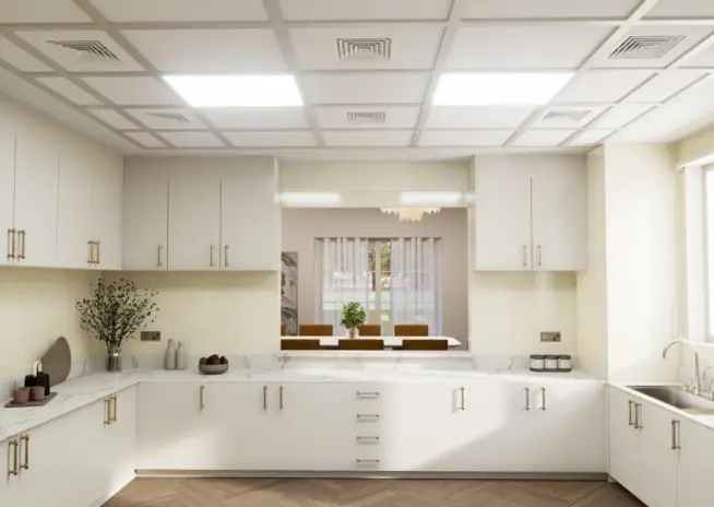
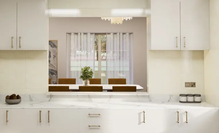
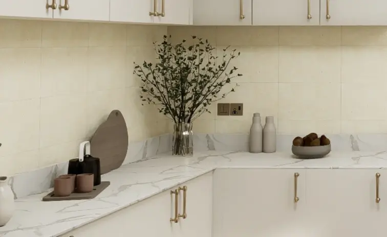
Cabinet finishes refreshed in warm oak against a marble backsplash, integrated appliances folded into the joinery, ten seater dining table alongside and considered task lighting overhead the composition.
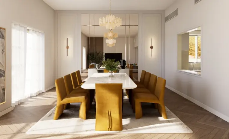
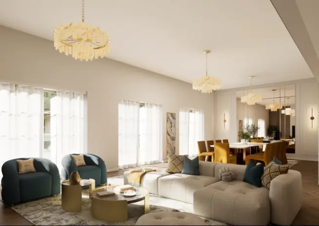
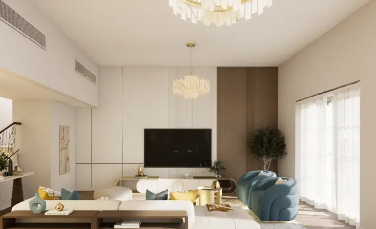
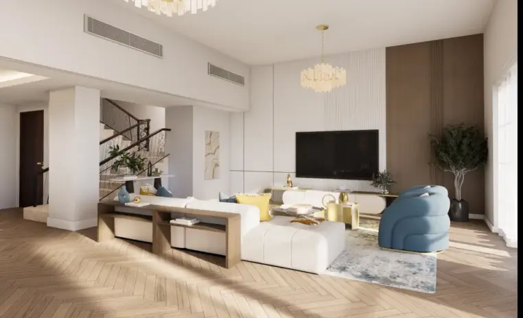
A generous sofa on herringbone floor faces a media wall composition, blue velvet accent chairs alongside, warm oak console at the back and layered chandeliers holding the ceiling.
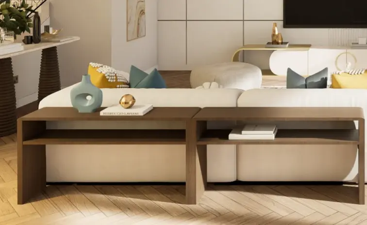
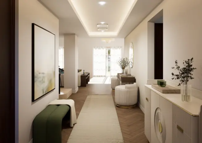
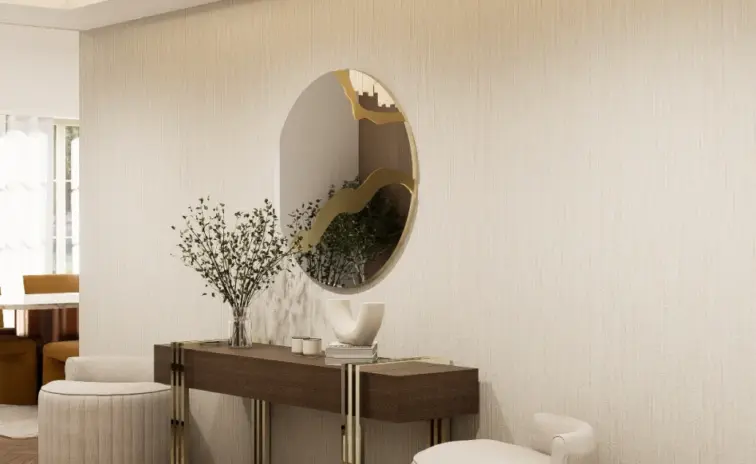
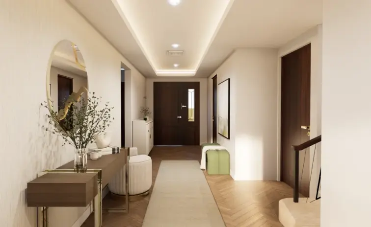
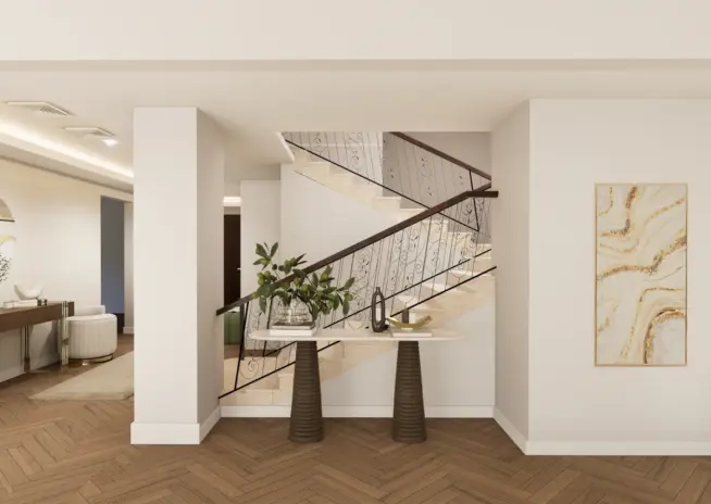
A textured feature wall with slim console and curated mirror at the entrance, warm wood balustrade running up the stair rise and considered lighting overhead through the arrival volume.
3D Walkthrough
Studio profile
The brief was for a simple, minimal and functional refresh of the ground floor, with a warm cohesive interior that reads clean rather than cold.
The living and dining had to hold a ten seater dining table and a generous sofa comfortably in the same open floor, with a large coffee table and enough scale for the household to use every day rather than only when guests arrive.
The kitchen was to be refreshed at cabinet finish level rather than rebuilt, and the guest bedroom had to be playful without ever leaving the minimal register the rest of the home was moving toward.
The foyer had to arrive as a proper first impression instead of a passage, and a compact workstation had to find a place inside the plan without competing with the living room for attention.
The palette was set early. Neutral cream, warm oak, deep wood and one bold accent hue used sparingly, with mid century detail as the softening layer that stops a contemporary shell from reading generic.
Read as considered villa interior design at compact scale, the real request was cohesion across six ground floor zones inside a fixed shell.
The plan had to hold six distinct functions on one floor of 1292 sqft, and none of the zones were allowed to feel like an afterthought.
That is harder than it looks. The living and dining had to accommodate a ten seater table and a generous sofa in the same continuous room, and the guest bedroom, foyer, workstation and stair area each had to hold their own weight inside a compact ground floor.
Structural change was not on the table. The design had to move through finish, joinery and lighting rather than through construction, which is the more considered route on most refreshes and also the one that leaves the least room for error.
The palette had to work as hard as the plan. A minimal home goes cold quickly when the restraint is only about removing things, so the discipline was to keep the number of elements low while pushing the warmth of each one up, through mid century wood tones, textured surfaces and one bold accent per zone rather than across the plan.
Zoning was the last piece. The living had to read distinctly from the dining, the foyer had to introduce the home rather than open onto it, and the workstation had to sit inside the plan rather than steal from the living room to justify itself.
Euphoria Interiors resolved the plan by setting the palette first and letting each zone compose itself inside the range.
Neutral cream, warm oak, deep wood and one accent hue per zone carry the language across the whole ground floor, so the living, the kitchen and dining, the foyer, the guest bedroom and the workstation all read as one home rather than as six connected rooms.
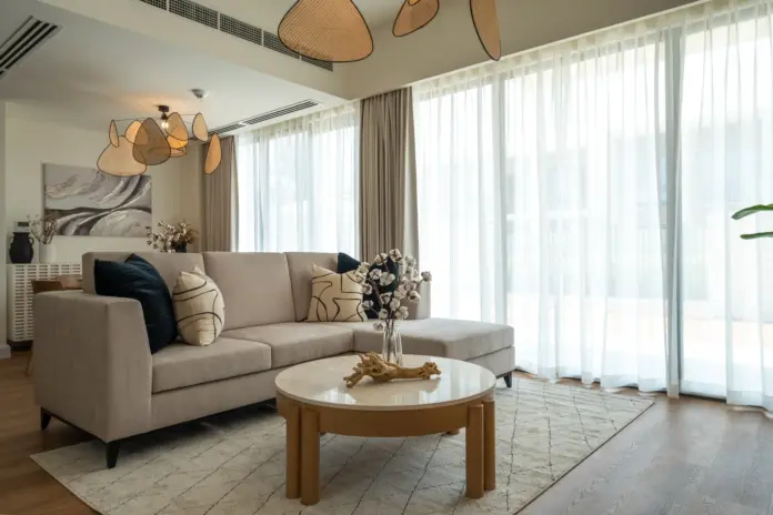
In the living, a generous sofa faces a low profile media wall on a textured plaster feature, with a large coffee table anchoring the seating and a considered rug drawing the boundary underneath.
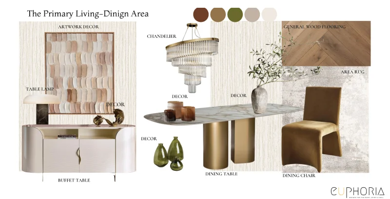
The kitchen and dining share the same warm oak language. Cabinet finishes were refreshed rather than replaced, and a ten seater dining table with mid century chairs sits alongside without breaking the sightlines through the plan.
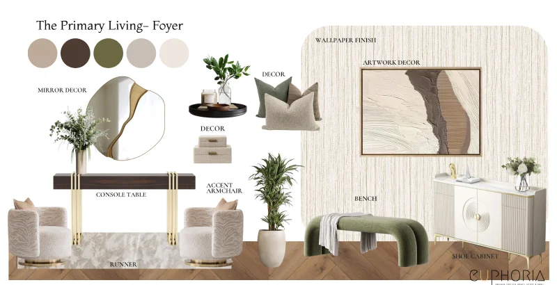
The foyer was designed as a first impression rather than a passage. A textured feature wall, a slim console and a curated mirror give the entry weight it did not have before, so the home introduces itself before the living room is even seen.
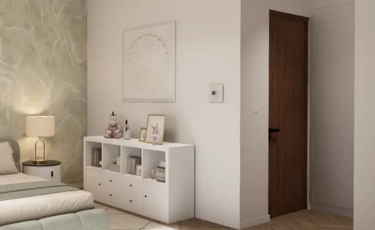
The guest bedroom carries a soft playful register with a rounded headboard, curved joinery and one bold accent that sits inside the palette. It reads ready rather than precious, which is what a guest room needs to be to actually get used.
The compact workstation was folded into a corner with a floating desk and joinery detail that makes work feel like part of the home rather than furniture that wandered in, and the stair area was treated as its own composition rather than as leftover circulation.









Creative Head

3D Lead

Project Coordinator

Quantity Estimator

Client Happiness Associate
Get your space designed,
without the stress.

Because true luxury isn’t just what you see —, it’s what you feel every day.
The Primary Living follows a Modern Contemporary direction with mid century elements as the softening layer.In practice that means a neutral palette as the base, natural textures across the surfaces, gentle curves in the joinery, warm oak and deep wood tones through the furniture, and one bold accent per zone rather than a busy shared palette.The mid century detail is what keeps a contemporary shell from reading generic. A rounded headboard, a curved shelf composition, a wood grain sideboard, small decisions across the plan that add character without adding volume.The result reads calm rather than sparse, and warm rather than beige, which is the difference between a minimal home that gets used every day and one that photographs well and disappoints in daily life.It is a language that ages slowly. Contemporary sets the frame, mid century adds the personality, and the palette is what makes both hold together across six connected zones on a single floor.
More than most homeowners assume, and less than most designers would like.On this project the interventions were kept either reversible or at finish level. Cabinet finishes were refreshed instead of the units replaced, wall treatments were textural rather than structural, and joinery was floated or freestanding wherever it could be so the plan could hold together with the walls exactly where they were.The living and dining were reshaped through furniture placement, a rug and a media wall composition rather than through partitions.Where the plan needed a real refresh it was in the details that carry personality, the foyer feature wall, the guest bedroom accent, the workstation joinery, the stair area composition.None of that required construction, and none of it looks like a compromise. A refresh handled this way is what a considered ground floor redesign actually is, and it delivers a home that reads cohesive without any of the mess that a full rebuild carries.
By running the deliverables in parallel rather than in sequence.Floor plans, mood boards, joinery drawings and sourcing lists were developed alongside each other, so the sourcing could start against the mood board while the drawings were being finalised, and the finishes could be committed before the joinery hit the workshop.That compresses a schedule without compressing the quality of the decisions.The other move was to accept the plan and the shell as given. No structural change, no ceiling reworking, no flooring lifted. Every decision landed inside the fixed set of surfaces, which is faster than a plan that keeps rethinking what the shell should be.The material palette was the discipline. Once cream, warm oak, deep wood and one accent per zone were fixed, the six connected rooms could be specified against a known range instead of chosen from scratch each time, and cohesion arrived as a byproduct of the palette rather than as a separate design job at the end.
The Primary Living covers 1292 sqft in the Nad Al Sheba Villas Community, Dubai, and the timeline from start to finish is 6 weeks.The scope is a full ground floor design. The living room, the kitchen and dining together, the foyer, a guest bedroom, a compact workstation and a stair area.Six connected zones inside one continuous envelope, each holding its own function without breaking the shared material language.The plan is generous for one floor and small for a full villa program, which is exactly the compact scale where zoning discipline decides whether the home reads considered or crowded.Handled well, a ground floor of this scale can hold everything a small household needs day to day, with the added benefit that everything sits on one level. Handled without discipline, the same floor turns into a corridor of rooms.
Minimal goes cold when it is only about removing things.The version that works keeps the number of elements low while pushing the warmth of each one up.At The Primary Living the palette is neutral cream, warm oak, deep wood and one bold accent per zone. The joinery uses gentle curves rather than only straight lines, the textures across walls and rugs are natural rather than smooth, and lighting is layered rather than centred on a single fitting.That combination is what turns restraint into calm rather than into absence.The mid century detail is the specific move that stops the base from reading austere. A curved headboard, a rounded shelf, a wood grain sideboard, each of these adds character without adding a new colour or a new material to the range.A home this considered stays warm because the design decided to keep it that way, not because it added things back in when the base started to feel bare.
 Villa interior design service
 Penthouse interior design service
 Townhouse interior design service
 Duplex interior design service
 Studio interior design service
 One bedroom villa interior design service
 Two bedroom villa interior design service
 Three bedroom villa interior design service
 Four bedroom villa interior design service
Areas we serve across Dubai