Waiting area
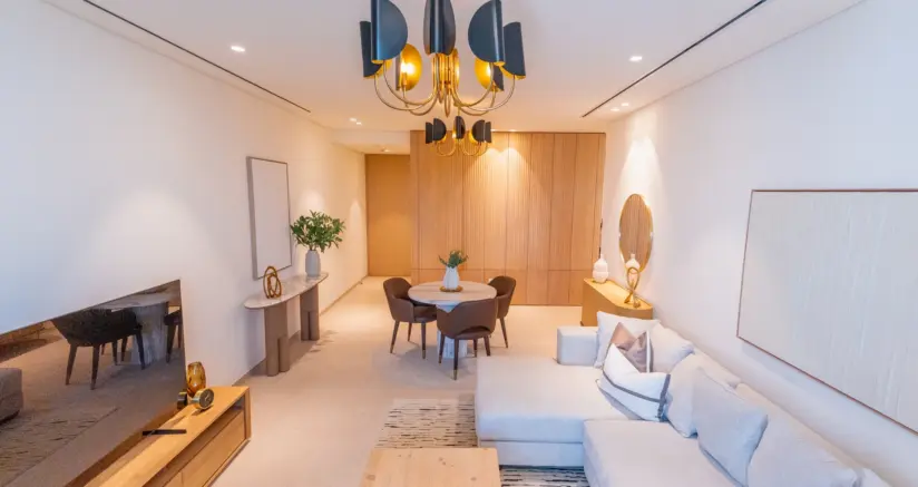
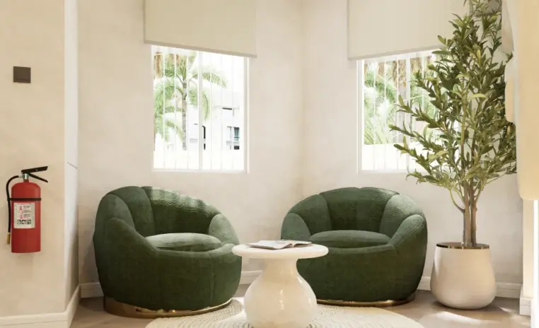
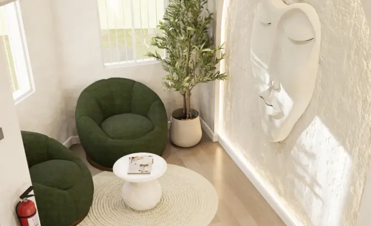
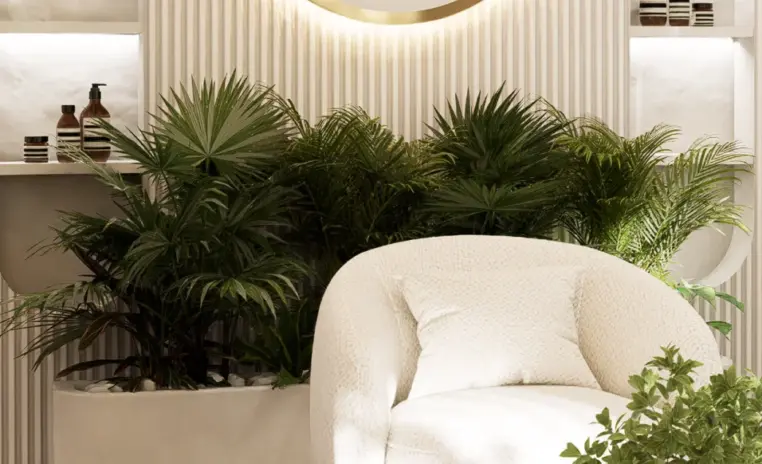
The part of a clinic patients rememberWhere anxiety either settles or builds. Seating for six to seven in a beige and white palette with greenery, planned so that waiting feels calm rather than clinical.
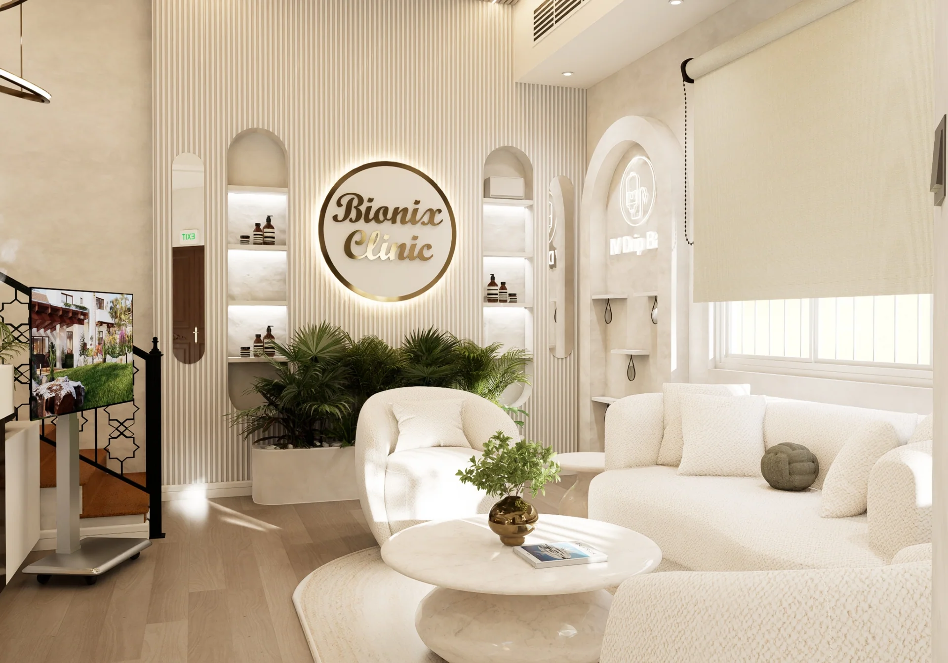
Bionix Clinic is a 390 sqft wellness and healthcare space in Umm Suqeim, designed to feel calm in a category that usually feels clinical. The palette is beige, white and greenery, minimal by intent, because the room has to lower a patient's pulse before anyone has spoken to them. The constraint shaping every decision is that the space is rented. Nothing could be demolished, rewired or permanently altered, so the design had to improve the experience without leaving a mark on the landlord's shell.
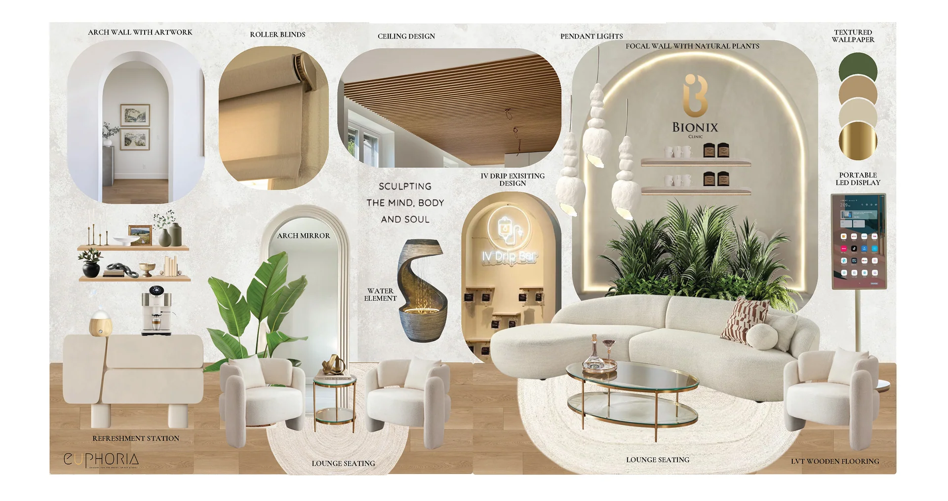
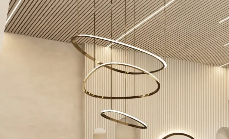
A fluted wooden ceiling conceals extensive trunking while carrying the lighting. Warm wood textured LVT flooring softens the acoustics, which matters more in a small clinic than most operators expect. The waiting area seats six to seven comfortably, branding elements stay movable, and a digital display handles information without adding another permanent fixture.
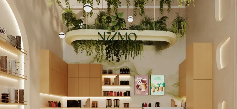
Even the product display and refreshment zone was built to be lifted out intact, because everything specified here has to be able to leave when the lease does. It is wellness led design working within genuinely tight limits, and the restraint is what makes the room feel considered rather than merely decorated.

Why they choose Euphoria Interiors for Wellness & Healthcare design?
Where anxiety either settles or builds. Seating for six to seven in a beige and white palette with greenery, planned so that waiting feels calm rather than clinical.
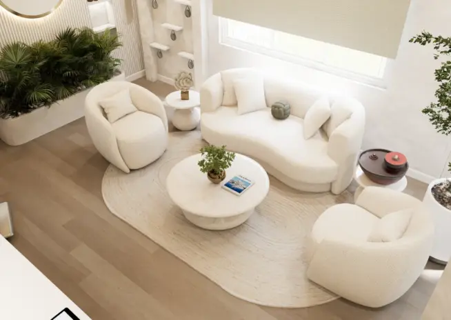
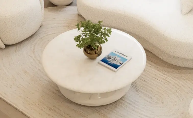
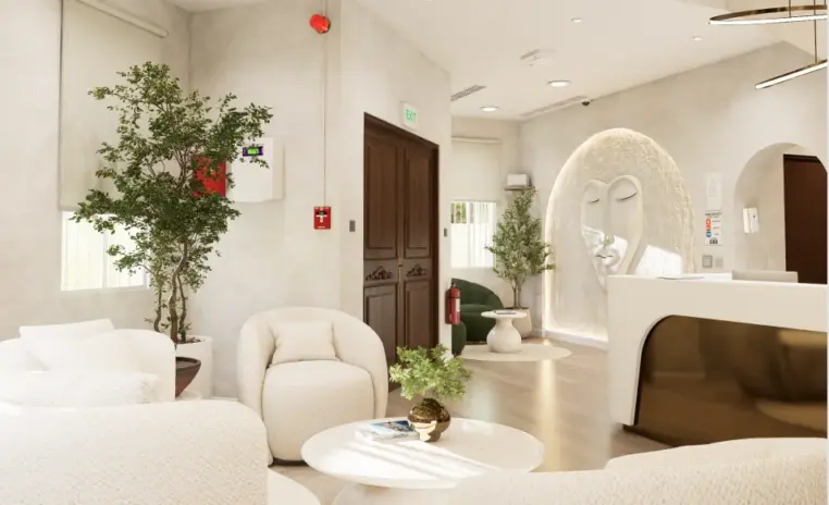
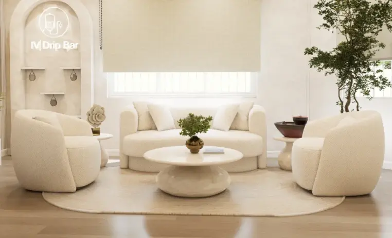
The reception counter and its backdrop were already built and could not change. The work went around them, refining the wall treatment and the light so they stopped dominating.
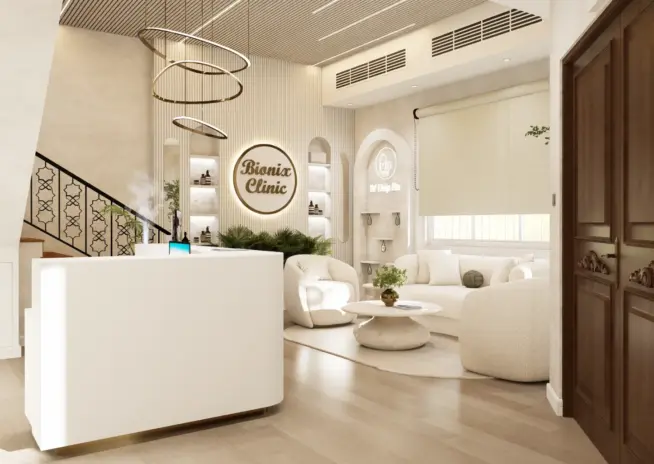
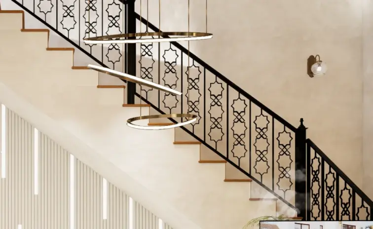
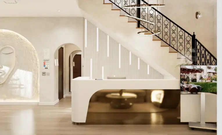
Warm wood textured LVT flooring doing quiet acoustic work. In 390 square feet sound carries further than anyone plans for, and a clinic where talk travels is one where patients go quiet.
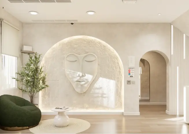
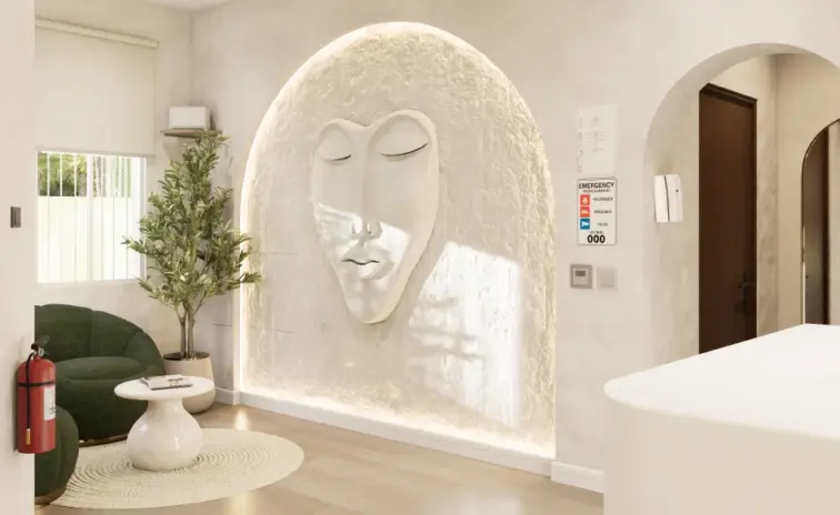
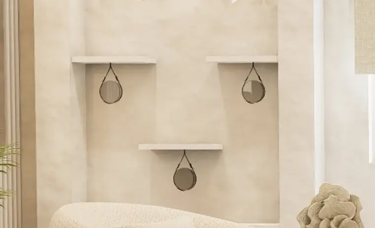
Product display and refreshment in one zone, built from elements that stay movable. Everything here leaves with the tenant, which is what a rented commercial space demands.
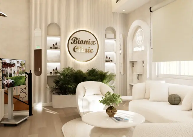
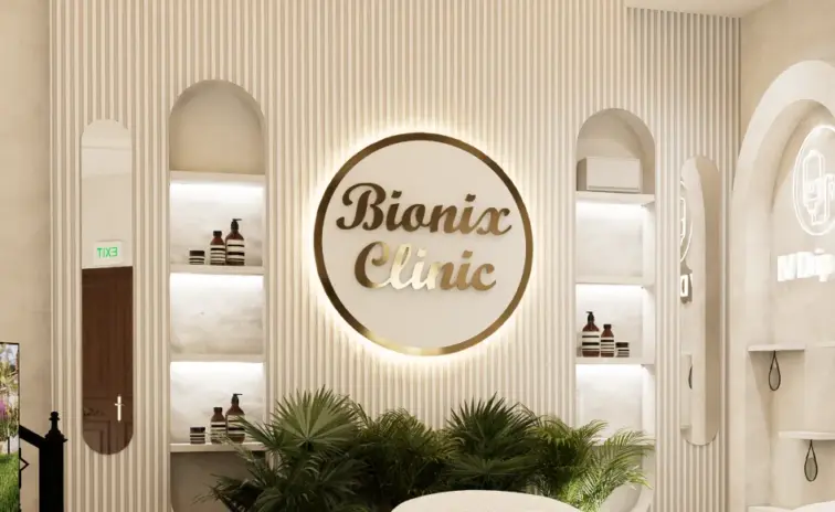
3D Walkthrough
Studio profile
The client wanted a minimal, calm, wellness focused clinic and was realistic from the start about what the space could and could not take. The ask was a clinic interior design in a beige, white and greenery palette that felt clean and soothing, delivered through non damaging, reversible solutions because the premises are rented.
The reception needed subtle improvement rather than replacement, with a refined counter treatment and a better branding back wall. A digital display screen had to be integrated for branding and information. They asked for a dedicated product display and refreshment area, and a waiting area comfortable for six to seven people. Beyond the fixtures, the brief was spatial. The clinic had to feel more open than 390 square feet usually allows, with lighting and furniture reworked only where genuinely necessary. Branding elements were to remain flexible and movable throughout. Restraint was part of the brief, without the result looking restrained.
Several key elements were already built before the project reached us. The reception counter, the reception backdrop and two primary walls were pre designed and could not be modified, which removed a large part of the room from the design conversation before it started. In a 390 square foot clinic, that is not a small subtraction.
The premises being a commercial rental added a second layer. Structural demolition was not available. Electrical adjustments were tightly limited. Concealing wiring, which is normally routine, ran into strict restrictions on what could be cut into or fixed permanently. The design had to work around existing conditions rather than correct them.
There was also a difficult stretch in the middle of the project. After the first two submissions did not fully land, the client temporarily lost confidence in the direction. That is an uncomfortable thing to sit with, and it is worth naming rather than smoothing over. It forced a genuine reassessment of the brief and a sharper reading of what the client actually wanted, and the proposal that followed was materially better for it.
Euphoria Interiors worked with the constraints as fixed points rather than obstacles to argue with. The walls were visually refined to build a soft, calming environment around the elements that could not move, so the pre built counter and backdrop stopped reading as the loudest things in the room.
Flooring did double duty. Warm wood textured LVT was specified to improve acoustics and reduce noise, which turns a small clinic from a place where every conversation carries into one where patients speak comfortably. It also warms a beige and white palette that could otherwise tip cold.
The most useful intervention was overhead. Extensive ceiling trunking was the single ugliest condition in the space and could not be removed. Rather than fight it, a fluted wooden ceiling was introduced to conceal the services entirely while integrating the lighting into a clean, deliberate rhythm. Trunking and DB panels elsewhere were absorbed by the same approach.
After the mid project reset, the revised direction resonated properly. The clinic now reads as a considered wellness space rather than a rented unit that has been decorated, and every element added to it can leave when the lease does.









Creative Head

3D Lead

Project Coordinator

Quantity Estimator

Business Development Associate
Get your space designed,
without the stress.

Because true luxury isn’t just what you see —, it’s what you feel every day.
By separating what you can change from what you can only disguise, then designing almost entirely in the first category. At Bionix Clinic nothing could be demolished, the electrical work was tightly restricted and no permanent alterations were permitted. That rules out most conventional fixes. What remains is surface treatment, lighting, flooring, furniture and joinery that can be installed and later removed. The discipline is to make those few tools carry the whole result. A fluted wooden ceiling hides services without touching them. LVT flooring lays over what is already there. Branding stays movable. The test of a good rented fit out is whether it improves the space meaningfully while leaving the landlord's shell exactly as it was found, and whether the tenant can take the value with them when the lease ends.
You stop trying to make them disappear and start making them recede. At Bionix Clinic the reception counter, the backdrop and two primary walls were constructed before the project was assigned, and none of them could be modified. In a 390 square foot space those elements dominate by default. The approach was to refine everything surrounding them, the wall treatment, the lighting quality and the material temperature of the room, so the fixed pieces sit inside a composition rather than setting it. Colour does a lot of this work. A consistent beige and white field with greenery removes visual competition, which means the eye stops snagging on the pre existing counter and reads the room as a whole. It is a less satisfying method than replacement, and in a rental it is usually the only one available.
Because privacy in a small clinic is mostly an acoustic problem, not a layout one. When a waiting area, a counter and a consultation zone share under 400 square feet, hard surfaces bounce every conversation around the room. Patients notice quickly, and the reaction is not usually a complaint. They simply lower their voice, give less detail, and the clinical conversation gets worse. At Bionix Clinic the warm wood textured LVT flooring was specified partly for this reason, to absorb and soften rather than reflect. The fluted wooden ceiling helps too, since a broken surface scatters sound where a flat plasterboard plane returns it. Neither move is visible as an acoustic intervention, which is the point. The room simply feels calmer and more private without anything announcing why.
With a secondary layer that sits in front of the problem rather than removing it. The ceiling at Bionix Clinic carried extensive trunking that could not be relocated, which is common in commercial units and is usually the single thing that makes a space feel unfinished. The answer was a fluted wooden ceiling designed to conceal the services along their full run while integrating the lighting into the same rhythm, so what reads as a deliberate architectural feature is doing a purely practical job. DB panels and remaining trunking were absorbed through similar custom concealment that blends into the surrounding treatment. The principle is consistent. Where you cannot remove an ugly necessity, give the eye something better organised to look at in the same plane, and make the concealment earn its place as design rather than as a cover.
Yes, provided the effort goes into the few things patients actually register. Bionix Clinic was designed for a rented space, with lighting and furniture reworked only where genuinely necessary. The work concentrated where it changes the experience, the ceiling that removes visual clutter, the flooring that warms the room and controls sound, the palette and greenery that set the mood before anyone speaks. What was avoided is equally instructive. No structural change, no replacement of serviceable fixtures, no permanent branding when movable elements and a digital display do the same job. A clinic feels considered when it feels calm and quiet. None of those qualities depend on scale, though all three depend on decisions being made in the right order.
 Villa interior design service
 Penthouse interior design service
 Townhouse interior design service
 Duplex interior design service
 Studio interior design service
 One bedroom villa interior design service
 Two bedroom villa interior design service
 Three bedroom villa interior design service
 Four bedroom villa interior design service
Areas we serve across Dubai