Living room
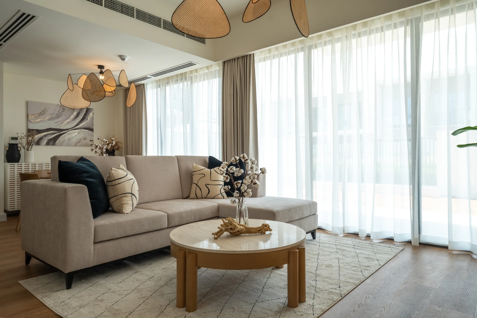
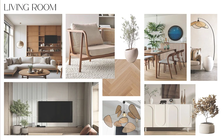
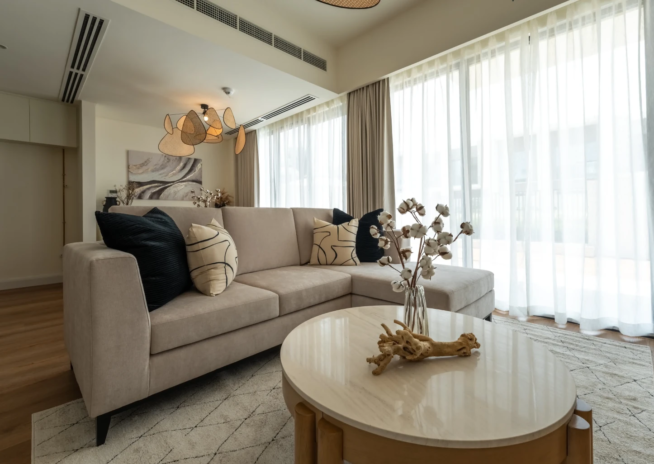
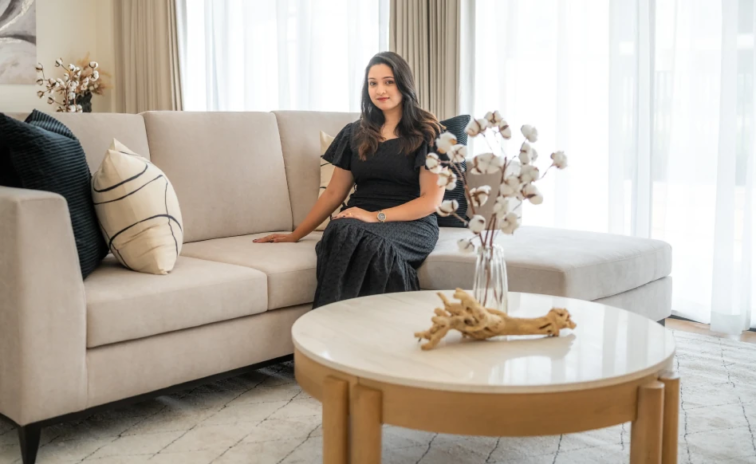
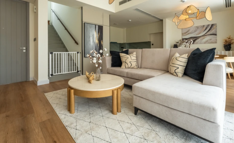
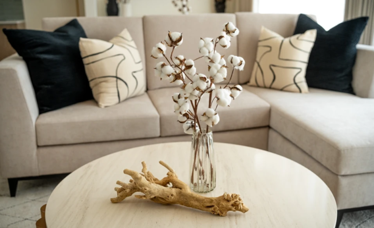
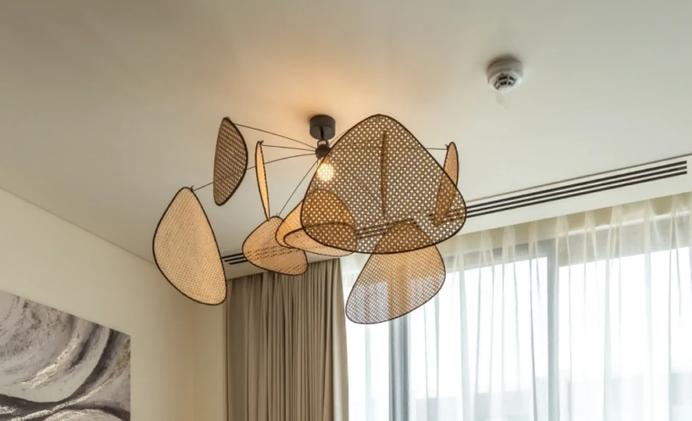
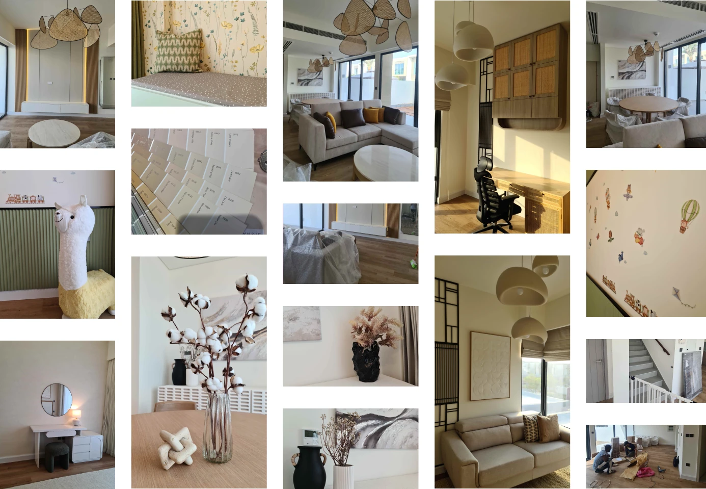
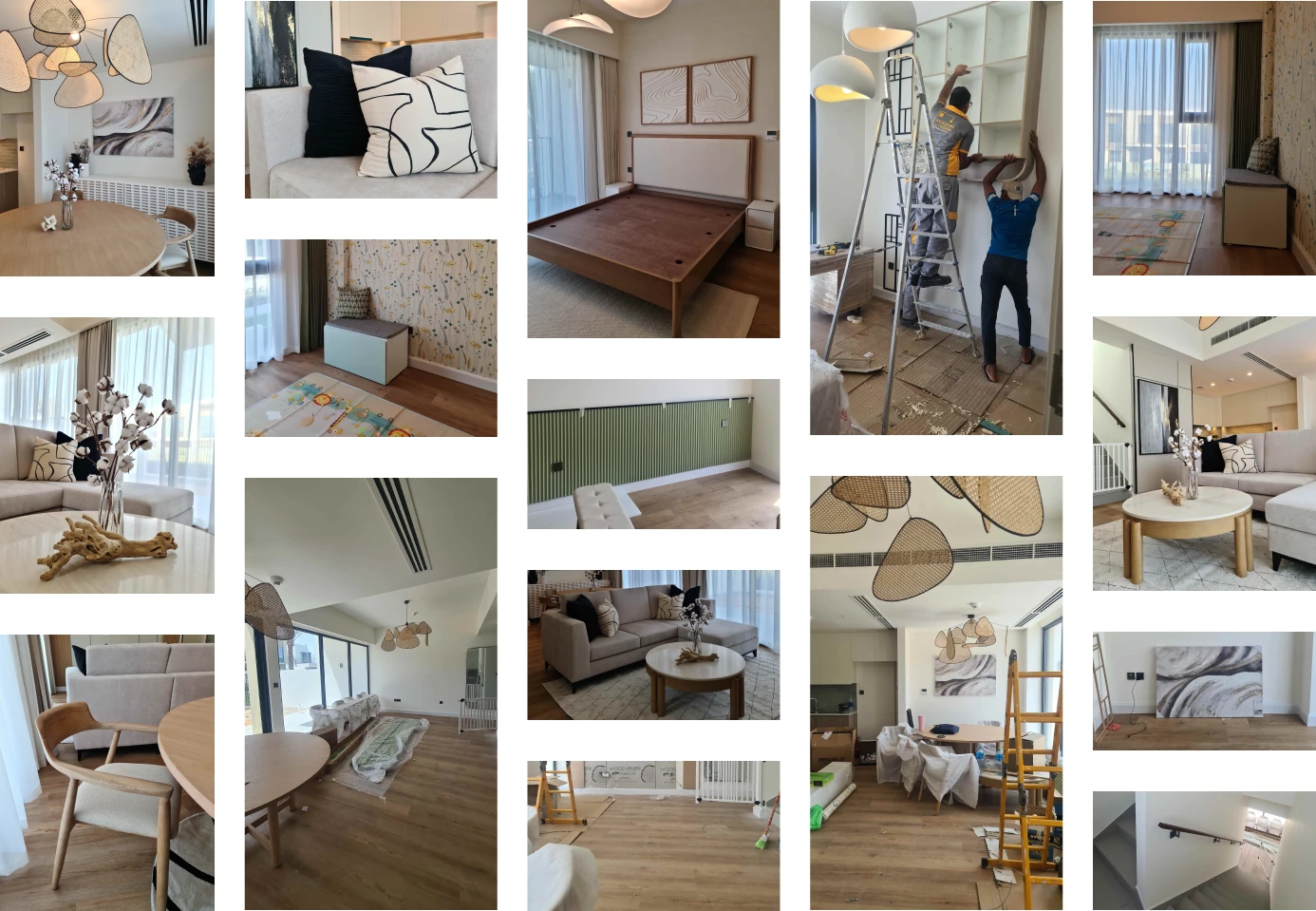
Minimal without ever feeling coldThe failure most minimal living rooms share is that nobody wants to sit in them. Here the greige sofa is deep and soft, the stone topped table is oval, and a petal pendant fills the ceiling.
Wabi Sabi is a 2500 sqft home in Eden Valley Community, Dubailand, and it is the kind of project that is far harder than it looks. The client asked for calm, uncluttered and Japanese in spirit across the living room and three bedrooms, with no structural changes to a brand new house. Minimal is easy to draw and easy to get wrong, because the moment you remove decoration you have nothing left to hide behind.
Every proportion has to be right. Upgrades were kept deliberately few, parquet flooring and wallpaper only where they earned a place. So the warmth here is carried by material rather than by quantity.
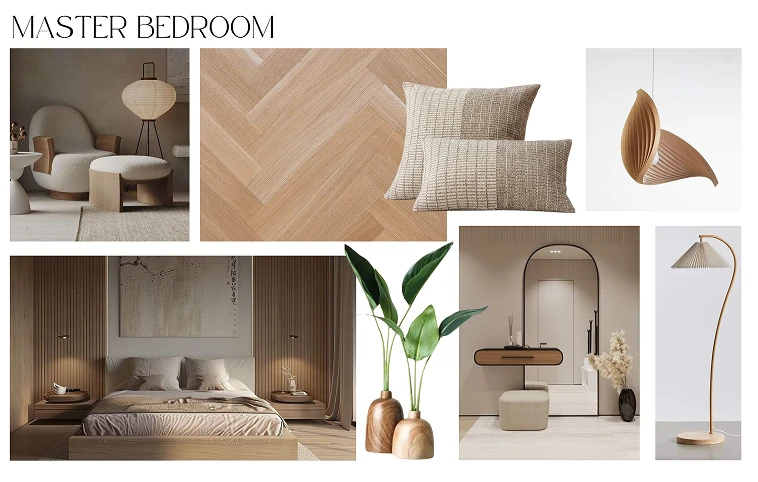
Oak, rattan, cotton, jute, textured plaster and a greige and cream palette do the work that colour and pattern would do elsewhere. The living room leans semi Scandinavian Nordic, the bedroom carries a dual tone textured paint finish that gives the walls depth without pattern, and the office wall is cut with black CNC panels. This is Japandi style handled as restraint, not as absence.

Why they choose Euphoria Interiors for Villa design?
The failure most minimal living rooms share is that nobody wants to sit in them. Here the greige sofa is deep and soft, the stone topped table is oval, and a petal pendant fills the ceiling.
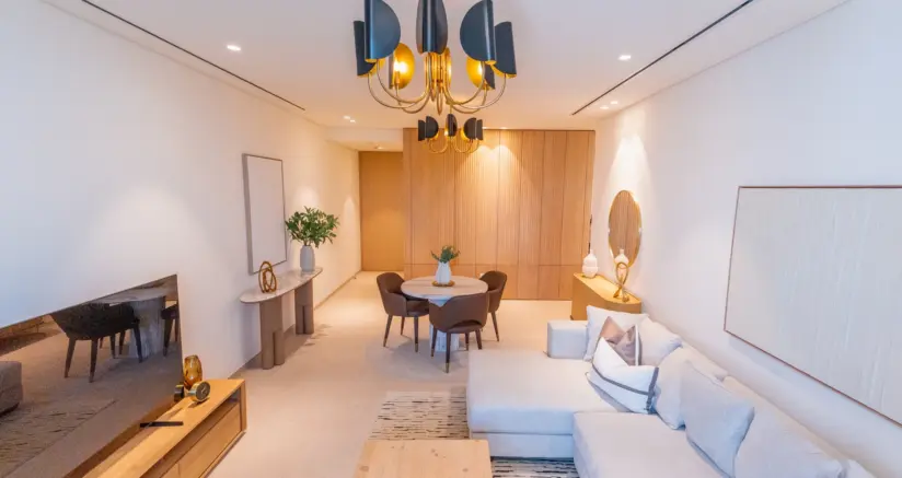
Light oak chairs with cream leather seats ring a round table, the shape that stops four people feeling formally arranged. Behind them a fluted curved sideboard softens the corner.
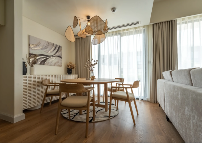
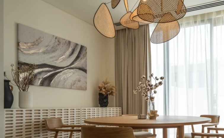
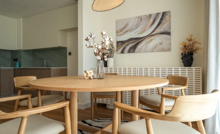
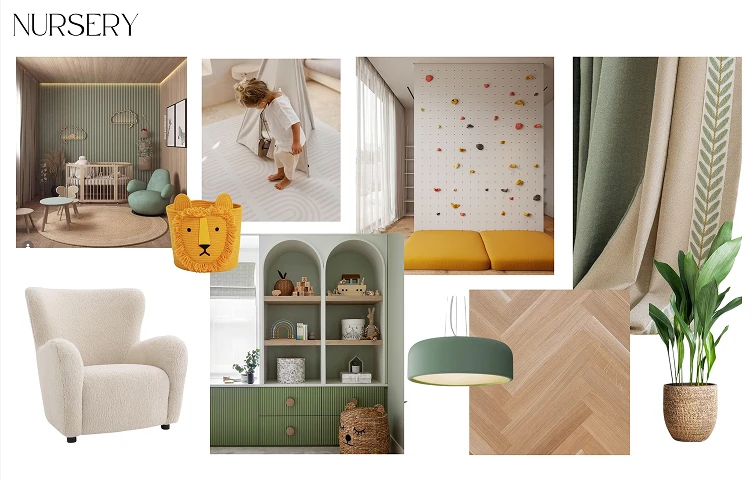
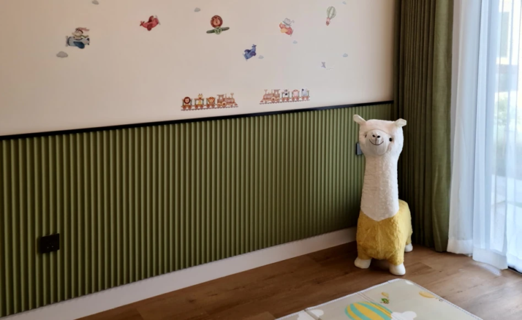
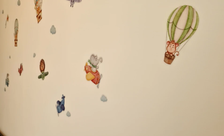
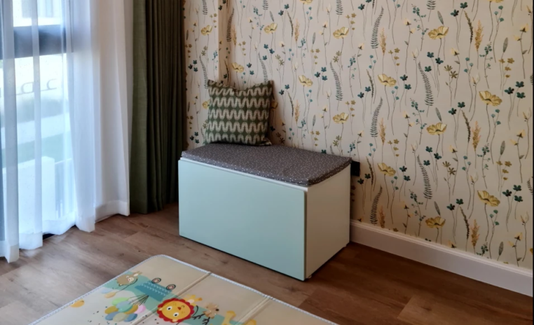
Playful without a theme to outgrow. A green tea coloured panel and floral yellow wallpaper carry all the colour the room needs, and the llama stool is the one piece allowed to be silly.
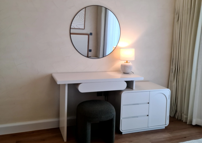
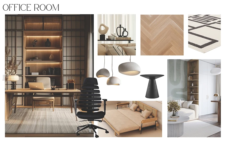
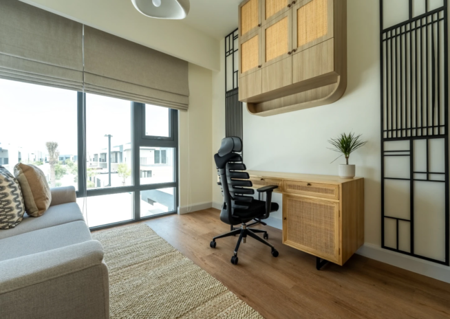
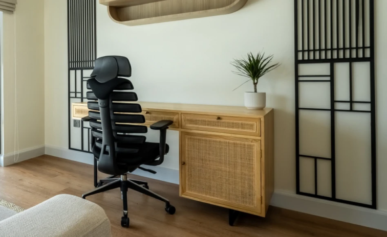
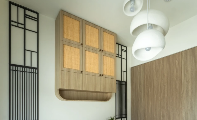
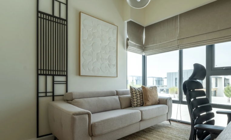
A workspace on Tuesday, a guest room on Saturday. Black CNC cut panels give the working wall its edge, and the sofa bed means a visitor never displaces anybody from a bedroom.
Success story
Our project
3D Walkthrough
Studio profile
The brief was precise about the feeling as much as the finish. Design the living room and three bedrooms in a clean, minimalist style, following a Japanese inspired aesthetic that stays simple, calm and uncluttered. Keep the layouts functional with minimal furniture and decor.
Use a neutral palette with very few design elements. Suggest and implement parquet flooring and wallpaper only if required, and make no structural modifications whatsoever, since this was a new home and the existing layout was to be respected. What the client wanted, underneath the style references, was a house that feels peaceful to come home to and does not need constant tidying to look the way it looked on day one.
The emphasis was on neatness, balance and subtle detailing rather than decoration. That is a residential interior design brief with nowhere to hide, because a minimal home is judged entirely on whether the few things inside it are the right things.
Restraint is the most expensive discipline in interior design, and clients are often surprised by that. When a scheme carries pattern, colour and quantity, a mediocre proportion goes unnoticed. Strip those away and every dimension is exposed.
A pendant hung fifty millimetres too high, a rug too small for the seating, a sideboard that is marginally too tall, each of these becomes the thing you see. The second difficulty was volume. At 2500 sqft with a deliberately minimal furniture count, rooms drift towards feeling underfurnished rather than serene, and the line between the two is thinner than it sounds.
Minimalism also has a well known failure mode in this climate, where neutral palettes and hard surfaces turn a home cold and slightly clinical, which is the opposite of what wabi sabi means. Storage presented the third problem.
A home only stays uncluttered if there is somewhere for the clutter to go, and visible storage contradicts the entire brief. All of this had to be resolved without moving a single wall in a newly handed over house.
Euphoria Interiors answered the coldness problem with texture rather than with colour. Oak, rattan, cotton, jute, boucle, stone and textured plaster all sit within the same narrow band of greige and cream, so the palette stays as quiet as the client asked, while the surfaces give the eye enough to hold onto. A room can be entirely neutral and still feel warm if no two materials in it are smooth in the same way.
Curves carried the second part of the answer. The fluted rounded sideboard, the oval coffee table, the round dining table, the arched storage door and the rounded desk edge all soften a scheme that could easily have read as severe. Lighting was treated as the sculpture the walls were not allowed to have, which is why the petal shaped pendants over the living and dining zones are the boldest objects in the house.
Storage was resolved by making every piece work twice, so the sideboard, the desk unit and the wall cabinet absorb daily clutter behind closed fronts. The office was planned to double as a guest room, which is how a minimal home stays minimal when visitors arrive.









Creative Head

3D Lead

Project Coordinator

Quantity Estimator

Business Development Associate
Get your space designed,
without the stress.

Because true luxury isn’t just what you see —, it’s what you feel every day.
Minimalism is subtractive, it is defined by what has been removed. Japandi is defined by what remains and how it feels to touch. That distinction matters enormously in a Dubai apartment or villa, where hard flooring, large glazing and strong light already push interiors towards feeling cool and echoing. A purely minimal scheme in that context often ends up clinical. In Wabi Sabi the count of objects is genuinely low, yet almost everything present is natural and tactile, which is what keeps the house feeling lived in rather than emptied. Oak, rattan, jute, cotton and plaster all age visibly and imperfectly, and that acceptance of imperfection is the actual meaning of the phrase the project is named after.
By defining zones with anchors rather than filling floor area. Each area in this home has one clear centre, the sofa and rug in the living room, the round table under its pendant in the dining area, the desk wall in the office. Once a zone has a centre, the space around it reads as generous instead of unused. Rugs were sized to sit under the furniture rather than beside it, which visually gathers a group of pieces into one object. Lighting was hung low enough to bring the ceiling height into human scale. And the boldest items in the house are overhead, because a sculptural pendant occupies attention without occupying floor, which is precisely what a large minimal room needs.
It only stays tidy if the storage was designed before the styling. In a decorated home clutter can hide among the objects. In a minimal one, a single stack of paperwork on a surface is immediately the loudest thing in the room, which is why so many minimal interiors look nothing like their photographs after a month. Every storage piece here is closed and doing more than one job. The fluted sideboard serves the dining zone, the rounded unit handles the study corner, and the office combines a desk, a drawer bank and a wall cabinet on one plane. Nothing needs to be displayed for the room to look complete, so putting things away is the natural action rather than an effort.
Because a spare bedroom that is used a few nights a year is one of the least efficient decisions in a home, and in a house committed to keeping things minimal it is also slightly contradictory. This room earns its floor area every weekday as a workspace, with a desk, a drawer unit and a wall cabinet resolved on a single wall so the rest of the room stays open. The sofa takes care of guests without any of the furniture announcing that purpose. The black gridded screens give the wall a graphic structure that reads as considered in both modes. It is the one room in the house with a hard edged geometry, and it holds the arrangement together.
It translates well, and in some ways more easily, because smaller rooms need fewer anchors to feel resolved. The principles carry directly. Keep the palette within one narrow band and let texture rather than colour create the interest. Introduce curves wherever a scheme risks feeling severe. Put the sculptural decision overhead in the lighting, where it costs no floor area. Make every storage piece closed and dual purpose, since that is what determines whether the look survives daily life. Choose natural materials that improve rather than deteriorate with use. The specific pieces in Wabi Sabi were selected for a 2500 sqft home and would be scaled down, and the reasoning behind each of them holds at any size.
 Villa interior design service
 Penthouse interior design service
 Townhouse interior design service
 Duplex interior design service
 Studio interior design service
 One bedroom villa interior design service
 Two bedroom villa interior design service
 Three bedroom villa interior design service
 Four bedroom villa interior design service
Areas we serve across Dubai