Dining area
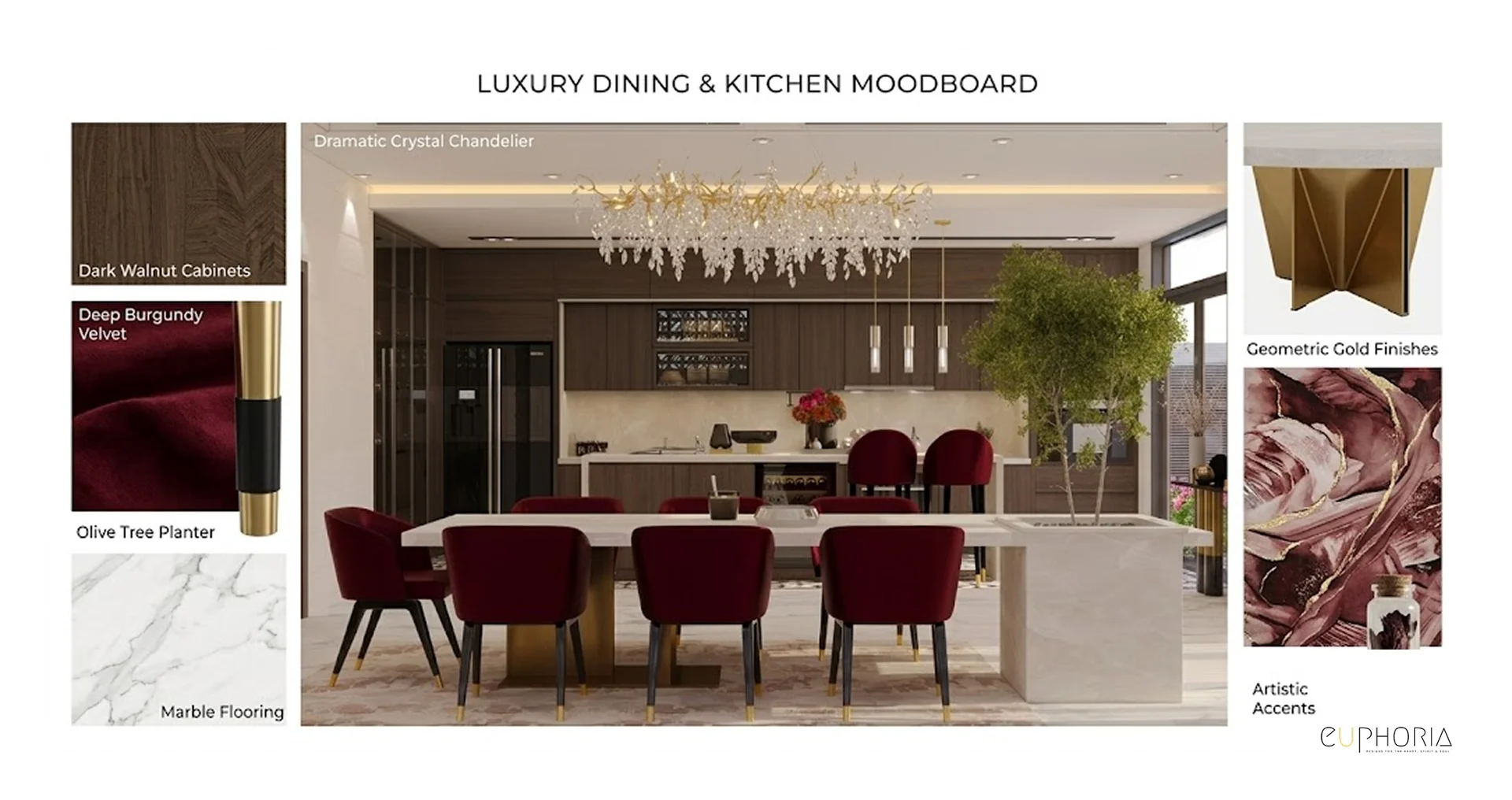
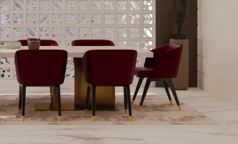
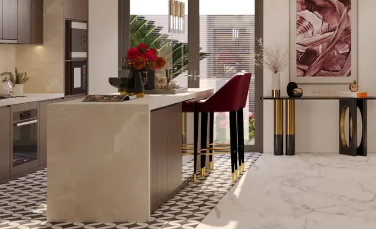
Intimate without going darkDeep red upholstered chairs around a considered dining table under a signature pendant overhead. Warm neutral base carries the volume without ever fighting the accent.

Wine Not is a Modern Luxury open kitchen and dining design inside a 1500 sqft 1BHK at Villanova, Dubai. The scheme brings the kitchen and the dining into one continuous volume, with rich material choices, statement lighting and one deep accent doing the identity work.
A home kitchen starts to behave like a restaurant not because of the appliances or the seating, but because of the atmospheric layering that a considered open kitchen design pulls together through material and light.
The palette holds warm wood, warm neutrals, marble and a deliberate deep red accent for the dining seating, layered against textured walls, a curated pendant fixture overhead and layered ambient lighting through the plan.
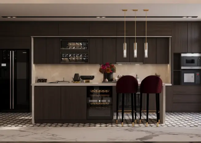
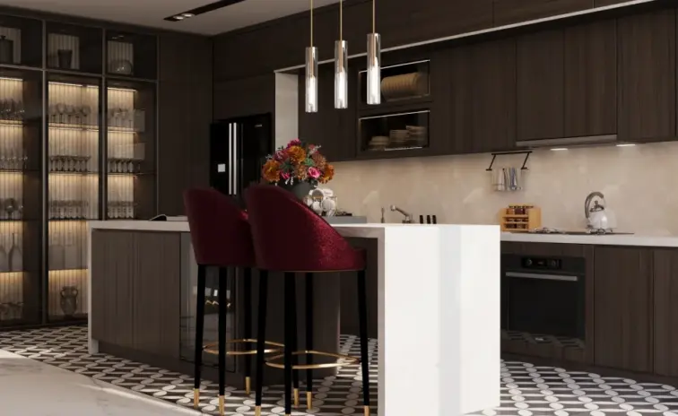
The kitchen carries warm wood cabinetry and glass fronted upper cabinets, with a working counter that faces the dining rather than turning its back to it, so cooking and hosting share the same floor without either one disappearing into the other.
The dining zone anchors the plan around a considered table and deep red upholstered chairs, with a signature pendant overhead marking the centre of the composition and a textured partition softening the transition from kitchen to dining.

Why they choose Euphoria Interiors for 1BHK design?
Deep red upholstered chairs around a considered dining table under a signature pendant overhead. Warm neutral base carries the volume without ever fighting the accent.
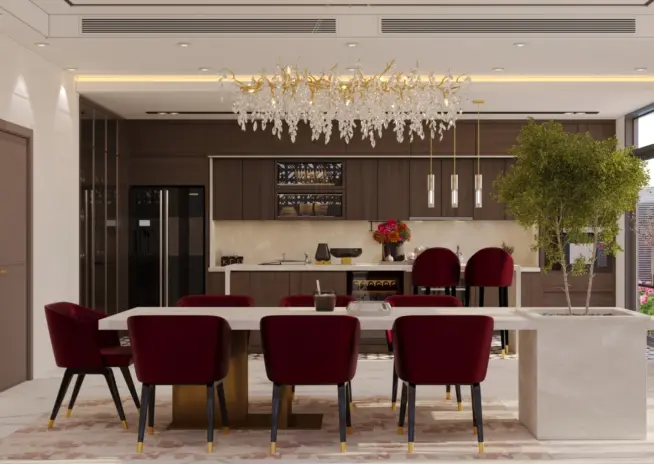
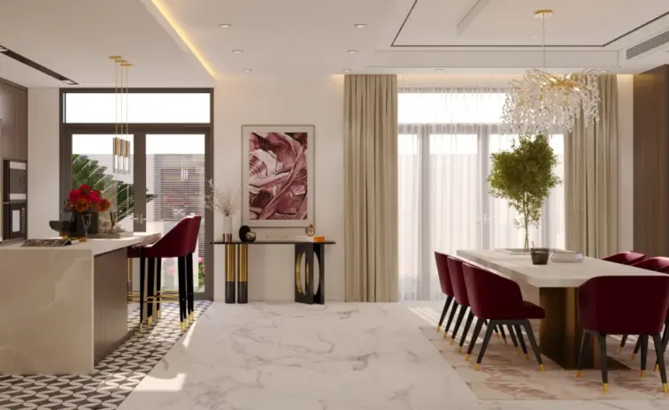
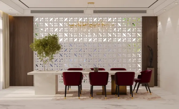
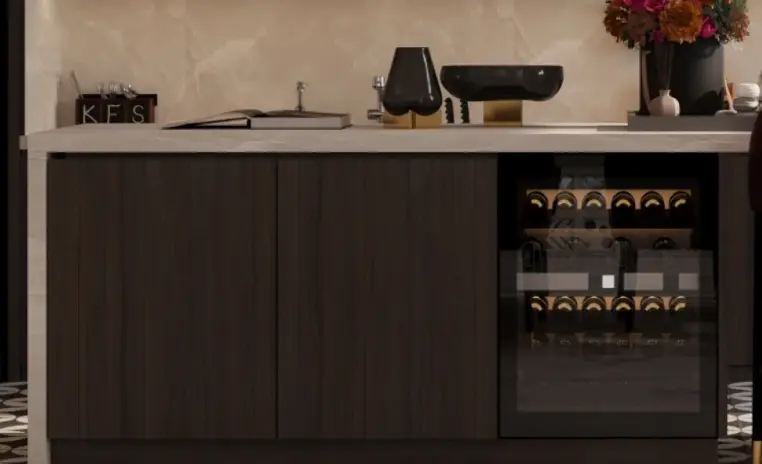
Warm wood cabinetry with clean lines, glass fronted upper cabinets holding curated pieces, and a working counter that faces the dining rather than turning its back.
3D Walkthrough
Studio profile
The brief was for a premium and elegant dining area that feels warm and luxurious, with statement lighting and rich finishes carrying the ambience.
The intent was atmosphere over show. A dining room that reads distinct on arrival, invites the customer to stay for the length of a meal rather than a course, and holds its register from an early evening dinner through to a late night gathering.
A modern and subtly classic direction was set. Elegant and timeless, with warm materials as the base and one bold accent doing the personality work rather than a busy palette across the surfaces.
Function had to sit alongside atmosphere. The kitchen had to be open to the dining without ever reading as a service room, storage had to be integrated rather than added, and the transition between cooking and eating had to feel like a shift of tone rather than a change of room.
The palette was set early. Warm wood, warm neutral, marble and one deep accent per zone, with layered lighting doing the heavy lifting on evening register.
Read as considered open kitchen and dining design in Dubai, the real request was cohesion inside one continuous volume.
An open kitchen changes the standard the whole plan is held to.
In a closed kitchen the working mess is private and the finishes only need to satisfy whoever cooks. Open the kitchen to the dining and every cabinet face, every appliance and every surface enters the composition. The kitchen becomes a room to look at as much as a room to work in.
Colour was the second constraint. The brief called for a deep red on the dining seating, and deep colours risk closing a room down when they arrive without discipline. The palette had to hold the accent in one place and let the rest of the plan stay quiet enough to carry it.
Zoning was the third piece. The kitchen and the dining had to read as distinct areas without a partition wall, and a plan that opens the two into one continuous volume risks losing the sense of arrival that a dining space depends on to feel like a destination.
Every solution had to sit inside one material language. Warm wood, warm neutral, marble and one deep accent per zone, layered lighting per activity, and a finish specification that would satisfy both the working kitchen and the atmospheric dining without needing two separate schemes.
Euphoria Interiors resolved the plan by letting the palette hold the plan together and letting the lighting decide the mood.
Warm wood cabinetry runs through the kitchen with glass fronted upper cabinets that keep the wall reading open rather than blocked. The working counter faces the dining rather than turning its back to it, so cooking is part of the evening rather than hidden from it.
The dining zone anchors around a considered table with deep red upholstered chairs, carrying the one bold accent of the plan against a warm neutral base.
A signature pendant hangs over the table as the centre of the composition, and layered ambient lighting keeps the surrounding volume warm without competing with the fixture overhead.
A textured partition sits between the kitchen and the dining, marking the boundary without sealing the volume, so light and sightlines pass through while each zone reads distinct in use.
Layered lighting stitches the plan together. The pendant marks the dining, warm ambient lighting fills the volume, focused task light picks out the kitchen counter, and the same room reads bright at midday and warm and low at night.
The result is a plan that photographs like a restaurant and lives like a home, which is the ambition an open kitchen and dining at this scale is worth committing to.









Creative Head

3D Lead

Project Coordinator

Quantity Estimator

Business Development Associate
Get your space designed,
without the stress.

Because true luxury isn’t just what you see —, it’s what you feel every day.
By deciding early how much of the room it is allowed to occupy.At Wine Not the deep red lives in the seating and nowhere else, while a neutral base holds the walls, the surfaces and the larger planes.The base is what carries the accent. Warm wood cabinetry, warm neutral walls, marble surfaces and layered ambient lighting all sit in a quiet register, so the deep red upholstery reads distinctive against them rather than fighting for space.Repetition is the second discipline. The accent appears in one place and is not repeated across the plan, which is what stops a strong colour from turning into a theme instead of a moment.The result is a room that reads bold and calm at the same time. The deep red carries the personality, the neutral base holds the volume, and neither one is asked to do the job the other one is better suited to.
The standard the kitchen is held to changes completely.In a closed kitchen the working mess is private and the finishes only need to satisfy whoever cooks. Open it to the dining area and every cabinet face, every appliance and every surface enters the composition of the room next door.The kitchen becomes a room to look at as much as a room to work in.The response is to design the kitchen to the same standard as the dining. Warm wood cabinetry with clean lines, glass fronted upper cabinets that keep the wall reading open, integrated appliances that disappear into the joinery, and layered lighting that holds the working counter and the dining table on the same tone.The counter facing the dining rather than turning its back to it is the last discipline. Cooking becomes part of the evening rather than hidden from it, which is the specific reason an open kitchen justifies the extra design attention it demands.
Through partial devices that suggest a boundary while letting light and sightlines pass.At Wine Not a textured partition does the primary work, marking the edge between cooking and dining without sealing the volume.Lighting does the second layer. A pendant hangs over the dining and focused task light picks out the kitchen counter, so the two zones carry different light qualities in the same continuous plane.Furniture placement does the third. The dining table anchors its own zone, the kitchen counter faces outward rather than dividing the space, and the deep red seating draws the eye to the dining as the destination in the plan.The result is one continuous room that reads as two distinct zones, which is what an open kitchen and dining plan has to achieve to feel considered rather than compromised.
Because a dining room is used mainly after dark, which makes light the material that defines it.A fixture over the table performs three jobs at once. It marks the centre of the zone, which is particularly important in an open plan where the dining does not have walls to hold it. It sets the light quality that defines the evening register. And it acts as the sculptural moment the room is remembered by.At Wine Not the pendant over the dining table is the single most theatrical move in the plan, and it does its work without competing with the other elements around it.Layered ambient lighting fills the rest of the volume in a supporting register, so the pendant reads as the centre without ever needing to shout for the attention.A dining room lit from a single ceiling fitting or a generic downlight scheme reads office. One built around a considered statement pendant reads as a room designed for the hours it actually gets used.
They work when what sits behind them has been considered as part of the design.Glass fronts lighten a run of cabinetry, breaking up what would otherwise be a solid mass of wood and giving the eye something to rest on across the wall.The trade off is that the contents of the cabinet become part of the composition. Stacked crockery, glassware and stemware read as intentional if they were curated at the specification stage, and read as clutter if they were placed after handover without a plan.At Wine Not the glass fronted uppers hold a curated set of pieces that carry the palette forward rather than competing with it. Clear glassware, warm toned crockery, considered spacing, and lighting inside the cabinet to hold the display in the same warm register as the rest of the kitchen.Handled this way the glass fronts add depth to the wall and reduce the visual weight of a large cabinetry run. Left to chance they turn into a display of everything the household owns.
 Villa interior design service
 Penthouse interior design service
 Townhouse interior design service
 Duplex interior design service
 Studio interior design service
 One bedroom villa interior design service
 Two bedroom villa interior design service
 Three bedroom villa interior design service
 Four bedroom villa interior design service
Areas we serve across Dubai